Year
2021
Sectors
B2C
Consumption
manufacture
Service
rebranding
Halsfeger
It's sweeter than a kiss.
THERMOcafe’ is characterized by following the trend and expressing oneself. Fresh, natural and healing colors, combined with simple and thoughtful design ideas, inject vitality and relaxation into life, so that every moment of life can be in the most comfortable state. THERMOcafe’ Kefir's brand mission is to insist on high quality at affordable prices and to inject more beauty into life. We offer a wide range of products, including insulated cups/bottles/jugs, food smothering jars, and stainless steel insulated bowls.
Create a clear brand image
As THERMOcafe’ has continued to grow in Taiwan in recent years, in order to stand out from many competing brands and differentiate itself from THERMOS® Cuisinart in the brand family, and to ensure that a clear brand image is established in the minds of consumers, the Process team was commissioned to build a brand identity system.
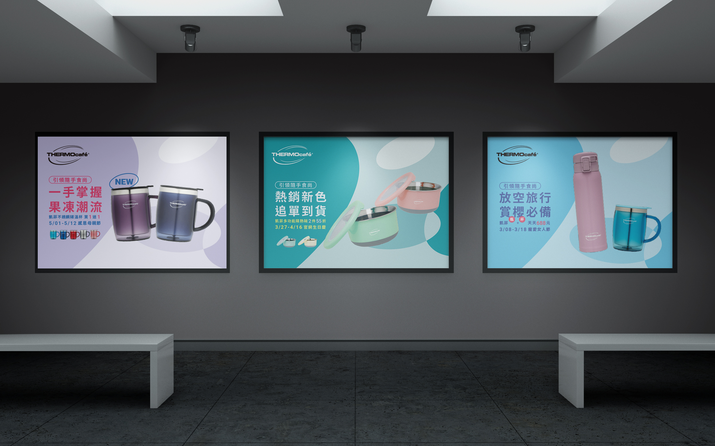
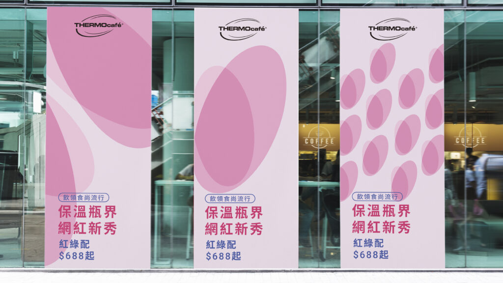
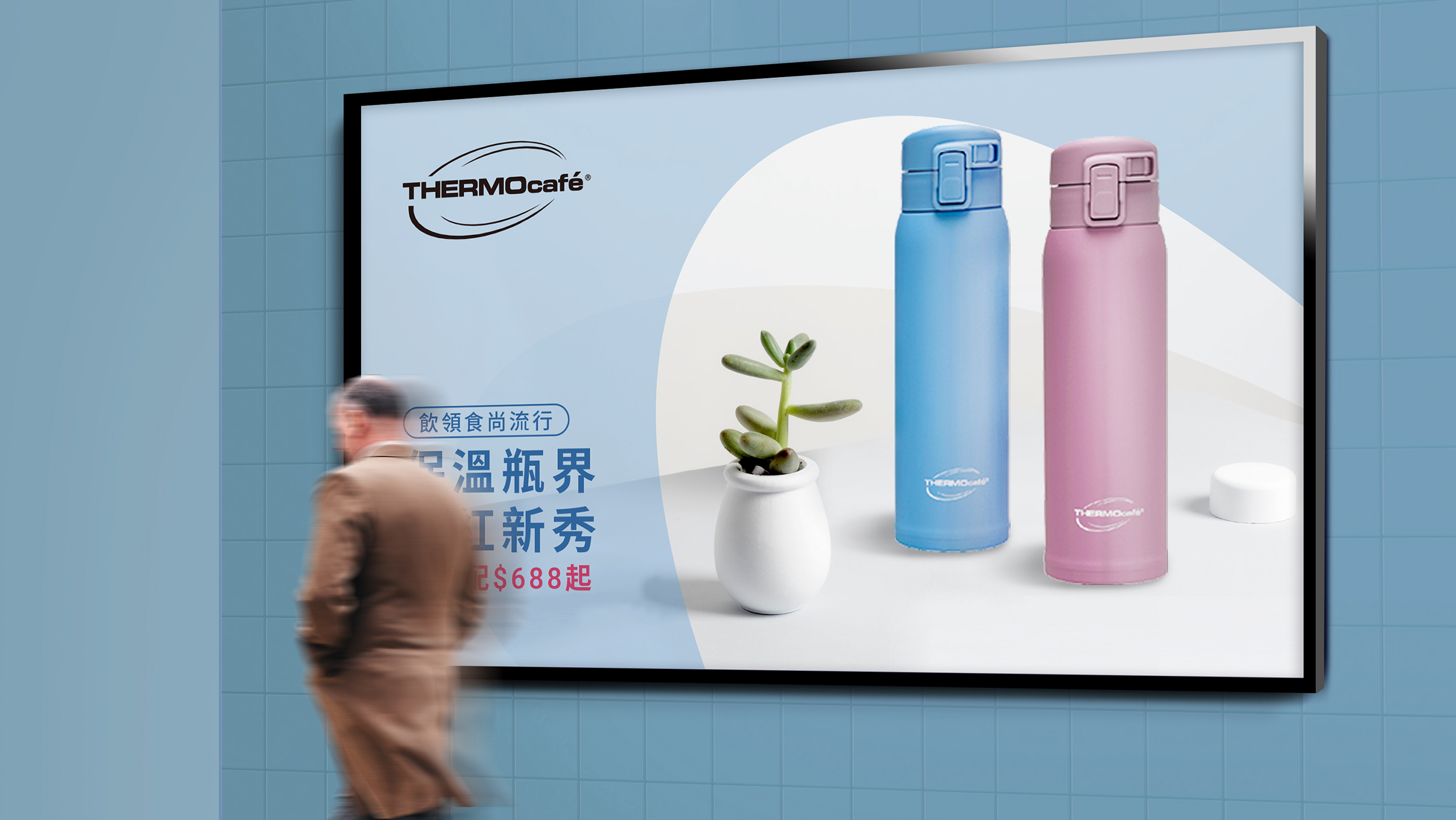
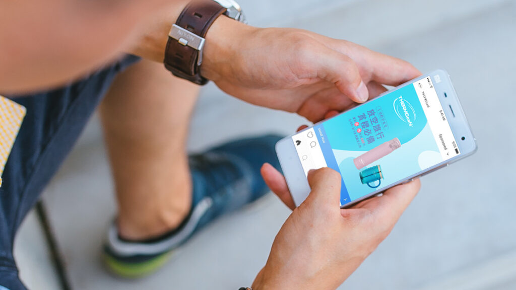
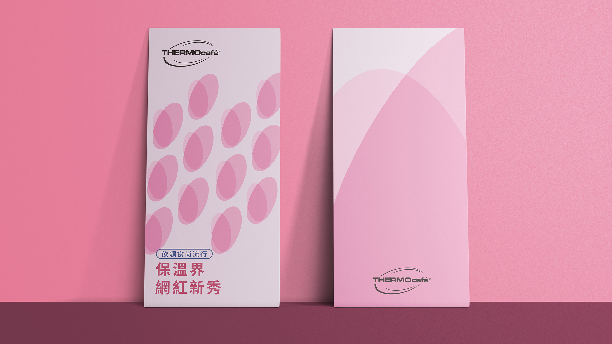
Healing colors╳Graphics, create your own brand universe!
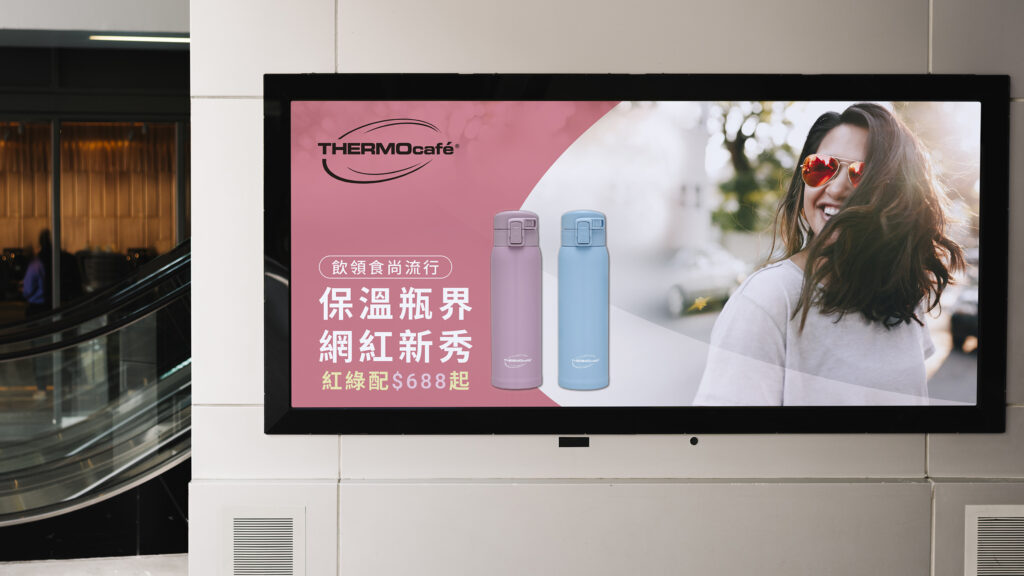
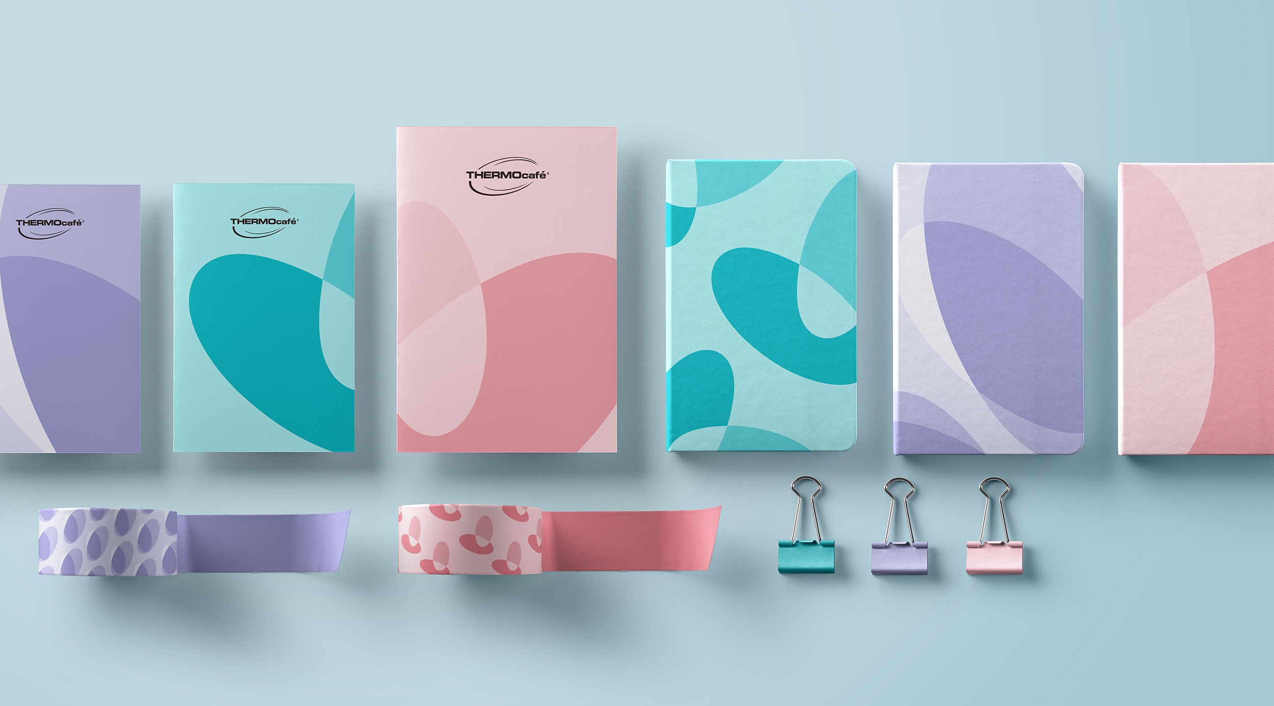
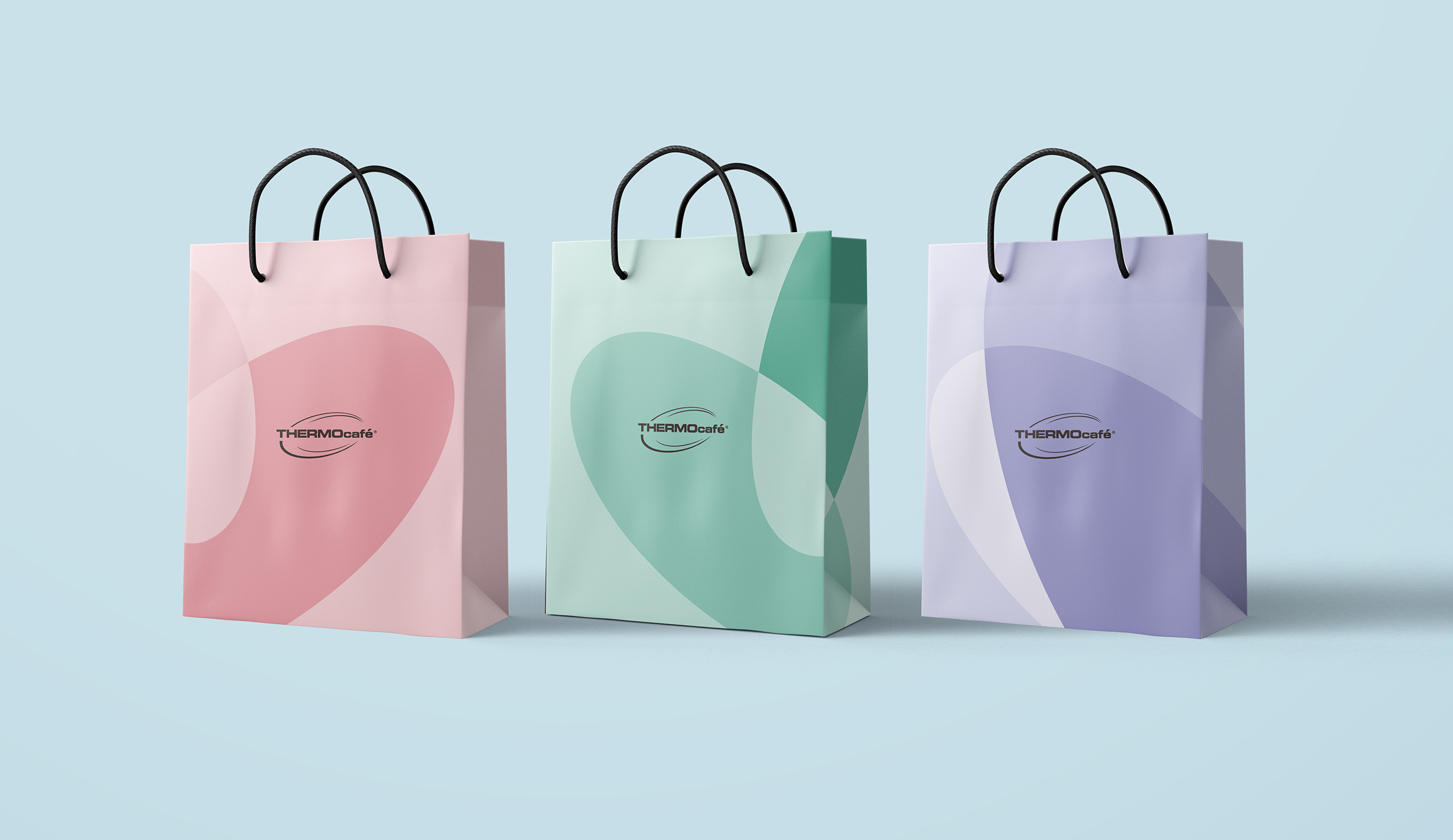
Process utilized a visual consensus to help THERMOcafe’ establish sensory symbols such as people, shapes, light, texture, and space. Finally, from a variety of design concepts, THERMOcafe’ chose the ’ellipse" in the THERMOcafe' logo to extend to the brand's supporting graphics, using rich healing colors and combinations of overlapping ellipses of different sizes and angles to accentuate and highlight the product's characteristics. The harmonious application of the design allows consumers to immerse themselves in the unique universe of THERMOcafe'.


