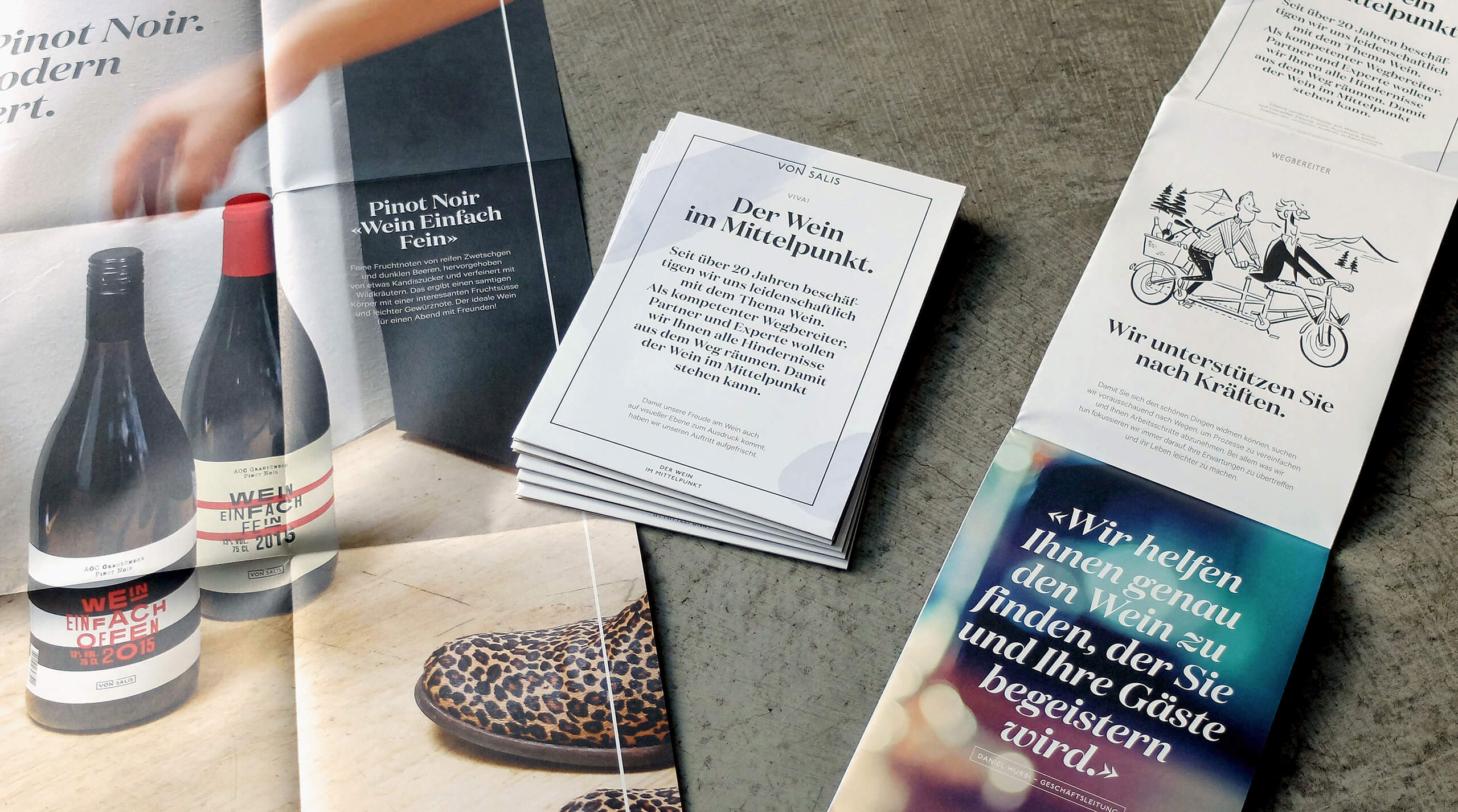
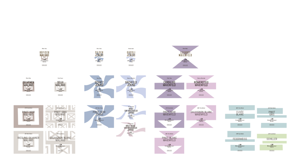
Year

2021

Sectors

B2C
Consumption
manufacture

Service

Brand Recognition

von Salis

Simple but extraordinary wines

Headquartered in the Swiss canton of Graubünden, wine retailer von Salis offers its customers wines from all over the world, covering more than 2,300 varieties. In addition, von Salis sells its own wine brands made from grapes grown in the Canton of Graubünden. This gives it a dual positioning as a wine retailer and producer, which is unclear for the brand, both internally and externally.

Headquartered in the Swiss canton of Graubünden, wine retailer von Salis offers its customers wines from all over the world, covering more than 2,300 varieties. In addition, von Salis sells its own wine brands made from grapes grown in the Canton of Graubünden. This gives it a dual positioning as a wine retailer and producer, which is unclear for the brand, both internally and externally.

Red wine retailers Challenge

The purpose of the rebranding is to bring clarity to communication. Ensuring that both von Salis businesses reach their full potential in different communication environments.
Whether von Salis speaks as a wine retailer or as a producer needs to be reflected in the design.

Solution

First of all, we have completely changed the image of the wine retailer. Depending on the specific use, the use of a dynamic trademark can be symbolic or a flexible background. The story of the wines, the products and the information are presented in the context of this trademark extension. This approach creates a dynamic image that is fully in line with the new brand concept.
von Salis has become a pathfinder, a partner and an expert in presenting the world of wine in a simple way, so that “wine becomes the centerpiece of the stage”.

Illustrations

The new brand exudes a vibrant fun and lively atmosphere that freely indulges the senses. Japanese artist Satoshi Hashimoto's illustrations highlight these positive associations, bringing the newly defined brand values to life and communicating them to employees and customers in a lively manner.

color scheme

The soft, earthy von Salis color scheme consists of five primary colors, each grouped into two different brightness levels, with the logo in a mix of black or white.

Fonts and Typography

Striking and captivating, the hand-drawn fonts work well on a variety of materials, from business cards to truck tarps, and the vibrant imagery of the selvedge Domaine Display and sans-serif Calibre fonts embellish a myriad of beautiful images on a variety of materials.

Digital Presentation

von Salis has undergone a major overhaul of its official website and online store to enhance the positive shopping experience and clear overview of its wines. Do you want a strong wine or an elegant little wine? Various condition filters help consumers find their favorite wines.

Product Brands

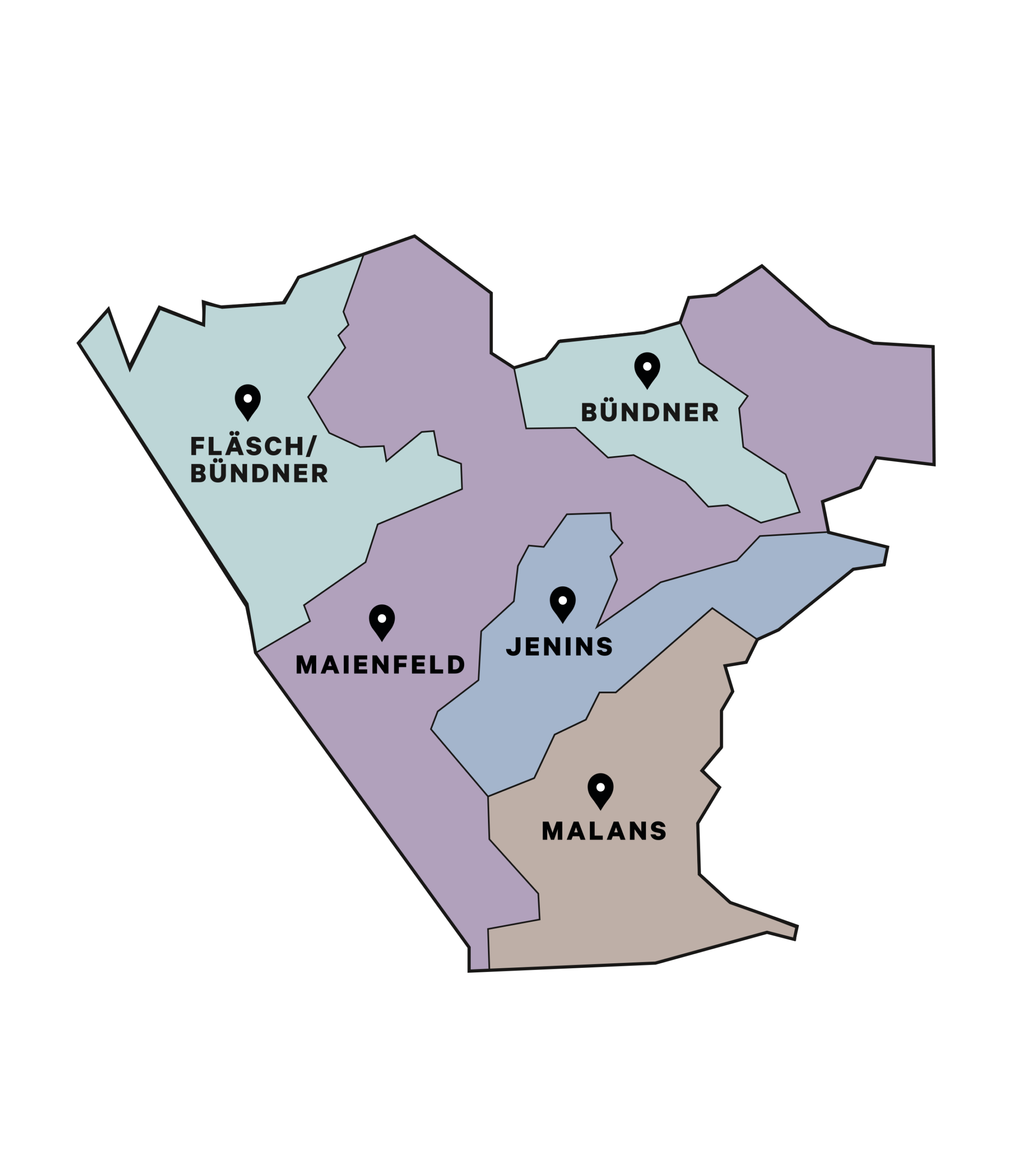
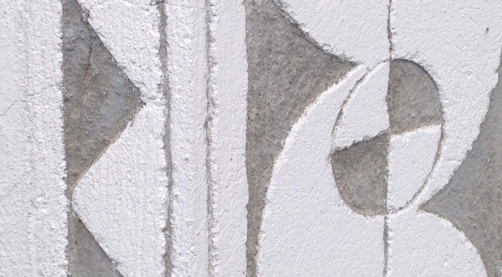
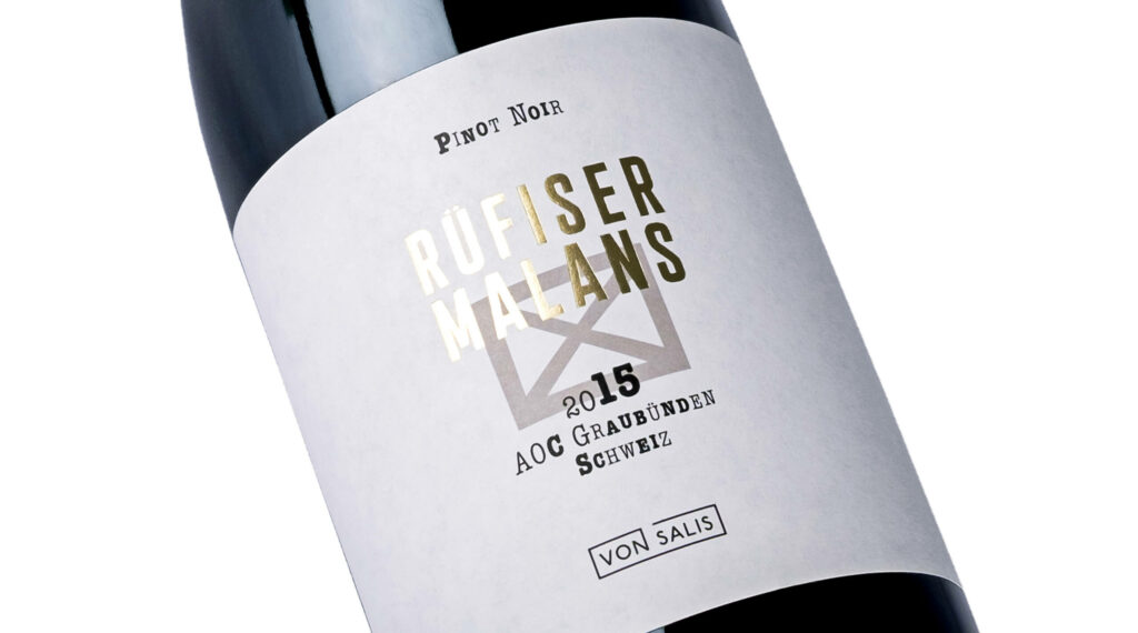
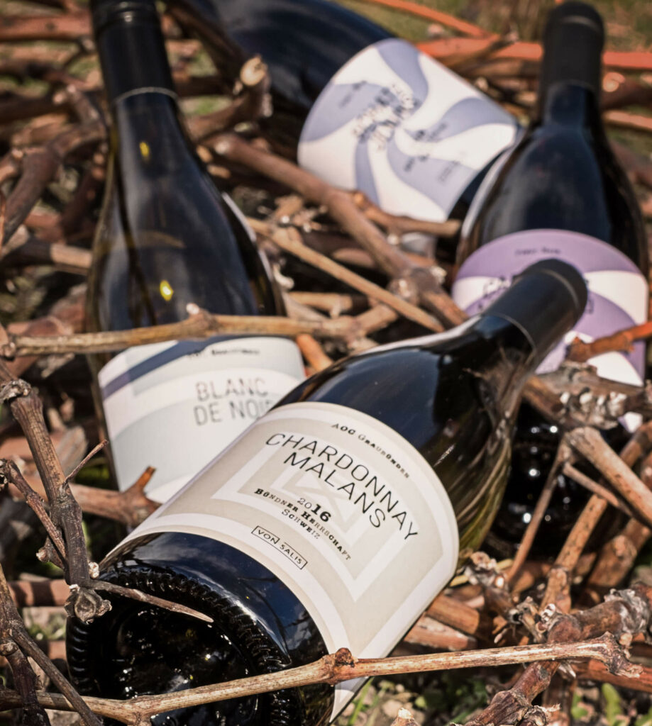
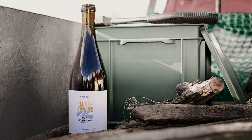
In Maienfeld, Jenins, Malans, Zizers and Grisons, known as the BündnerHerrschaft, we find the same distinctive decorations appearing again and again on new buildings and historic structures, which are known as sgraffiti and are part of the region's architectural culture. The motifs, doorways, windows and wall decorations are abstract, such as shapes and ornaments that correspond to triangles or circles, assigning a characteristic five-leaf clover pattern to each of the four different wine zones and serving to differentiate the basic design components.

The categorization of the individual wine varieties and pricing groups has therefore resulted in a simple but realistic graphic combination. And most importantly: even if each bottle is unique, the von Salis wine collection reveals the harmony of the various combinations.

Classification System

Pro Brand used a creative categorization system to create more than 25 wine labels. Each of the three different wine categories uses a combination of colors, words and symbols to facilitate classification, and each bottle has a unique design that also forms part of the wine collection.

“The Pro brand clearly differentiates our image and communicates the origins of the grape in a non-traditional way. The authentic and inspiring design of the wine bottle carafe completes the sensory immersion experience.”

Managing Director of Salis AG DanielHürbi

Fine Wines and Open Wines

We have developed a simple yet modern product identity and name, just like the wines: “Simply Fine Wines” for more refined, hardened wines and "Simply Drinkable Wines" for modern specialty wines. Various font styles are used to symbolize the blend of grapes, such as the stripes that symbolize the strata where the grapes are grown.

Packaging

The composition of the four symbols from the wine-producing regions provides a template for infinite combinations, which means that the different forms of wine packaging can be arranged interactively or side by side with each other, ensuring a harmonious image regardless of the combination.

Next Project

TUSTA by ADATA

TUSTA by ADATA

Process is a member of
Leading Swiss Agencies (LSA)

12F., No.8, Sec. 1, Heping E. Rd., Da’an Dist.,
Taipei City 106, Taiwan.
+886 (2)2368 3436

Facebook

Instagram

LinkedIn

Copyright © 2025 Process Ltd.
All rights reserved.