Year

2025

Sectors

B2C
Food & Retail

Service

Brand strategy
Brand design

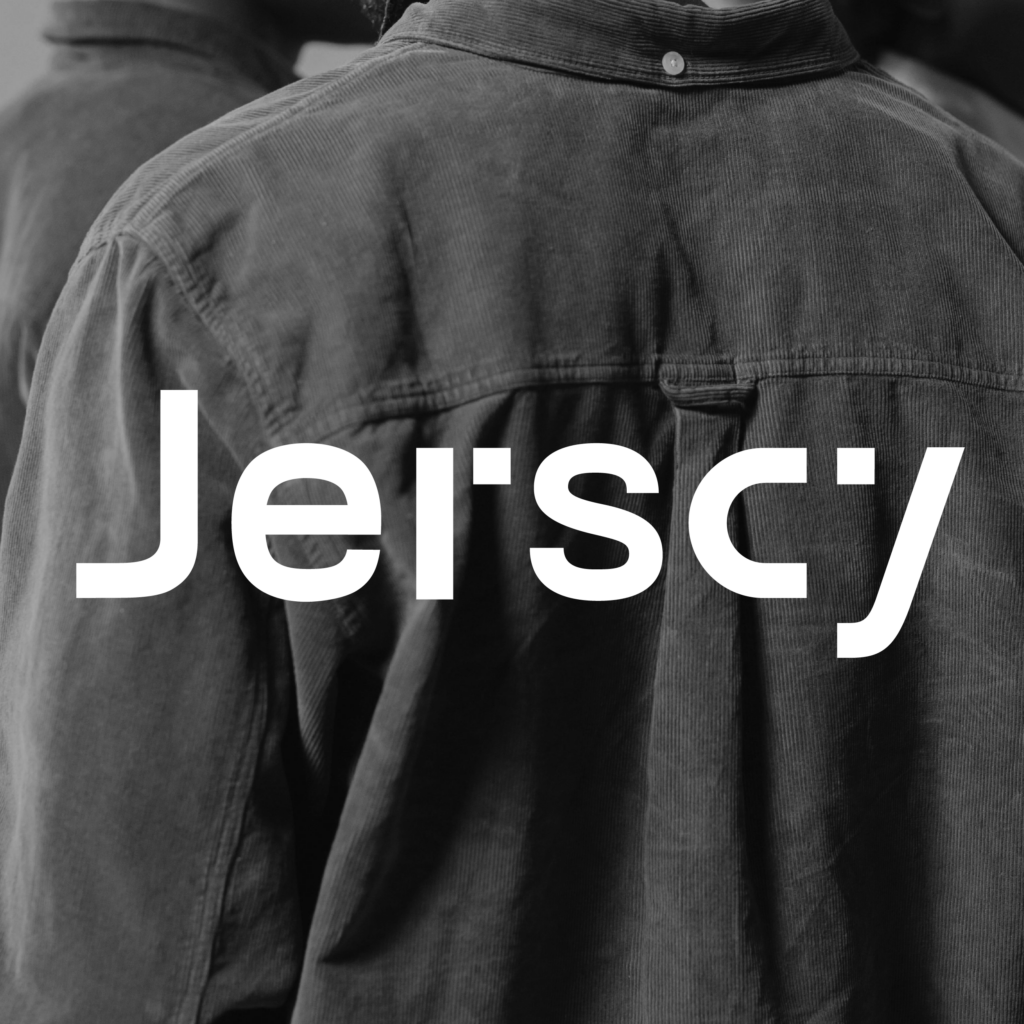
Jerscy

Simple, but Special

In the menswear market, 'minimalism' and 'functionality' are becoming a common language. With most brands focusing on style or price, the choices for everyday wear are becoming more and more similar.JERSCY has long been focused on comfort and durability.Through the details of fabrics and shapes, it responds to the needs of men in different situations.

As the brand continues to build user and product experience, theHow to build a clearer sense of what's going on in the midst of the everyday.Become an important topic in rebranding.

Translating Positioning: From Function to Feeling

Through market analysis and user research, we reexamined how men make decisions in clothing. Beyond style or branding, what matters more is simple: easy to match, comfortable to wear, and natural in daily life.
Clothing is not meant to be overthought— It is a choice you can rely on.

What truly shapes daily experience is not function alone, but how one feels within it. A sense of ease, freedom, and effortlessness— These subtle states form a steady rhythm of everyday life.

Therefore, JERSCY focuses on the core of the brand: "Clothing that cares about men's psychological functions".
Returning to Fabric, Rediscovering Expression

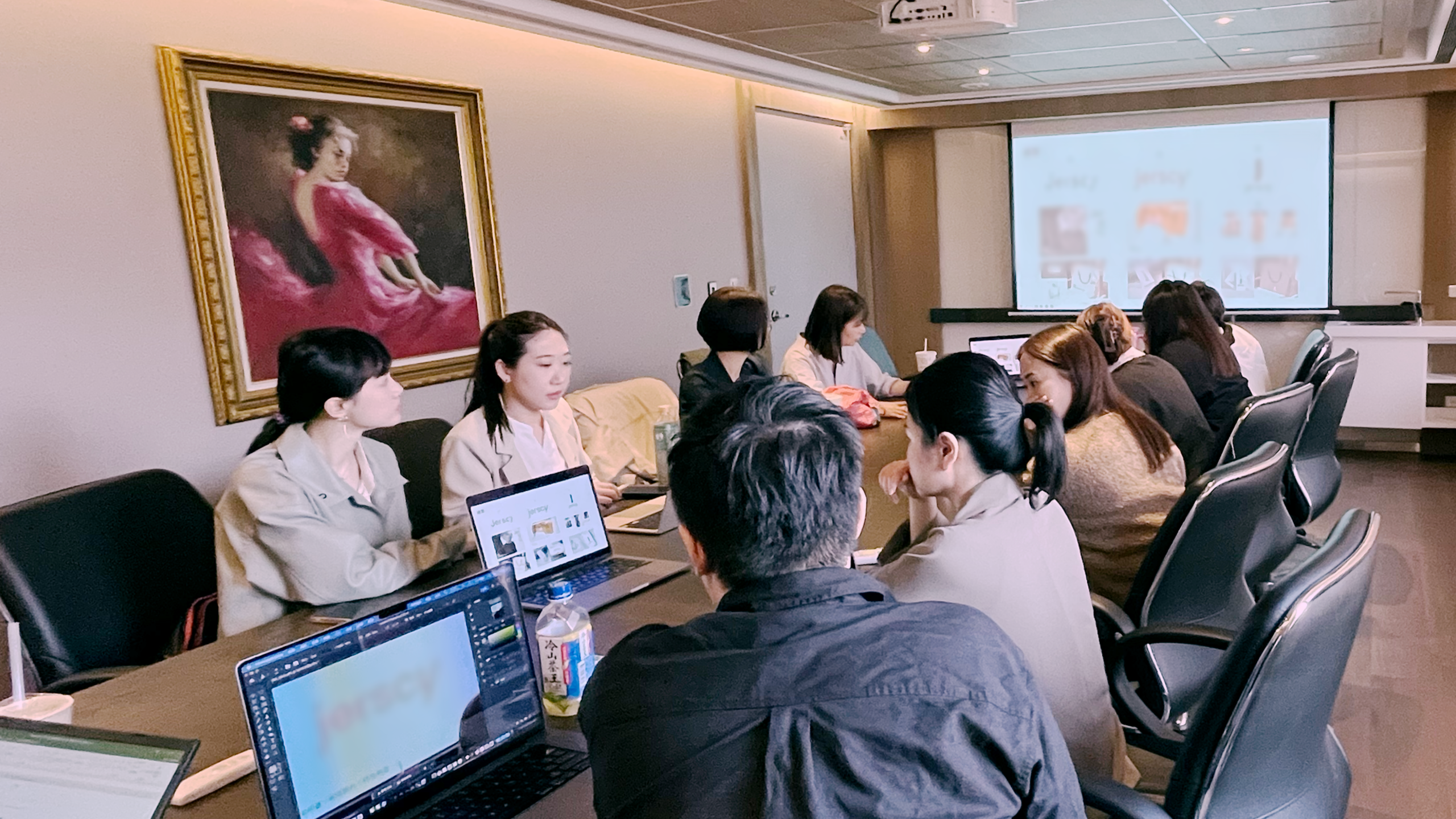
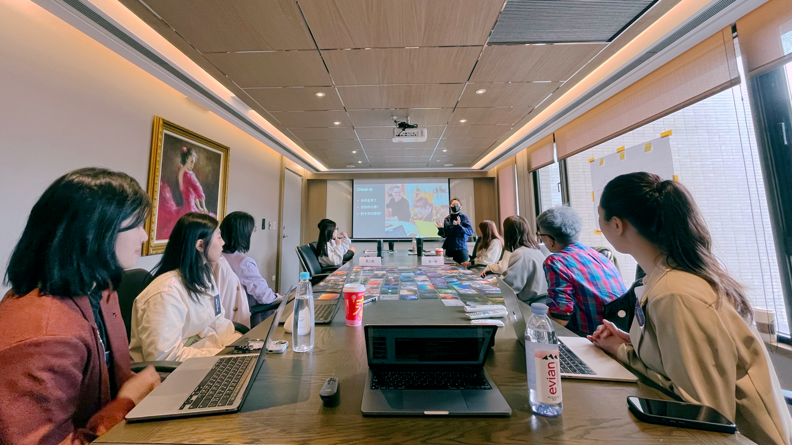
Through internal interviews and workshops, we explored the history of Jerscy's meaning and founder Jocob's experience to tell the story of the brand, linking the brand positioning, and sculpting the essence of Jerscy under the foundation of the brand strategy.

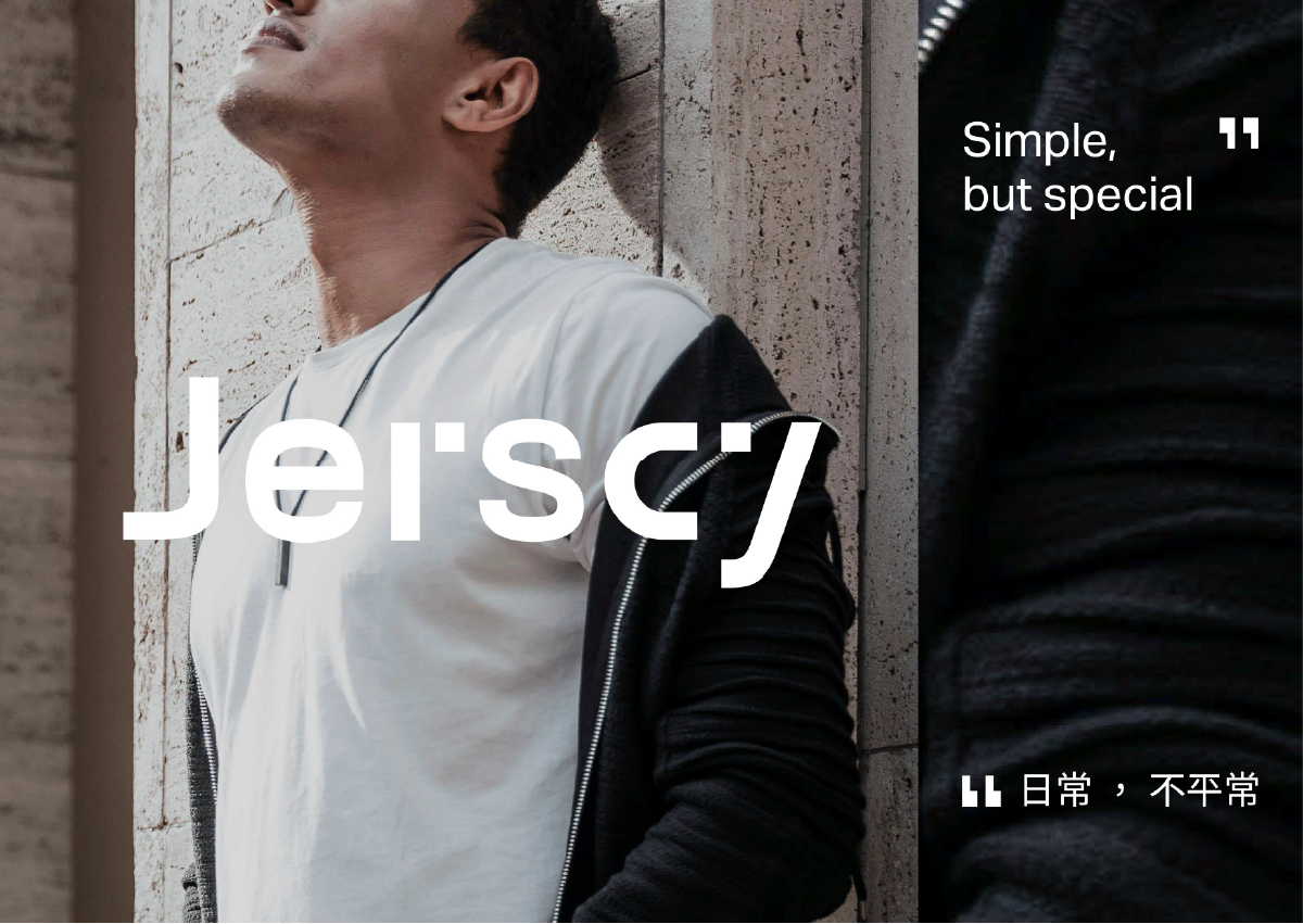
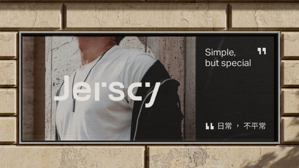
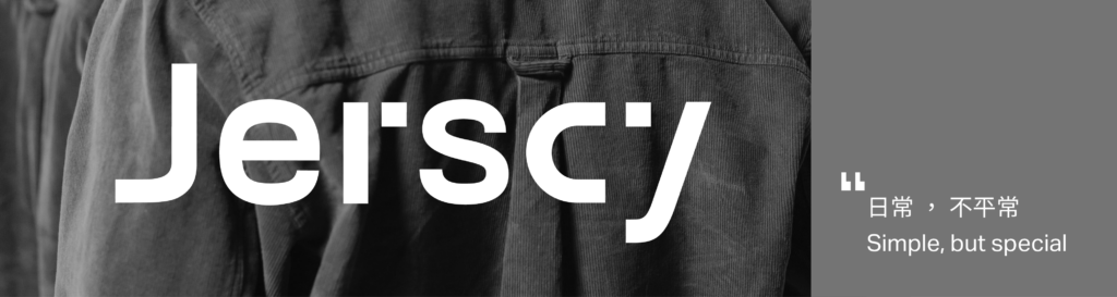
Jerscy creates a state of balance— calm within, ease outward. It is not only functional, but psychological. From this, the brand line emerges: Simple, but Special.

Starting from the everyday, yet going beyond it— design reframes the relationship between clothing and self.

Minimal Is Not Reduction, but Refined Freedom

With the strategy defined, we explored how the brand should be seen and expressed.

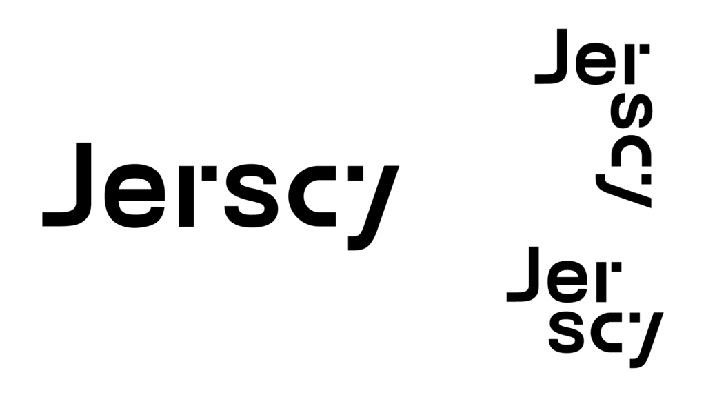
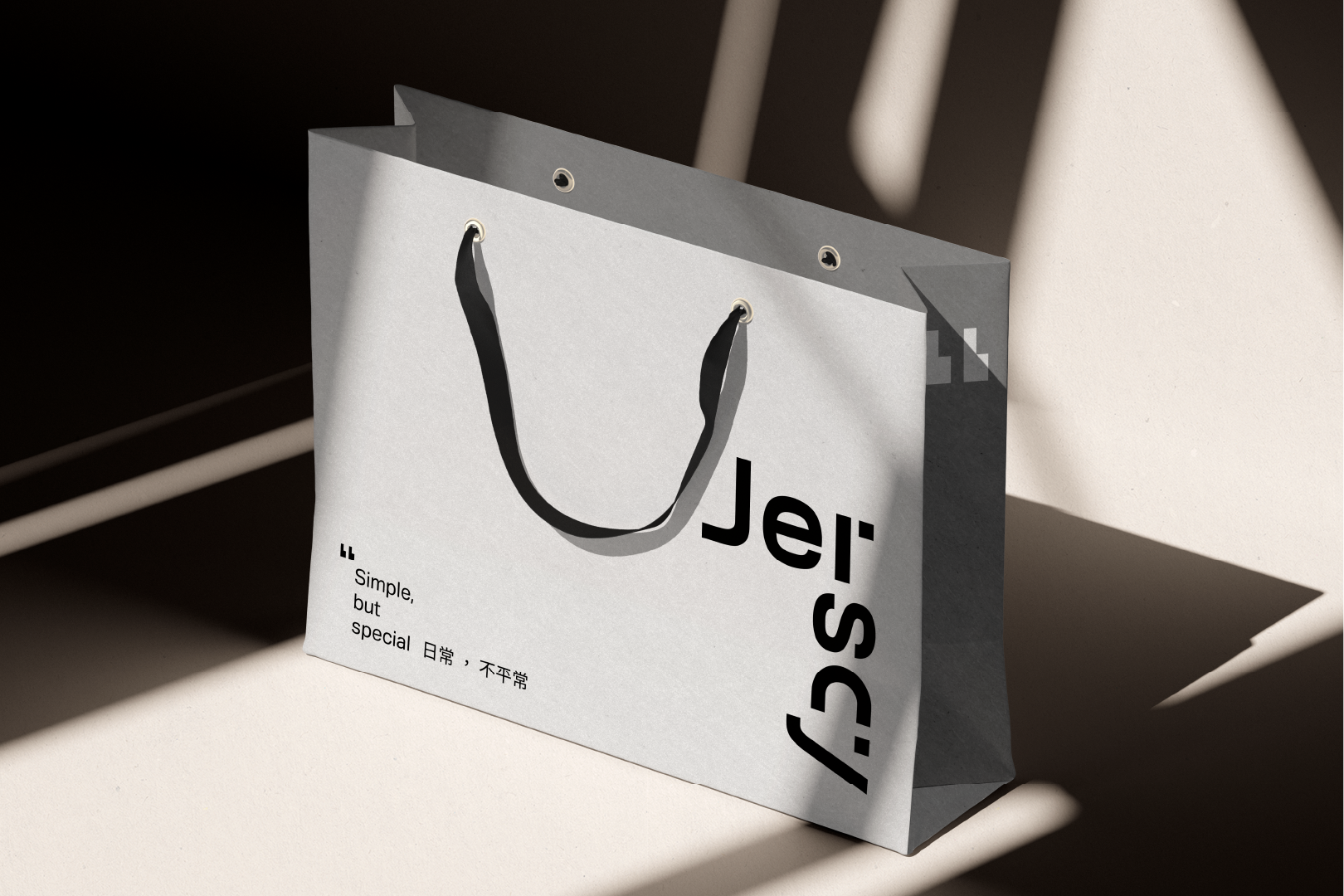
We returned to the essence of Jerscy— structure, order, and clarity. The identity is built on geometric forms, reflecting the logic of functional apparel. Yet it remains flexible— a modular system that adapts across contexts and media. Consistent, but never rigid. Structured, yet free.

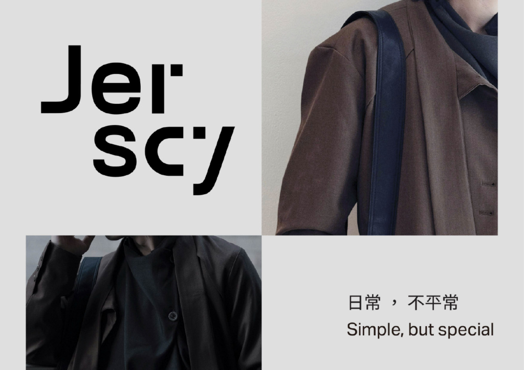
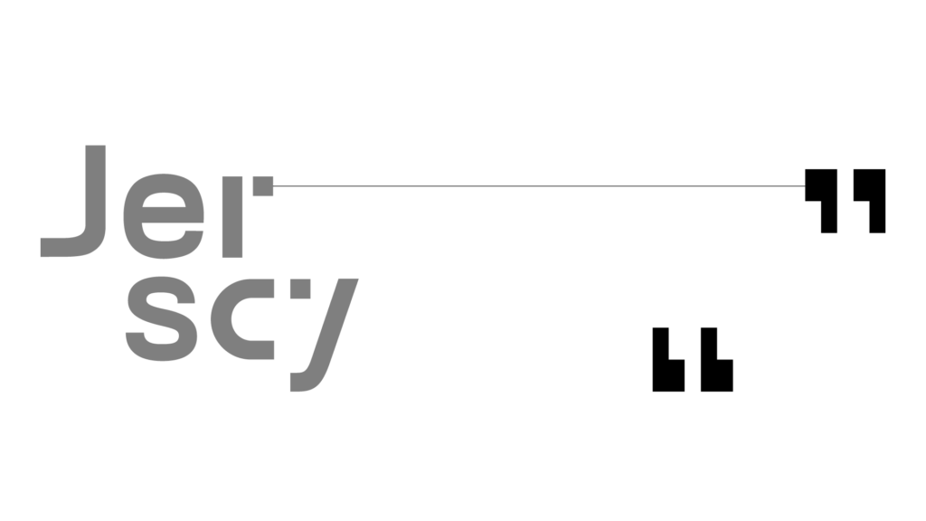
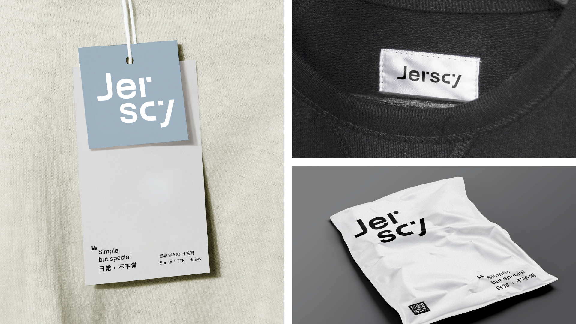
Square forms become the core visual language, extended into quotation marks “ ”— a symbol of expression. Like speaking through styling, Jerscy allows individuals to express themselves with ease. This system is applied across touchpoints, building a visual language that is both coherent and expressive.

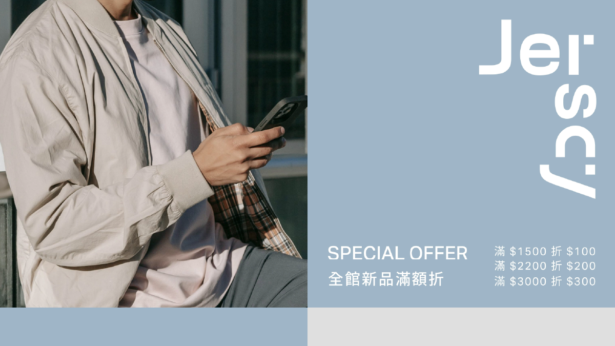
Color is kept low-saturation and cool-toned, projecting a calm, rational atmosphere. A signature “Ease Blue” is defined as an accent— supporting both brand identity and communication.

With Process guiding the strategy, Jerscy clarifies the essence of “function.” Minimal is no longer just simple— it carries confidence, freedom, and clarity.

The brand evolves with focus, turning every act of dressing into a sense of being understood. Simple, yet not ordinary. Every day, yet never average. This balance of reason and emotion defines how Jerscy speaks to the world.

Process is a member of
Leading Swiss Agencies (LSA)

12F., No.8, Sec. 1, Heping E. Rd., Da’an Dist.,
Taipei City 106, Taiwan.
+886 (2)2368 3436

Facebook

Instagram

LinkedIn

Copyright © 2025 Process Ltd.
All rights reserved.