Year

2022

Sectors

B2B
manufacture

Service

Re-branding
Brand Design
Business Model

WALRUS

Better life through innovation Injecting innovation, welling up beauty

(WALRUS PUMP CO., LTD.) was founded in 1967, in the design and development of water pumps, manufacturing and sales service has been fifty-four years of history, the products are sold to China, the United States, Canada, Britain, Germany, Japan, India, Australia and other countries, to provide the market with the best quality of water.

After WALRUS completed its rebranding in 2012, Process Pro was commissioned to carry out a brand optimization project to build a superior brand in anticipation of its 55th anniversary in 2022 and the opening of its Kaohsiung plant.

Taiwan's Leading Pump Brand Continuous Improvement and International Expansion

Although WALRUS is already the leading brand of water pumps in Taiwan, in order to expand into the international market, it is necessary to further optimize the existing brand assets to enter more markets as a leading international brand.

The original brand identity system of WALRUS is very limited, which makes it difficult to manage and extend the development of the brand when marketing, communicating and publicizing. Pro assisted in sorting out the current status of the brand, starting from highlighting the brand's unique spirit and value, with the goal of creating a world-class brand.

Laying a solid foundation for brand strategy

Through the strategy workshop, WALRUS helped to organize and establish the foundation of the brand strategy, which included understanding the profile of the target group and the customer journey, and then formulating the vision, mission, brand positioning, brand proposition, brand personality, core values, and guiding principles to shape the brand's fundamental image.

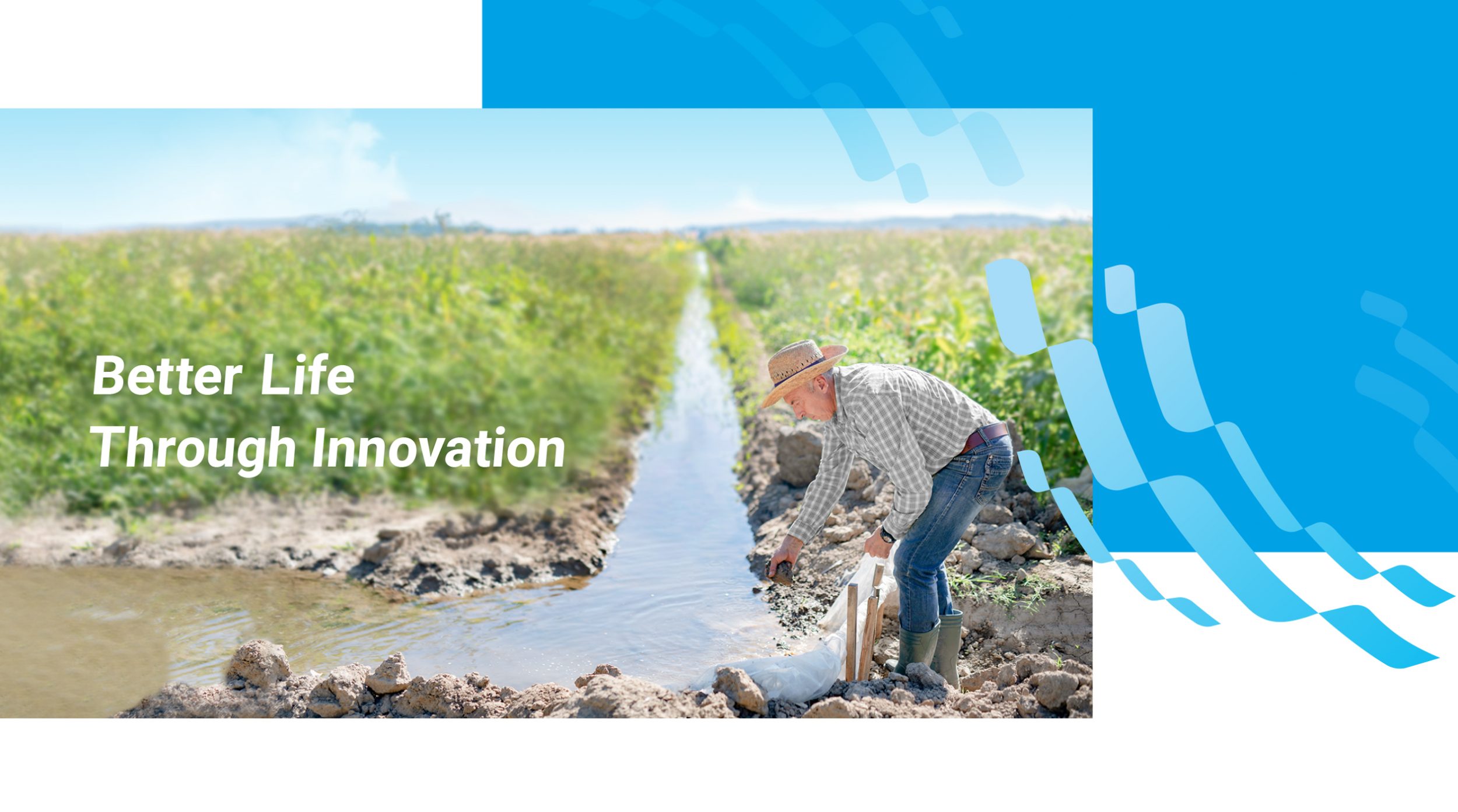
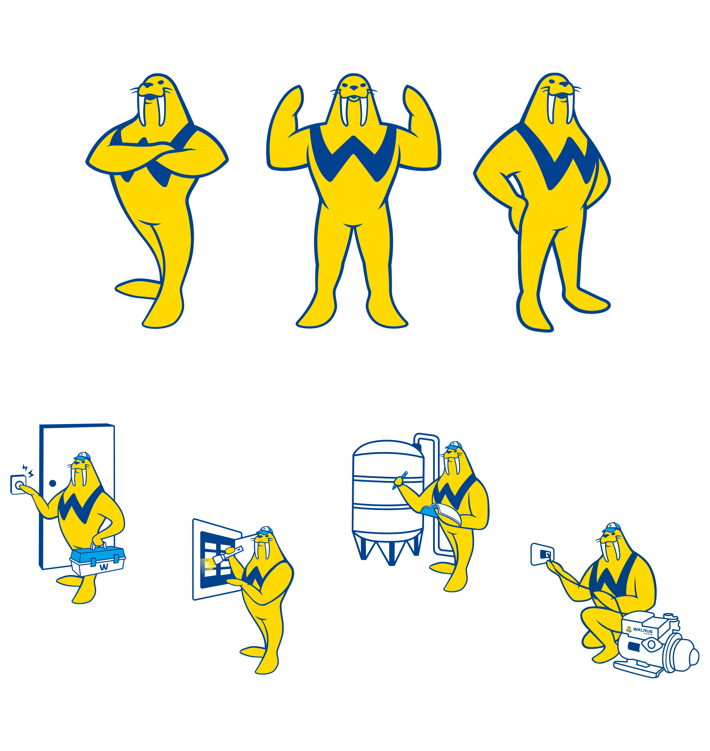
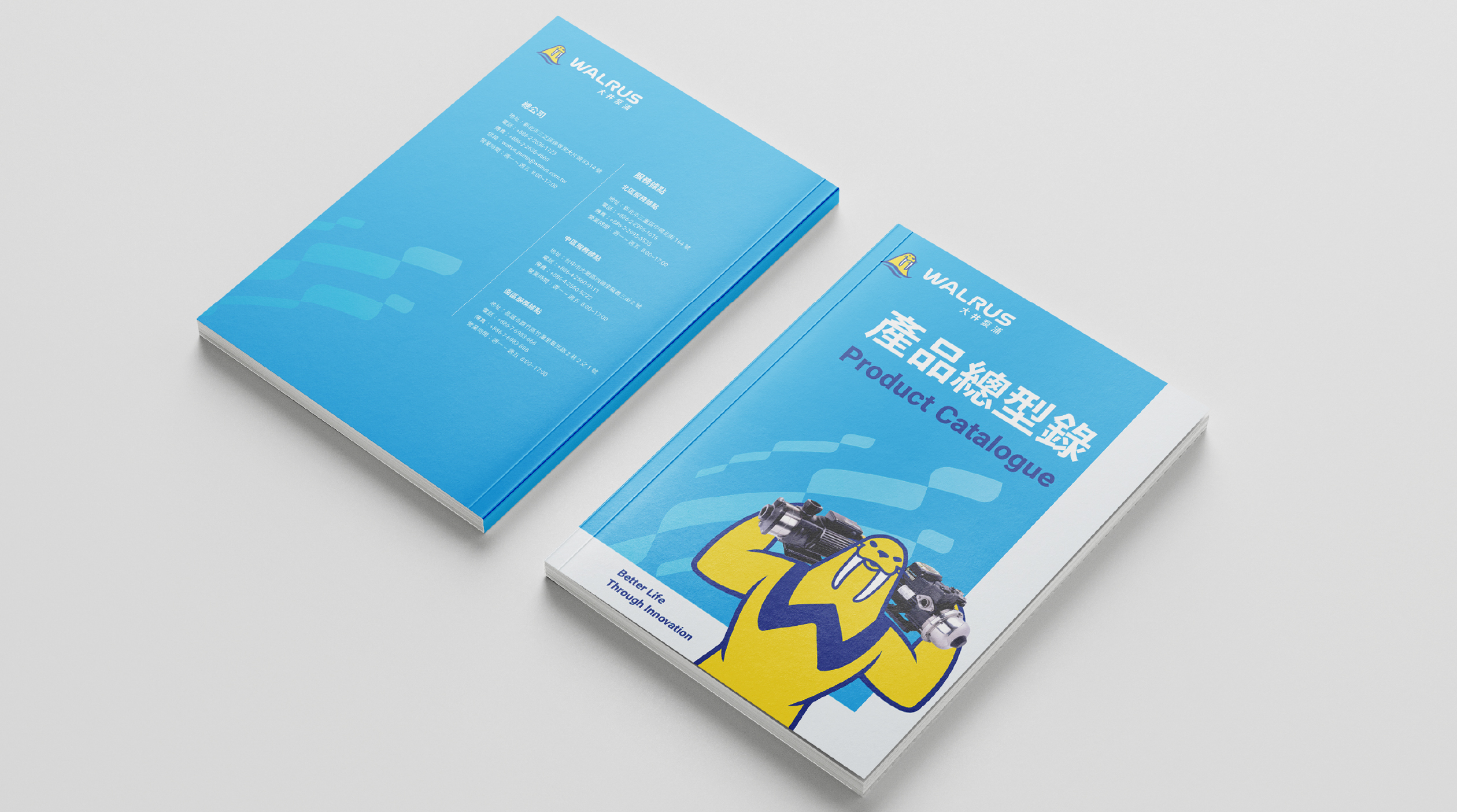
WALRUS Walrus: Challenge the limits, never give up, dominate the waters.

The brand name WALRUS means walrus, even in the harsh environment, cold climate and limited food, the walrus is still fearless and tough to survive and dominate the waters, almost no natural enemies, symbolizing the spirit of WALRUS Oi pumps to challenge the limits and never give up, and to be proud of being the leading brand of water pumps.

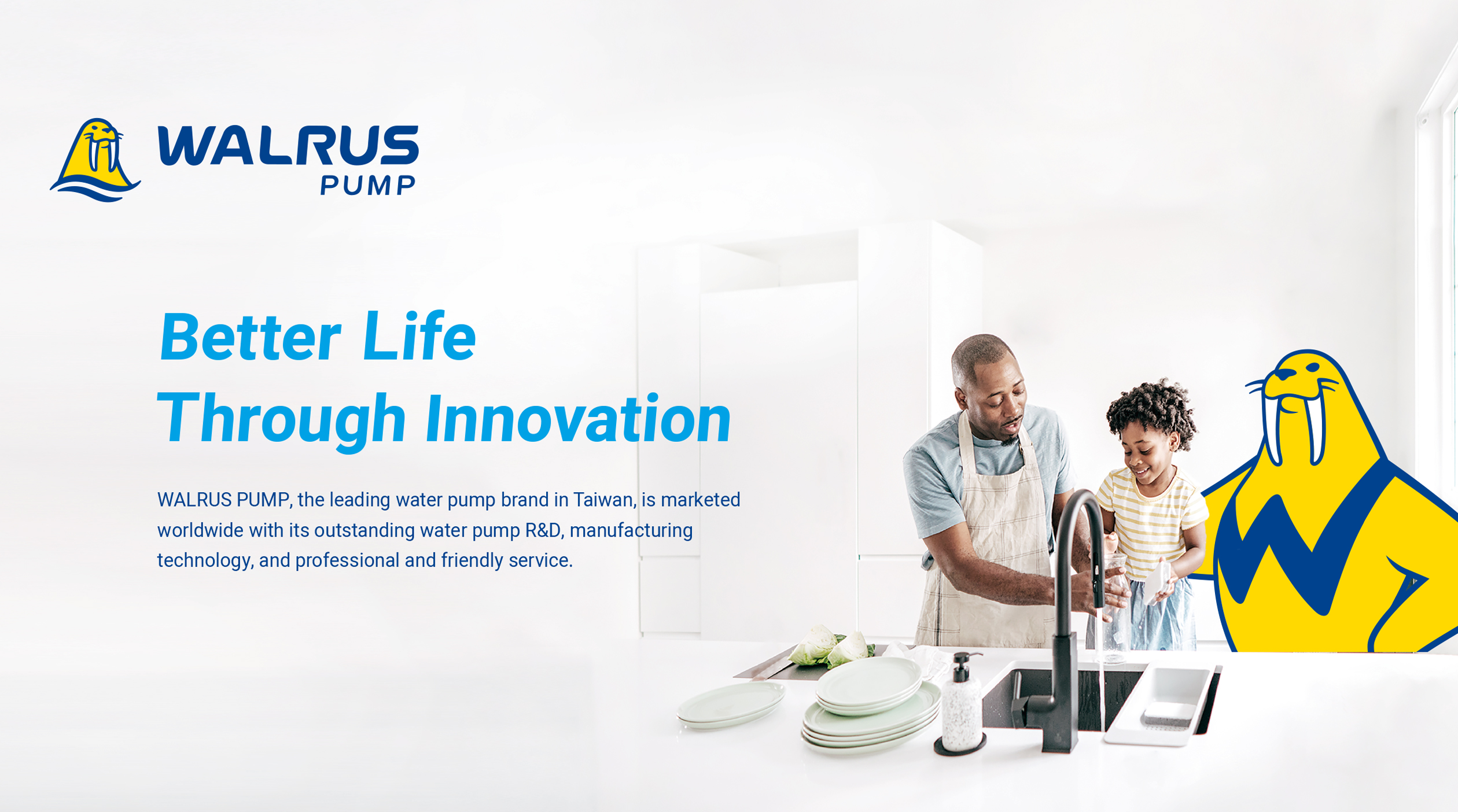
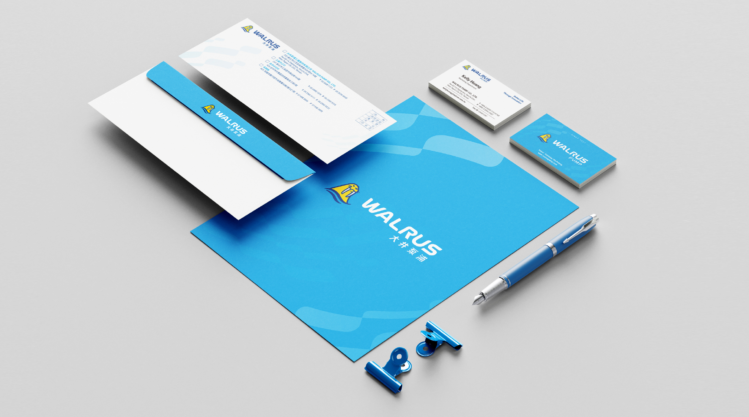
The original logo color was relatively dark and did not match the dynamic and innovative nature of the new brand strategy. Pro used a more vibrant and saturated blue to convey the clarity and cleanliness of the water; bright yellow to convey the imagery of sunshine, freshness, and vitality, which will help WALRUS pumps highlight the five senses of the "walrus" in the future application of the logo, and tilted the angle of the standard characters by 5 degrees, conveying the core value of "Continuous Improvement" to communicate with consumers with clear and unambiguous identification. The standard letters will be tilted 5 degrees to convey the core value of "Continuous Improvement" and to communicate with consumers with a clear and distinct identity.

A new visual language that spreads across the globe like an ocean current.

Using the ocean current as the source of inspiration for the auxiliary graphic, the flow of water full of power is transformed into the visual image of the brand, symbolizing that WALRUS pumps, like the ocean current, will continue to have the power to promote a better life, and it also reflects WALRUS pumps' determination to expand globally.

The Ocean Stream graphic is made up of several geometric shapes, which not only symbolizes the brand's solid team, but also shows the team's vitality with its dynamic structure, which fully embodies the brand's spirit of "Injecting Innovation, Swelling Out Beauty".

Demonstrate the flexibility of the mascot

The walrus is the mascot of WALRUS Oi Pumps, and Pro assisted in restructuring the mascot's coloring and body shape and reinforcing the specification to facilitate a more consistent and complete representation of the brand's personality in future use.

In addition, Puro also assisted in the design of the walrus mascot's new stance and costume to facilitate interaction with the characters and products in the advertisements.

Eight industry applications to enhance product communication

We have reorganized our product classification system, utilizing the eight industry categories, and designed icons representing each industry and set up icon specifications to further communicate with consumers and distributors, and to help WALRUS pumps communicate consistently and effectively, both internally and externally.

Systematized brand identity elements and design applications

Puro has also developed systematic brand identity elements and design applications, including brand image specification, PowerPoint presentation templates, product catalogs, posters, online advertisements, and website, to announce the new milestone of WALRUS Oi Pumps and continue to convey the brand spirit!

By assisting the Daijun team to precipitate and extract, we understand that "injecting innovation and emerging beauty" is not only the brand value of WALRUS PUMP.

It is also a beautiful future that every WALRUS Oi person strives for.

WALRUS Oi Pumps General Manager - Amy Huang

Process is a member of
Leading Swiss Agencies (LSA)

12F., No.8, Sec. 1, Heping E. Rd., Da’an Dist.,
Taipei City 106, Taiwan.
+886 (2)2368 3436

Facebook

Instagram

LinkedIn

Copyright © 2025 Process Ltd.
All rights reserved.