Insight
Design styles of different countries as seen in the Olympic brand identity
(Translation: EPILEDS YEH / Creative Director, Process Pro Brand Taiwan)
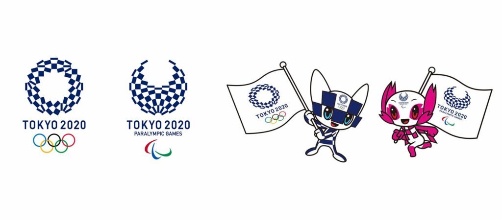
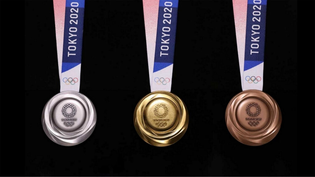
The quadrennial Olympic Games officially came to an end this summer. The Tokyo Olympics in Japan, which was originally scheduled to be held in 2020, was postponed to 2021 due to the impact of the COVID-19 outbreak, but it still did not diminish the enthusiasm of the host country and the world's population for the sports event. In the face of the world's largest sports event with the largest number of participating countries, the Tokyo Olympics demonstrated its own unique design thinking, from the identification of the design of one of the elements of Japanese culture, "Kasumi Matsumoto", which embodies the symbolic meaning of tolerance and harmony, and combined with the mascot's visual representation, fully utilizing traditional culture and technology (the conceptual theme of the Olympics) to the fullest extent. This year, the OOCL has also incorporated the theme of "sustainability" into various activities, including the use of a large number of recycled metals for the medals, the first time that the awarding podiums were made of plastic waste, and the use of 100% recyclable cardboard for the beds in the athletes' village...and other environmentally friendly design ideas, which left a unique impression of the Olympics for those who watched in front of the fluorescent screens.

(Source: Tokyo 2020 Olympic Games)
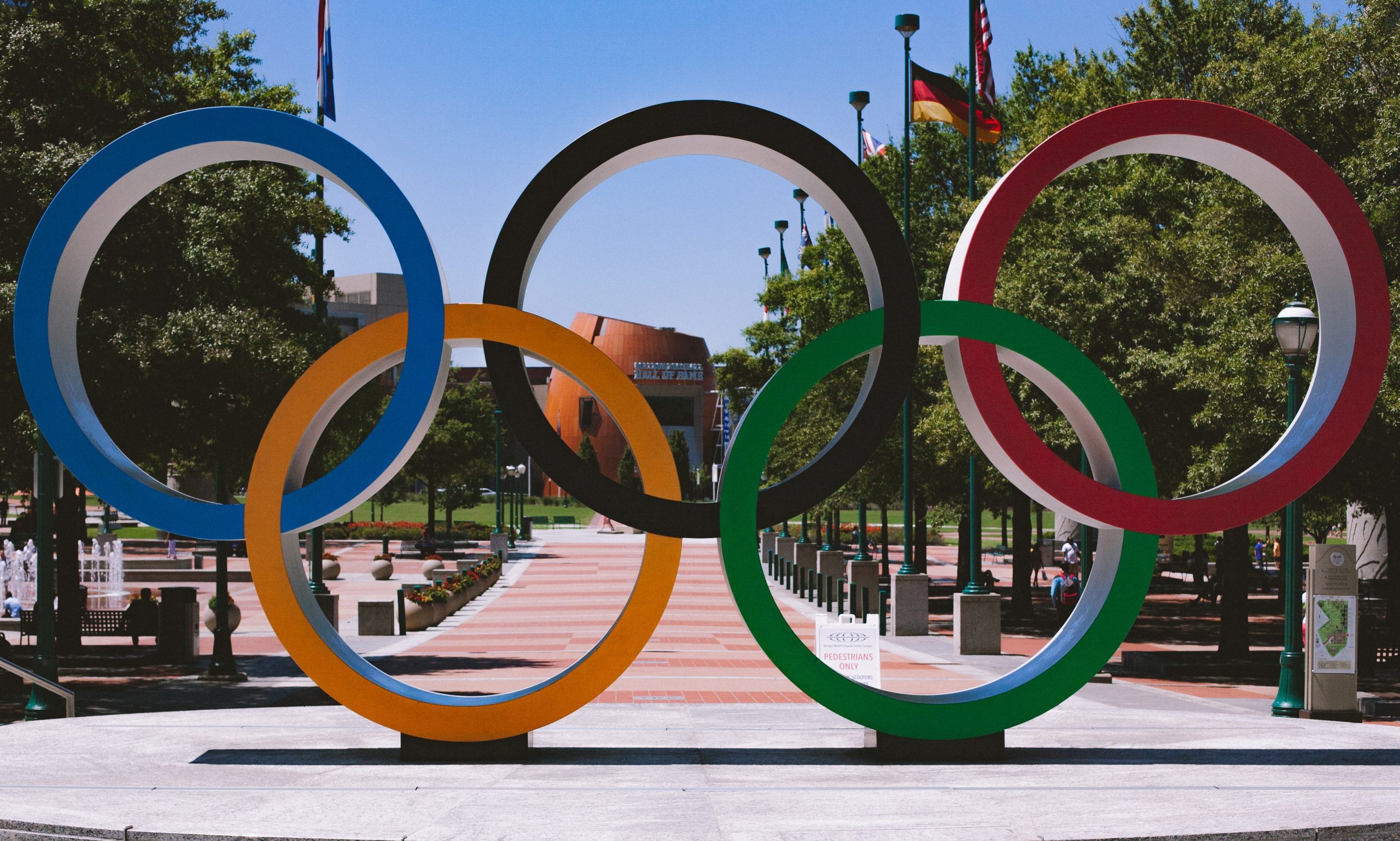
In addition to being a place where the world's top athletes gather to compete, the Olympic Games are also a time for the host country to demonstrate its national strength to the world. Not only do they provide the perfect facilities for athletes to focus on the competition, but they also showcase the host country's own unique culture and design style in the marketing of their events, and there have been many impressive brand identities planned for the past events:
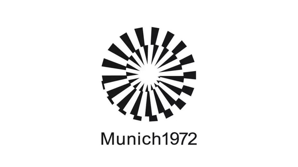
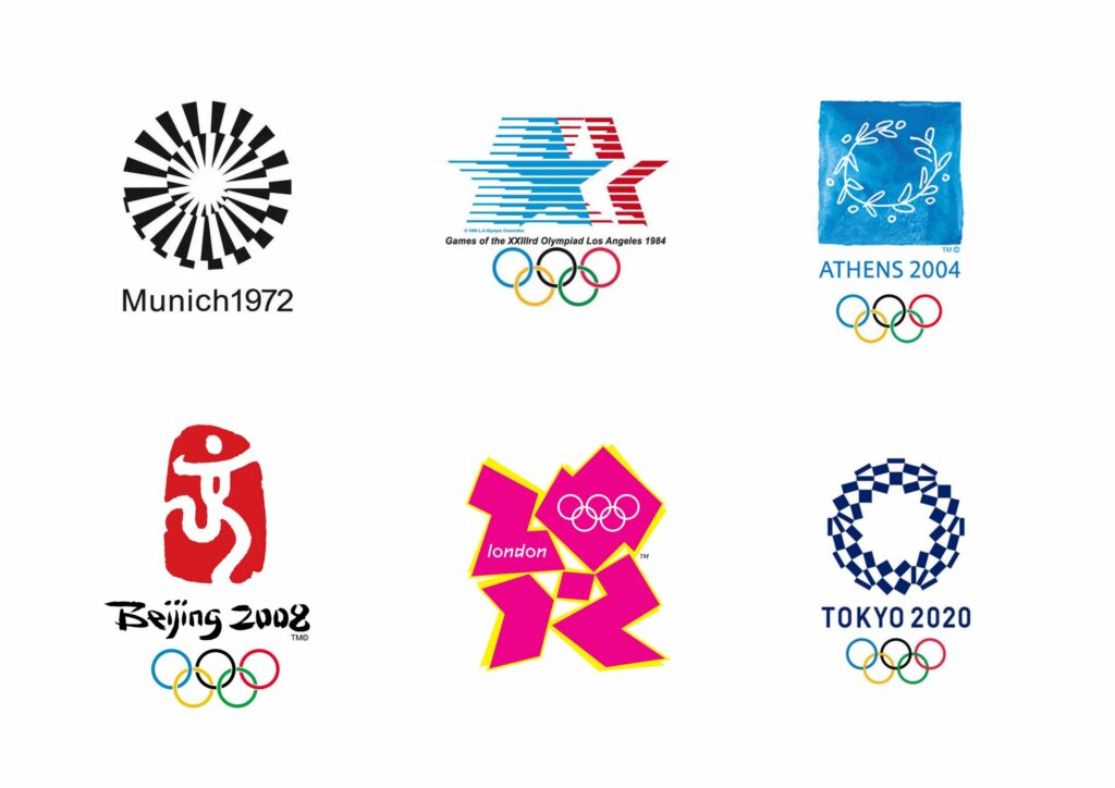
1972 Munich Olympic Games, Germany
When we think of German design, we often describe them as strict and rational. The goal of the 1972 Munich Olympics was to reshape and modernize the image of Germany after World War II, and the logo used radial and geometric patterns to form the sun, conveying the image of a new Germany after World War II, and creating a cheerful, relaxed, energetic, non-political, and ideology-free sports culture by using the "grid line system". Using the "grid line system" to develop a series of visual graphics, mascots, and various sports icons, etc., coupled with the subtle separation of blue, orange, and green color tones, it fully demonstrates the visual uniqueness of the German War design and the political and cultural ideology of the time.
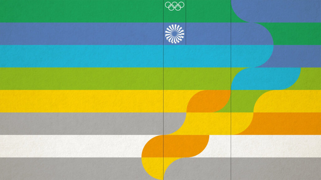
(Source/Munich 1972 Olympics)
(Source/Olympics︱https://www.youtube.com/watch?v=JZSajtrVxo0 )
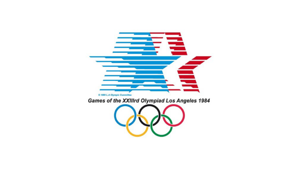
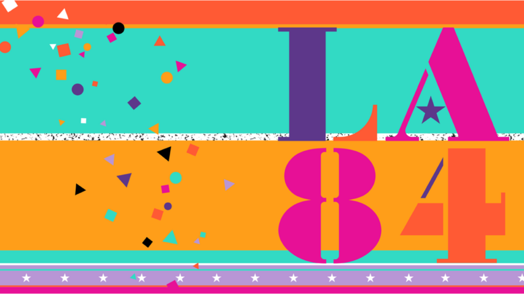
1984 Olympic Games in Los Angeles, USA
The United States of America often gives people a direct feeling of freedom and democracy. In the 1984 Los Angeles Olympics, in order to show the unity and diversity of the city's ecology, the design system was based on the development of a lively, fun, and flexible direction, using a variety of color combinations such as pine, magenta, red, yellow, purple, and so on, and using the LA 84 (Los Angeles 1984) identity. At the same time, the geometric color blocking style with stars and stripes embellishment, and the placement of movable objects in various streets and pavilions, showing the festival-like bright identity to collide with the sparks of sports competitions, and the mainstream new wave and passionate thinking of Los Angeles at that time is also shown in the theme of this time.
(Video Source/ Olympics︱https://www.youtube.com/watch?v=IPnw-GXxRb4)
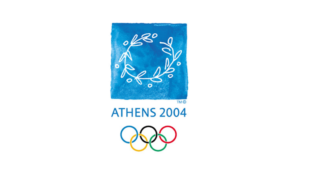
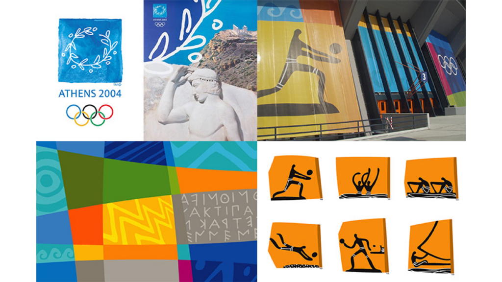
2004 Olympic Games in Athens, Greece
As the birthplace of the Olympic Games, Athens, the biggest challenge of the 2004 Athens Olympics was to find a balance between classical Greek culture and modernity, and the Athens Olympics logo design was based on the "laurel" shape, reinterpreting this symbol of the highest honor for athletes in an organic, hand-drawn, line-shape style. The visual graphics and various sports icons are transformed from traditional Greek totems, paintings and cultural relics sculptures, utilizing modern design to express the characteristics of Greek culture that have been passed down to the present day, as well as conveying the original spirit and values of the Olympics in this grand event.
(Source/Olympics︱https://www.youtube.com/watch?v=HuZPRCJ51uY)
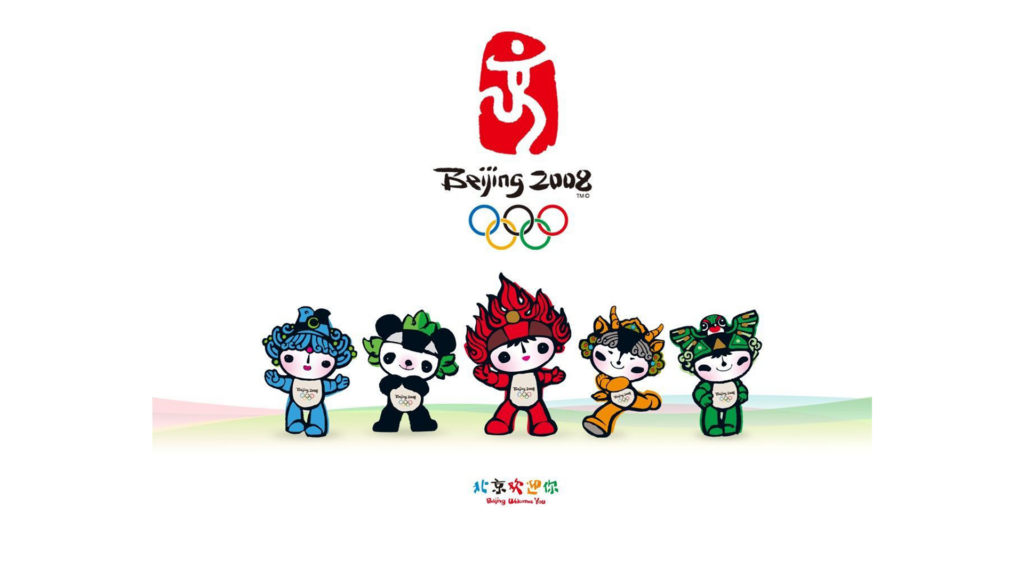
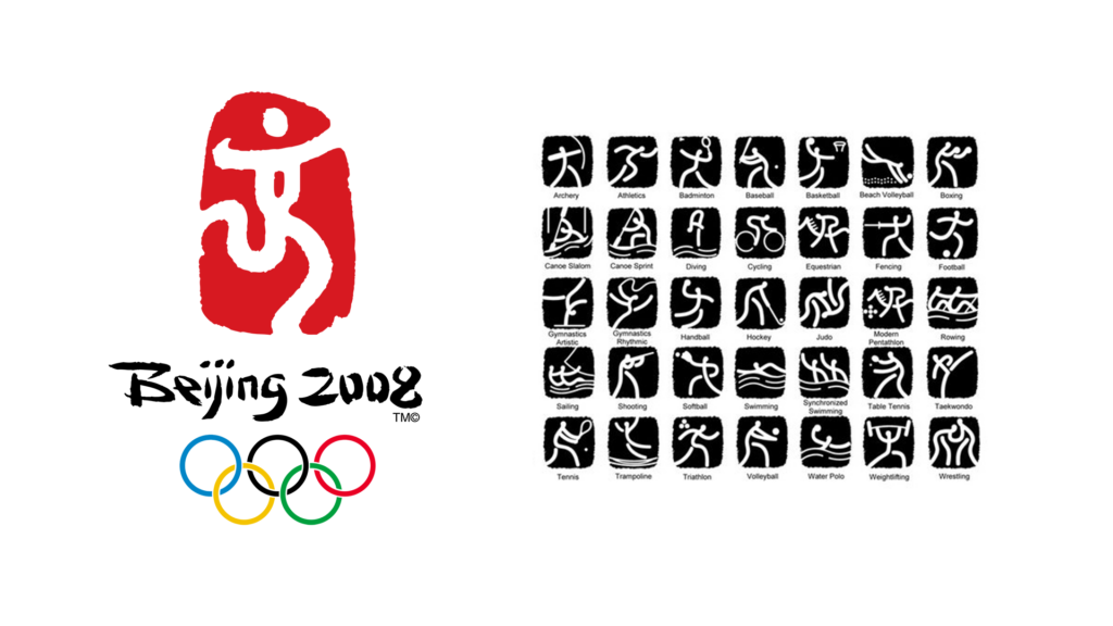
2008 Olympic Games in Beijing, China
As the birthplace of Chinese culture, China developed the 2008 Beijing Olympic Games with traditional calligraphy and hieroglyphics to develop a logo identity based on the character "京" (京), which is a human figure running towards victory and dancing, with its body shape outlined by graceful lines, symbolizing the vibrant image of the Chinese nation. Based on this design language, it is also consistently applied to the visual graphic and various sports icons. At the same time, the mascot "Fook Wa" adopts symbols unique to Chinese culture, including the five elements, nature, and traditional totem elements, which also symbolize conveying to the world the spirit of friendship, peace, and progress, as well as the hope of harmonious coexistence between human beings and nature.
(Source/Olympics︱https://www.youtube.com/watch?v=1rMxVYaJ07Q
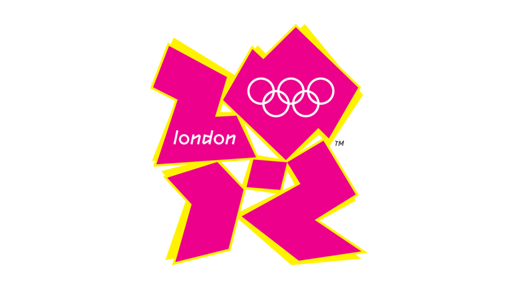
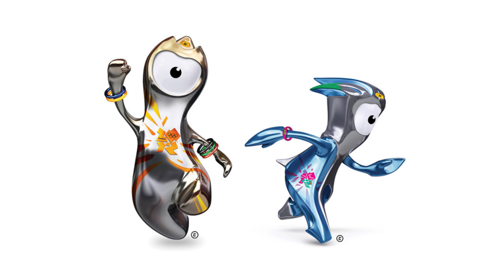
London 2012 Olympic Games
The 2012 Olympic Games in London, England, with the vision of "inspiring a new generation of young people through sports", the dynamic image style is full of vitality and changeable brand characteristics, the identification of "2012" will be composed of thick color block text shape identification, like a chameleon that can inject a variety of colorful colors and shapes, coupled with a broken grid system extends the application of auxiliary graphics, a breakthrough from the previous Olympic identification of the established framework. This is a breakthrough from the previous framework of the Olympic identity. Not only does the overall identity have a new visual experience, but the icons for each sport are based on the movements of real people, and at the same time reflect the dynamic trajectory of the athletes, echoing the dynamic and energizing theme of the year, allowing the 2012 Olympic Games to strengthen the core nature of the "dynamic" nature of the sports events, in addition to differentiating the design performance from the past.
Through the Olympic brand design over the years, we can see that the composition of a country's design style not only reflects the current design trend, but also reflects more national style and social orientation, here we summarize three points to think about:
:: Hardening of cultural elements
It can be transformed by the humanities, geographical customs, totems, and popular elements inherited from the present or history, and transformed by applying a modern visual point of view, so as to quench the elements of cultural value.
:: Responding to social issues
To meet the design needs of different times, it is necessary to meet the needs of the current society, from politics, economy, humanities, environmental sustainability...etc., which will be able to add more depth of thought to the application and performance of design.
:: Establishing a clear vision
Any design output has a great vision to communicate to the public, and such a goal is born for the people, for the betterment of the world, with a visionary mindset based on the systematic establishment of brand design goals.
(Photo credit/ Olympics)
Through the Olympic Games over the years, we can find that the formation of a country's design style is formed through the current people, events, time, place, and material factors, in different states and needs of the arrangement of combinations give birth to the era's unique visual culture, if we have to say whether creativity will one day end?