Project
EKZ: Rebranding of a Zurich-based energy supplier
Process | SNK brought a stronger visual impact to the Swiss energy brand EKZ through a rebranding project. With a clear, modern look and a new, simple brand communication language, EKZ aims to stand out in the dynamic energy market and create a strong image for its customers.
The power and energy industry is booming. To keep up with the changing trends, it was necessary to find a more convincing position in the market, while at the same time being able to demonstrate a close relationship with customers and considering the degree of freedom for possible adjustments. With the rebranding exercise, EKZ renewed its overall brand image and increased the strength of its graphics, visual language and tone. “Through the rebranding, we will be able to communicate our corporate values more directly and authentically to our target audience, while at the same time delivering our services more persuasively.” Norbert Egli of EKZ Brand Management emphasizes.
Redesign all contact points
Firstly, Process | SNK and EKZ created a perceptual positioning to strengthen the value of the existing brand, and as a result of a brand consensus meeting, a comprehensive review and optimization of all brand touchpoints and related applications was carried out. All innovations were documented on Frontify, an online brand management platform created exclusively for EKZ, to facilitate the subsequent management of the brand on the ground.
Clarification of the core message of the brand
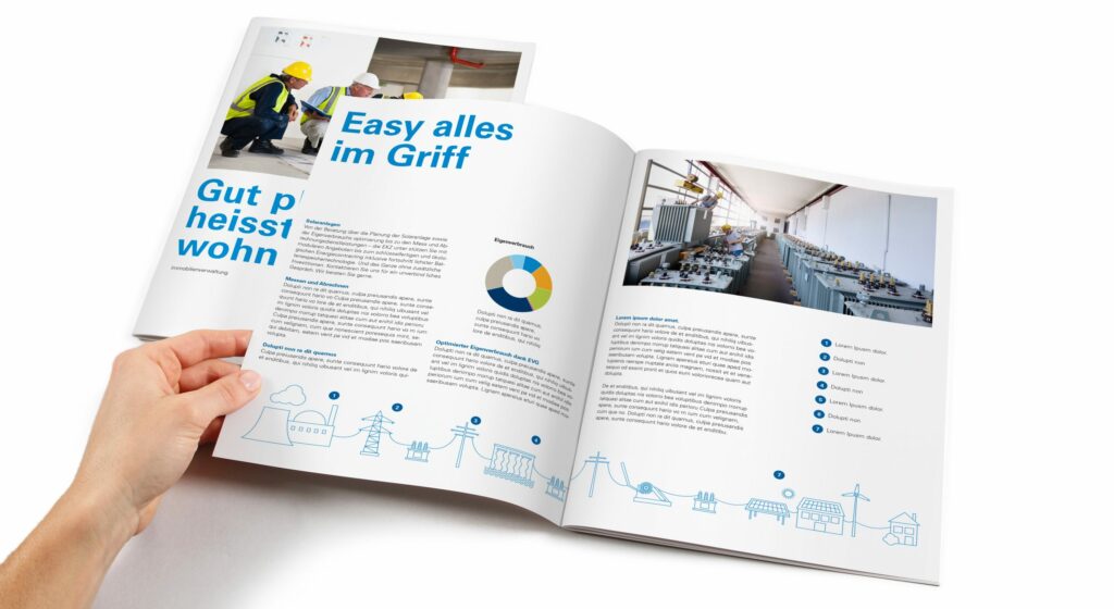
Another focus of the project was on communication and the use of language: a simple, clean headline in EKZ's classic blue color, with a clear narrative to draw the eye. This design concept is intended to explain issues more succinctly, while communicating the benefits to the customer more quickly. The development of new icons and illustrations extends from this concept, with over 140 icons providing direction and helping EKZ communicate complex topics in a more concise and engaging way.
Modern design, realistic graphics
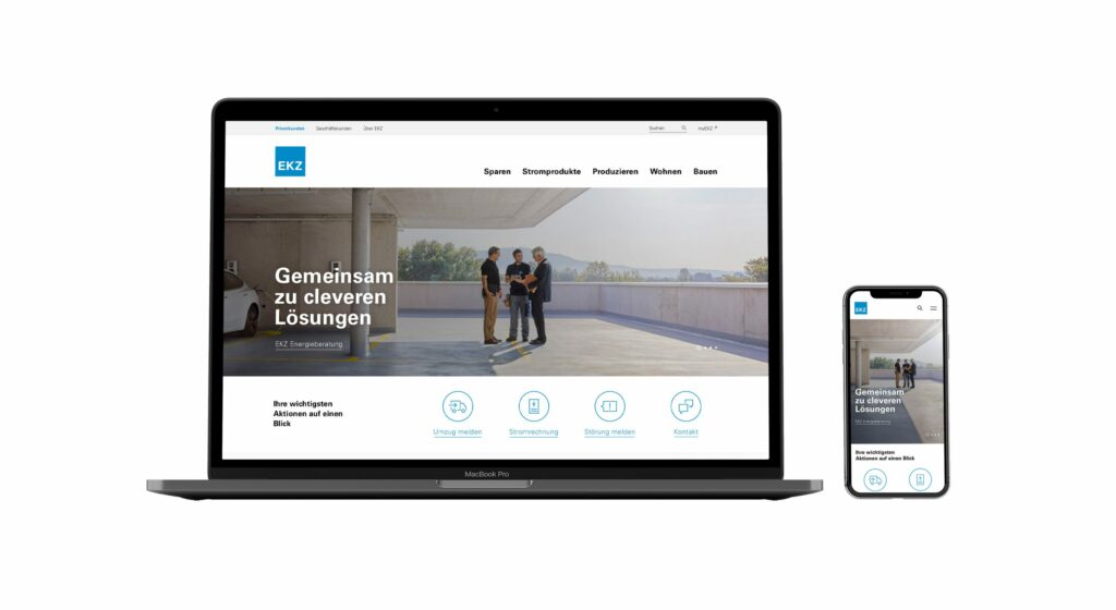
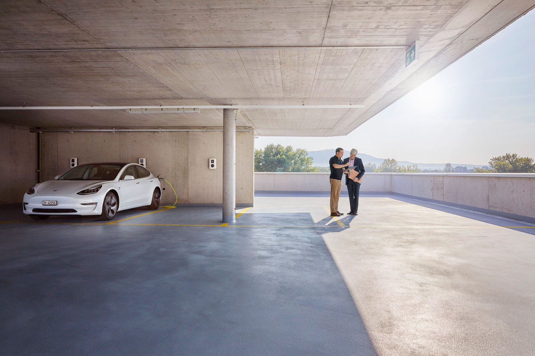
This new sense of clarity needs space to be fully realized. As a result, the new EKZ website has been designed in a broad and bright style. The design is also anchored by the large amount of white and the iconic blue color that is so common in Zurich. Two other blues, a soft light, a shadow and three high intensity colors reflect the richness and eye-catching nature of the brand. The new visual presentation is a perfect interpretation of the new EKZ brand look, and the visual illustrates a very clear message: provide EKZ's customers with solutions in the energy sector through dynamic and realistic images.
www.ekz.ch
Contact person for further information EKZ: Norbert Egli Agency: Process | SNK Photographer: Noë Flum