Interview
Taiwan's Toyo Gastrografin has overturned the stereotype of gastric drugs, successfully linking the uniqueness of the product's ingredients with the brand's spirit.
Taiwan's Toyo Pharmaceutical's old brand of gastric medicine, Gastric Reflux, has always been sold in the medical channel for its mildness and quick-acting effect. The pharmaceutical industry has always been limited to the B2B model of special channels, but since Gastric Reflux is a self-funded directive, the user's feelings are the most important, and in order to further communicate with the consumer side directly, Gastric Reflux and ProcessPro will launch a re-branding project in 2019 to allow patients to know more about their medication. In order to further communicate directly with the consumers, GastroSmart and ProcessPro will launch a rebranding project in 2019, so that patients can better understand their medication. In the past, patients knew that it was a gastric medicine from the name, but the focus of this re-branding project is to respond to the needs of patients at a deeper level and to understand the consumer journey of the customers, not only to make the brand more intuitively connected to the ingredients, but also to re-interpret the content of the product through a more distinctive brand image, which will help the consumers to make a quick choice and to take the initiative to purchase the product from the channel.
The core value of the reengineering project is "brand and quality should be linked".
Serena Hong, Senior Manager of Marketing and Research & Development Department of Toyo Healthcare Taiwan, said that before the launch of the rebranding program, the company went through a period of internal discussion, and at that time, it studied several well-known brands in the market, which are well-known but have been exposed to contain harmful ingredients. Gastroesophageal reflux requires long-term use of medication, and ingredient safety is one of the most important concerns of consumers, which is also what Toyo has always insisted on. Therefore, we hope that through the assistance of professional brand consultants, we can strengthen the core value of the brand of "excellent quality", and allay the concerns of consumers about the gastric medication available in the market.
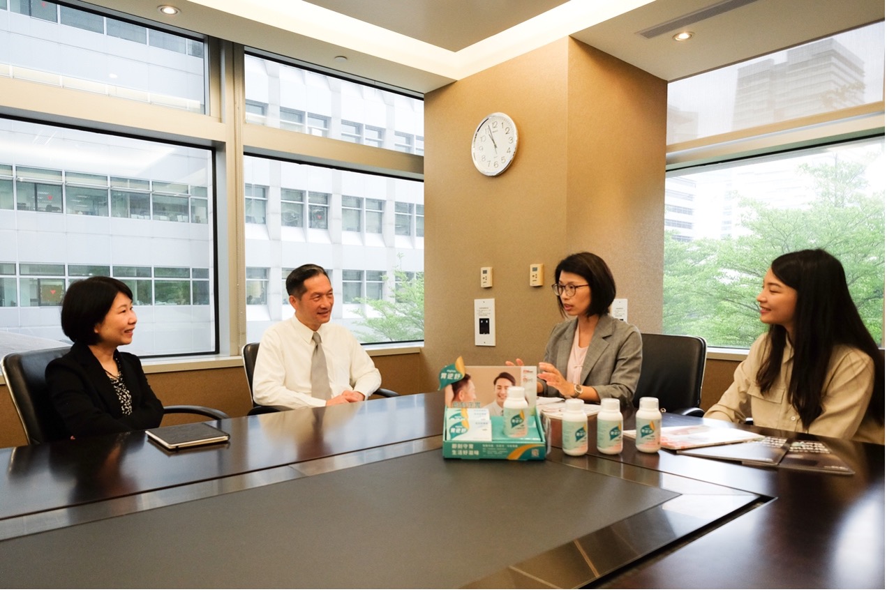
Mr. Yung-Liang Wu (second from left), Vice President of Toyo Healthcare Taiwan, Ms. Shu-Fen Hung (first from left), Senior Manager of Marketing and Research & Development Division, and Ms. Shu-Yen Yang (second from right), General Manager of Process Taiwan, and Ms. Yi-Ting Liao (first from right), designer, lead the branding project and share the process of brand building.
Breaking through the challenges of drug branding to accurately convey the spirit of the product
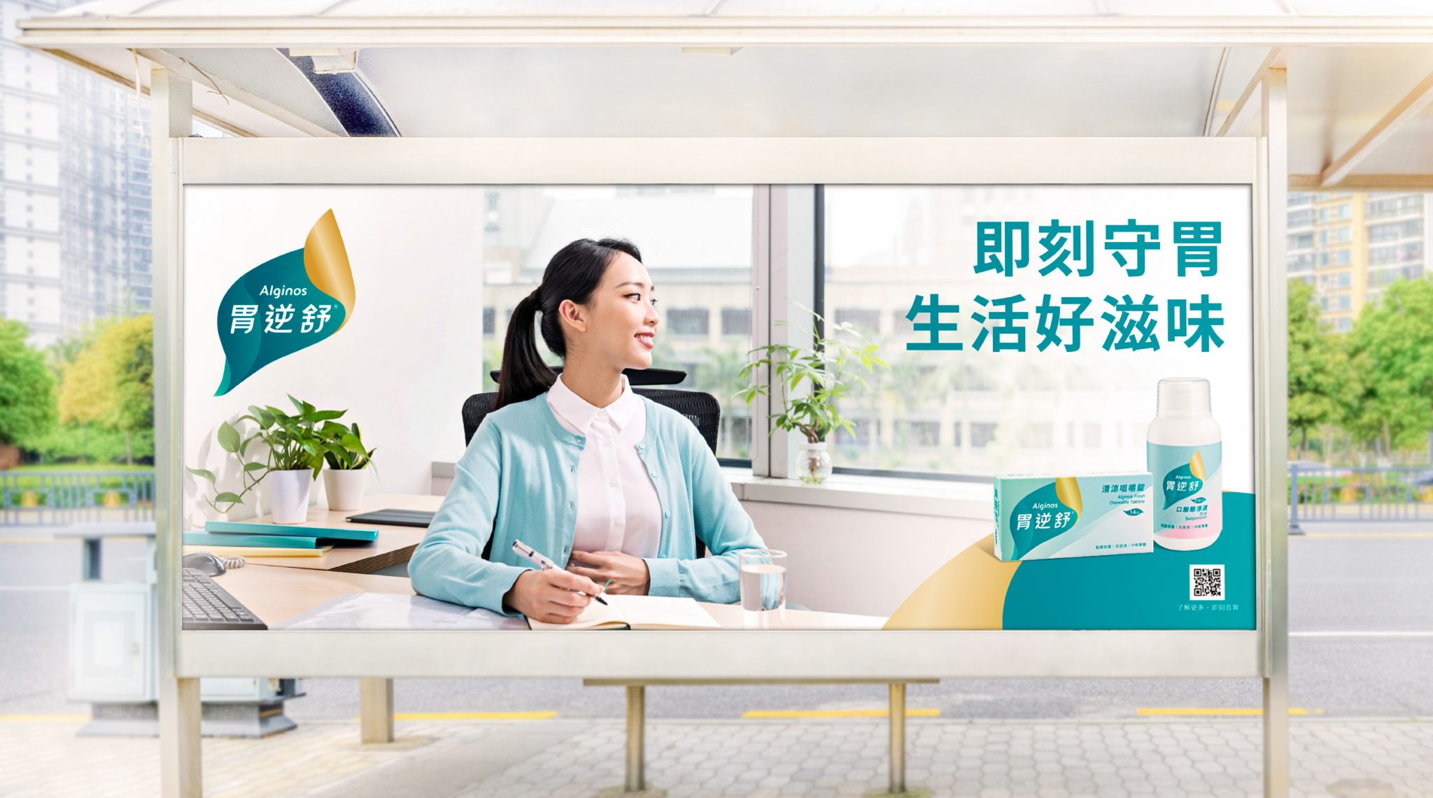
Pharmaceuticals and health foods are extremely sensitive in terms of publicity. Under the premise that the current regulations cannot emphasize on curative effects and functions, we negotiated with the Process brand to achieve consistency between the intrinsic connotation of the product and its attributes, and then the slogan of "instantly guarding the stomach for a good taste of life" and the statements of "safe" and "fast-acting" on the package were approved, which conveyed the spirit of Gastric Reversal Perfection perfectly.
Serena recalls a customer interview in which the customer said that all they wanted to hear about the drug was "safety" and security. However, safety is a very vague concept, but there are some efficacious communications that are not permitted by law. So the communication had to be precise without overstepping the boundaries of the law, and that's what Puro did!
Successful internal consensus building through professional third parties
Serena mentioned that Process has a clear brand structure that takes us all the way through the process. Compared to the consulting firms we have worked with in the past, Process emphasizes the voices of those outside the marketing team, and through a third-party perspective, it helps to build cohesion within the business and marketing teams of the company.
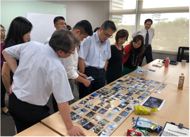
Wu Yongliang, Vice President of Toyo Healthcare Taiwan, said, "The most impressive thing is that by choosing the picture card together, we can explain the core value of the brand in our heart, and all the colleagues can stimulate each other to come up with the key words of the brand, and then summarize the key core value under the guidance of Pro, which is a co-creative process for the whole group.
In the past, we used to communicate professionally with doctors and pharmacists through our sales colleagues, and since professionals look at the ingredients, they did not care about the external packaging, and the image mostly showed the specific image of the "stomach", which was seldom connected with the brand's unique strengths. Through the cooperation with Process Pro brand and the process of "co-creation", there is a consensus within the company on this matter, and after the completion of the project, there is a sense of honor and deep meaning, which greatly improves the cohesion of the team. Since the completion of the project, colleagues have found it refreshing, and channel pharmacists believe that the product image is clear and highly linked to the quality of the product, coupled with the high-quality packaging design, which also enhances the pharmacist's willingness to recommend the product to consumers.
ProcessPro Brand and the GastroSmart team conducted a branding workshop to identify core values.
More than just packaging design, the brand image conveys the impression of the products and services in total.
ProcessPro's creative director, EPILEDS YEH, pointed out that unlike ordinary advertisements that communicate with a single visual, brand icon communication is a series of visual photographs planned according to the product's application scenarios, with the effect of corporate identity, reflecting the brand's look and feel, which is an important element to help the brand's long term communication. In order to make a distinction with the market, this graphic communication not only takes the refreshing color system as the tone, but also locks the image of the social stalwarts in the character casting, from the family, work, pressure and other pains, and resonates with the consumers' experience through a set of brand images.
EPILEDS YEH said, “Many western brands are accustomed to using images to convey their attributes and enhance their value, because when the target audience sees the image, they experience an atmosphere that generates the idea and feeling of wanting to ”become the user inside'."
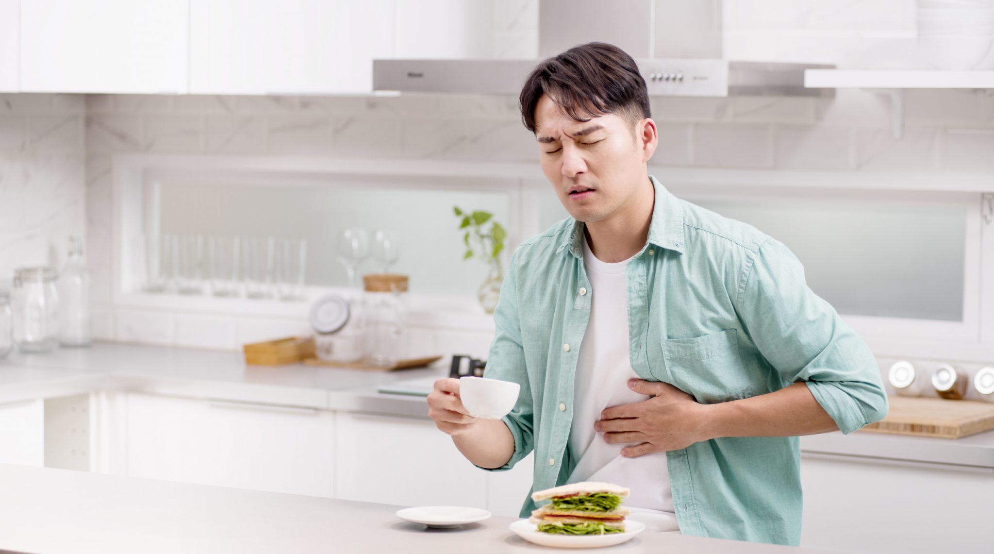

Gastric Reflux Relief guards your health and immediately breaks the bonds of GERD, so you can get back to work and get on with your job.
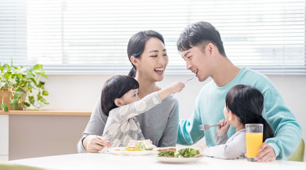
With GastroSmart, you can enjoy the moment, savor the goodness of life, regain your strength, and continue to care for the ones you love.
On the other hand, to break away from the boring stereotype, Pro has added fun elements in the production of hygiene videos; the new packaging of Gastrografin has increased the sense of joy in the process of shelving, and the well-designed animation has made it easier for the public to understand the product and simplified the process of explanation by pharmacists and doctors.

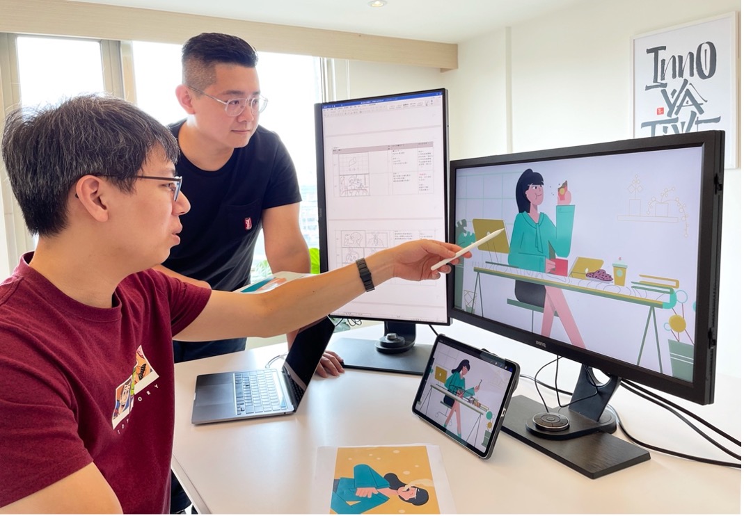
(Second from left) Creative Director of Process EPILEDS YEH and (First from left) Dynamic Designer Huang Yiru continue to produce GERD educational videos in accordance with GERD's brand identity and standards.
Ms. Sue Yang, Director of Business Development at Process Taiwan, also recalled that during the image shooting process, a colleague curiously asked about the difference between Process and the common advertising agencies in Taiwan in terms of performance. For Pro, branding should not be just a package design or a single message communicated in a video, but rather a series of construction processes that transform the realization of corporate strategy into various elements, including graphic language, which is easier to penetrate into the consumer's awareness and be widely accepted.
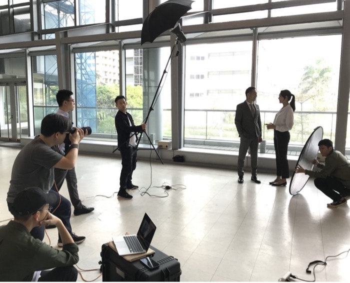
Gastrografin Brand Image Shooting
Pro's clear structure and ability to crystallize vague concepts.
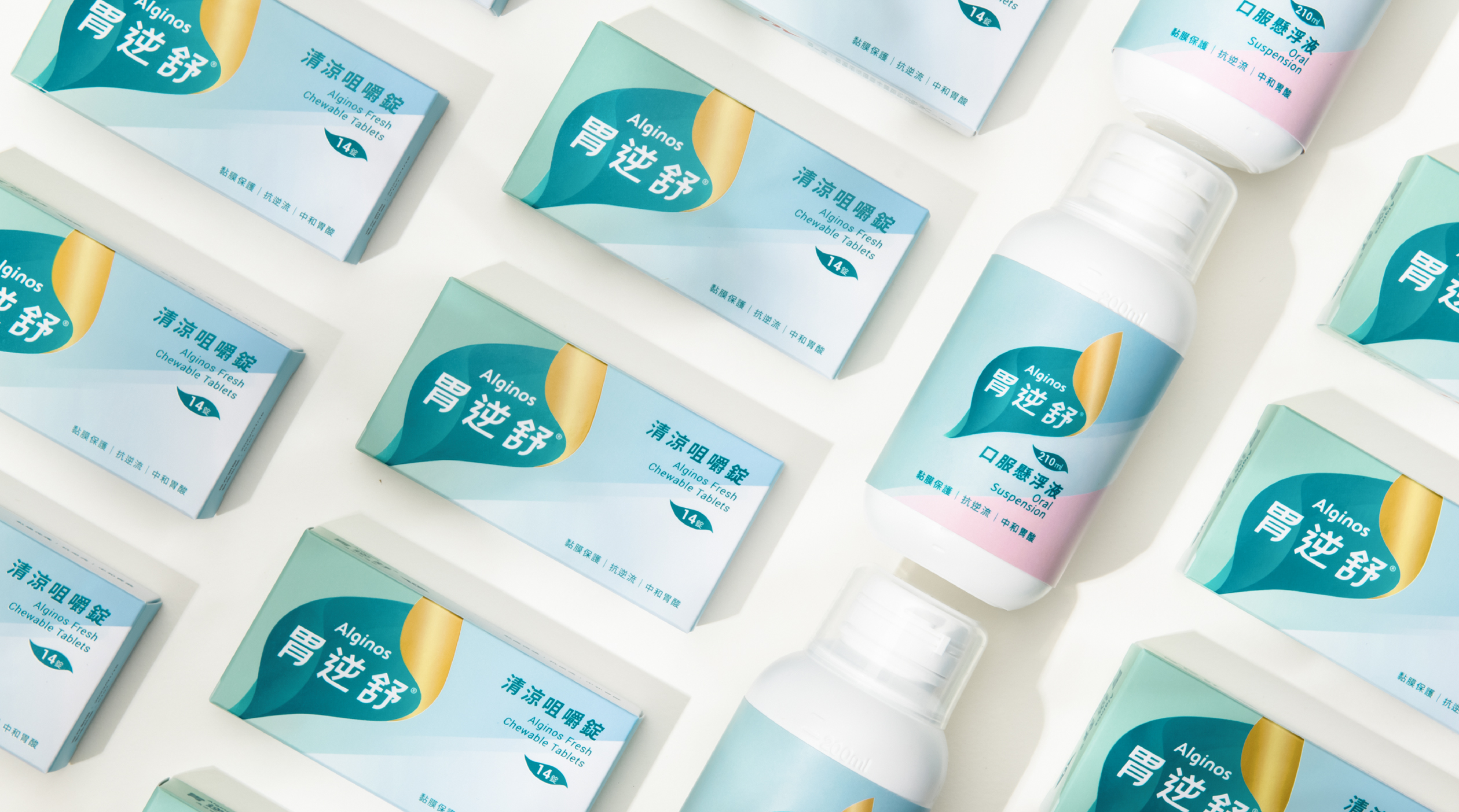
Process Pro brand Taiwan branch senior brand designer Liao Yi-ting said, in the collective selection of cards to summarize the process of consensus, because most people already have a "natural" consensus, so the selection of wood, grass and other tones as the main, only a colleague picked out the gold to cause heated debate, the colleague that in addition to natural imagery, but also hope that there can be quality assurance, and gold to give a sense of trust, so that the communication has been recognized! In the design of the product, the element of gold was retained. The package design focuses on consumers' intuitive associations and closes the distance with users. At the same time, it combines the elements of "natural" and "gastric medicine", etc. In the design, it utilizes the green color that represents alginate, the shape of the stomach, and the gold color that has a sense of trust, and the fonts also use the more stable and angular elements, and the tactile sensation of the cardboard box is soft and hard, so as to make a better sense of touch, and to enhance the brand's desire to communicate the "comfort", and to help patients regain the comfort of the pre-reflux period. The brand aims to emphasize the "comfort" that the brand wants to communicate, helping patients to regain the comfort they had before GERD.

Serena believes that working with Prosperity has been very enjoyable and efficient. Prosperity has a clear structure that helps the team to move forward step by step, and is very efficient in controlling the progress of the project. In addition, the professional design team has presented the collective fuzzy concepts in a concrete way, and has gathered the consensus of colleagues, and the result has exceeded the expectation! Big companies have no flexibility, small companies have no experience in complete branding.
“ Pro is not big, but it has the processes of a big company and the flexibility of a small company.” Serena said.
Continuing with this rebranding, Toyo has responded to market demand by developing a series of new products. From quick-acting stomach milk, Toyo has responded to the demand for convenient lozenges, developed a mint-flavored product line in response to insights from consumer interviews, and in the future, will develop convenient stomach milk in small packets with a variety of flavors. Through a series of fine-tuning, we will continue to listen to the market and communicate with consumers by providing products that better meet their needs.
Case reading:Alginos
Department of Health Pharmaceutical No. 050033
Ministry of Health Pharmaceutical No. 060365
Bei Shi Wei Yao Guang Zi No. 110060108
