Year
2019
Sectors
B2C
manufacture
Service
Brand strategy
Brand Recognition
Packaging Design

TRADEFORCE
The best assistant in adventure challenges
SONEPAR Group Development In order to further expand its corporate scope and develop its own brand TRADEFORCE, SONEPAR Group cooperated with Process Pro to establish a strategic positioning and identification system for its global private label brands. With a breakthrough image, we quickly establish brand positioning in the market.

SONEPAR Group Development In order to further expand its corporate scope and develop its own brand TRADEFORCE, SONEPAR Group cooperated with Process Pro to establish a strategic positioning and identification system for its global private label brands. With a breakthrough image, we quickly establish brand positioning in the market.
Own brand TRADEFORCE
With more than 50 years of history, SONEPAR is the world's leading and Europe's largest professional electrical distribution company. Under the development of its global strategy in 2019, it has decided to extend the Group's existing strengths in channels to develop its own brand TRADEFORCE, and to seek the cooperation of ProcessPro to develop a global brand strategic positioning and identification system.
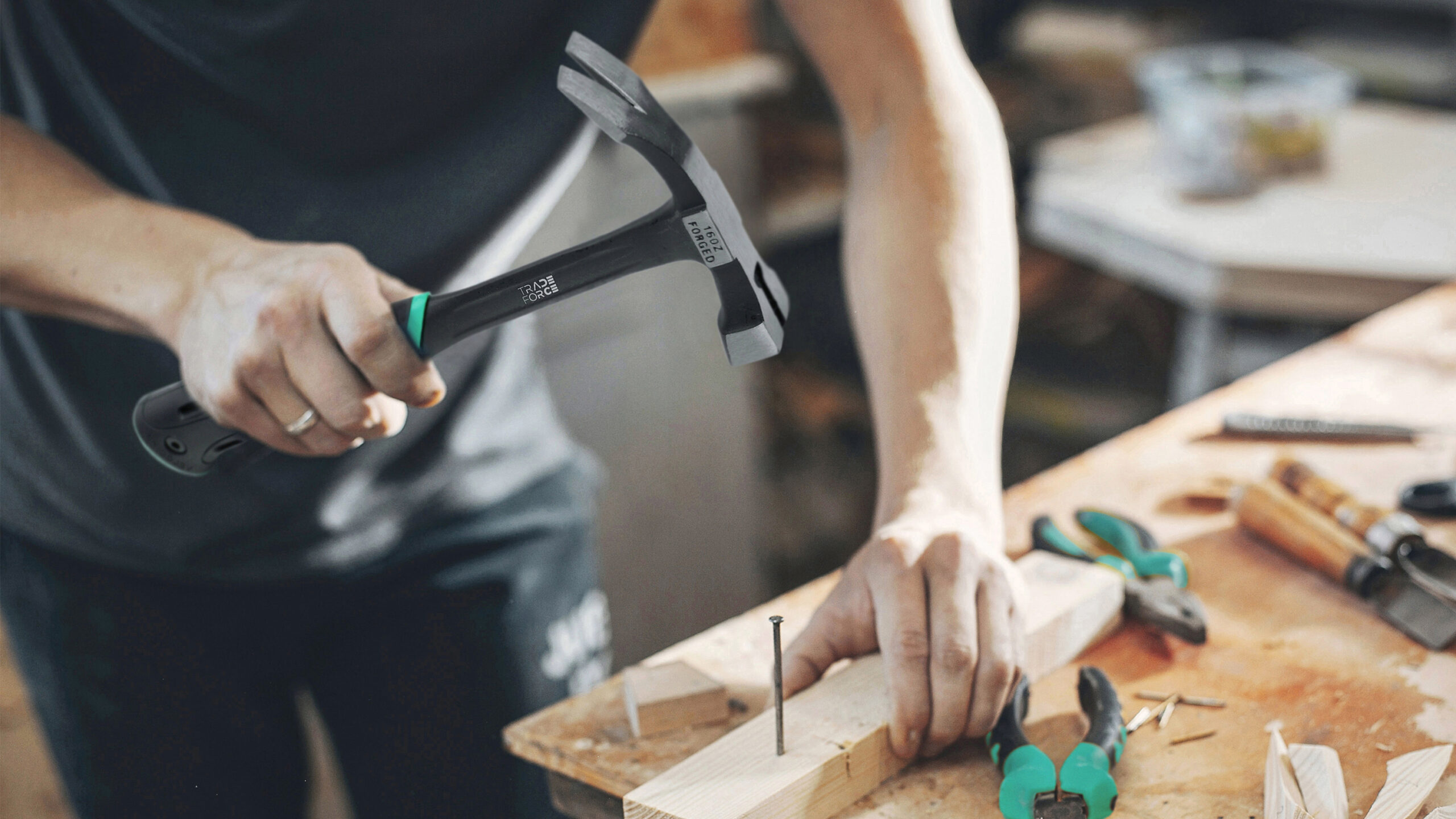
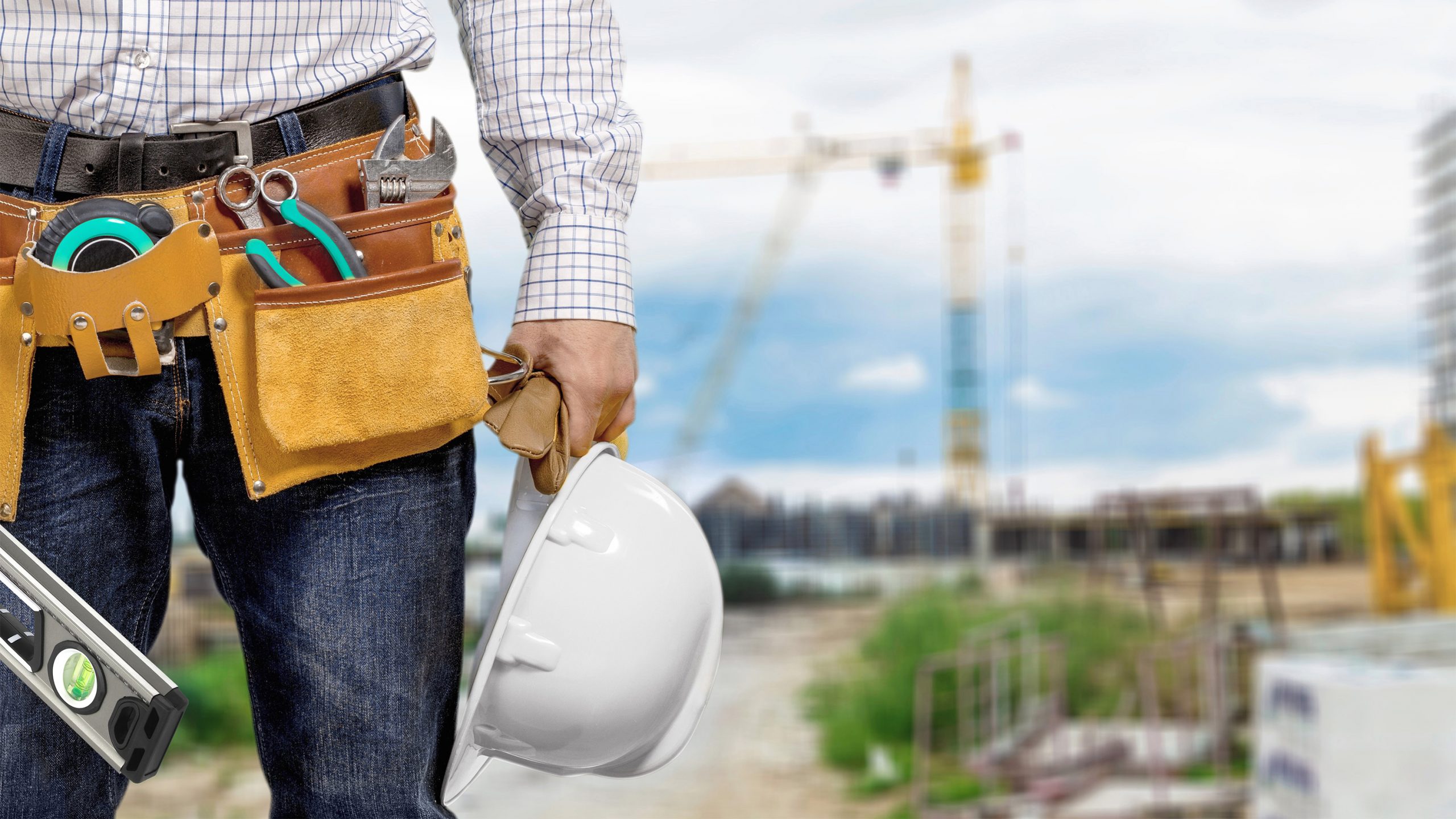
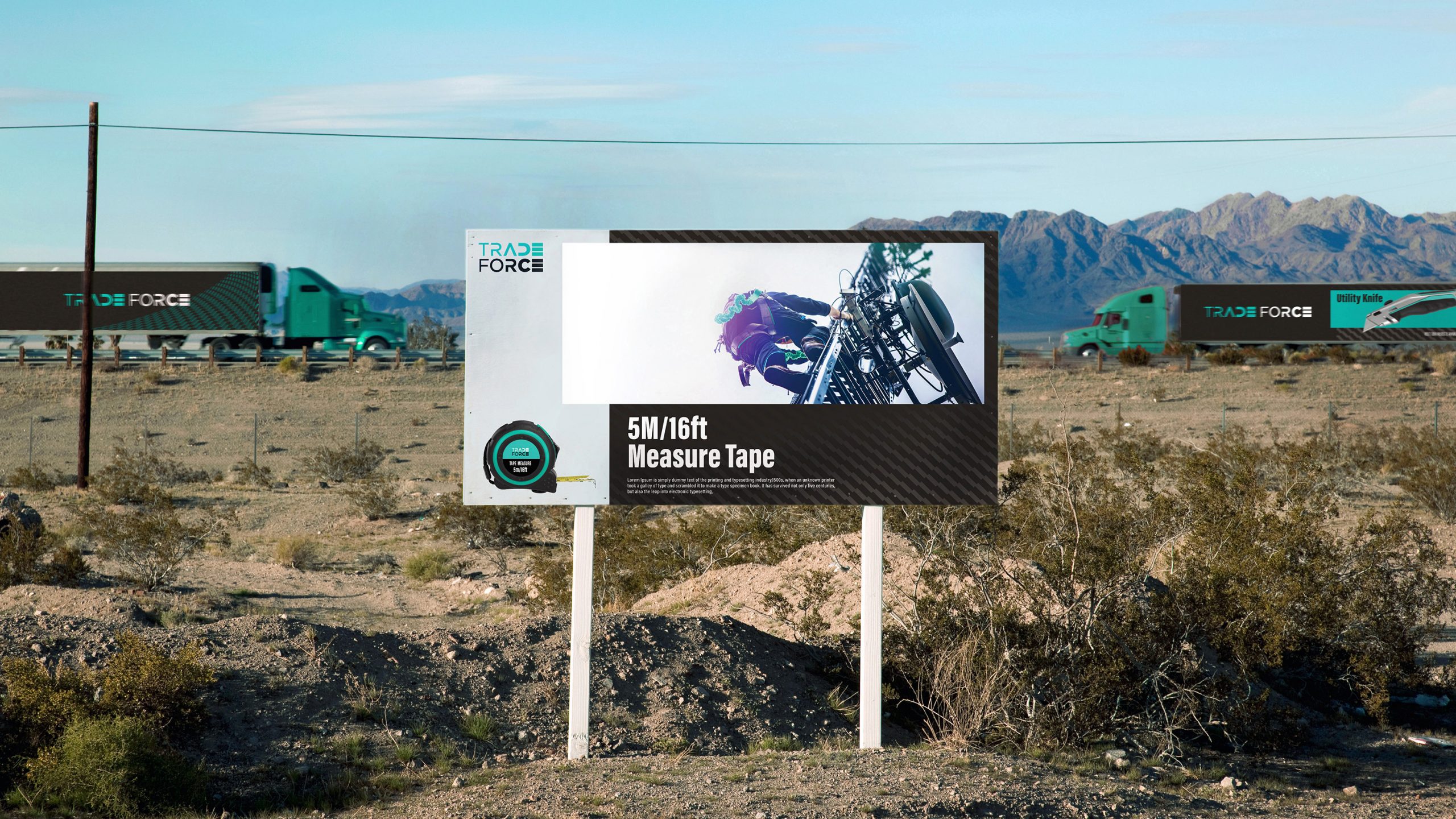
SONEPAR wants to build a new business unit by establishing the tool supply chain as a professional and comprehensive tool supply chain service platform, focusing on professional engineers, such as maintenance personnel in high altitudes or construction engineers on construction sites. Their work environment is often hazardous, and tools are their best companions, providing them with maximum support and assistance.

TRADEFORCE's Challenge: Launching New Brands in Conservative Category Markets
- Visual taste for the European and American markets
- Emphasis on product quality and established reputation in the marketplace.
- Many well-established and strong established brands
- Consumers are conservative and tend to choose established brands in the market.
- New brands need to target new segments and customize their marketing approach.
Facing the tool market, especially a brand for the mature market in Europe and America, it was a big challenge for the project to gain the trust of consumers who value the brand name and quality. How to gain the trust of consumers who value brand reputation and quality is a big challenge. In addition, the existing strong brands in the industry have already established a mature and deep brand image, solidifying the consumers' image of what professional tools should be. Meanwhile, consumers tend to be conservative when choosing tools, favoring old brands with a certain history or recommendations from existing users. It is a challenge for branding programs to attract consumers' attention and quickly build up brand trust in the midst of a sea of experienced brands.
Solution: Targeting the young professional user group as a brand breakthrough, delivering a professional image with a fashionable and bright brand vision.
- In-depth target group analysis
- Competitor Research Analyzes Market Dynamics
- Distinctive and innovative design style to emphasize the brand's characteristics
- Establish a systematic brand color to increase the flexibility and adaptability of brand use.
The new brand uses young professionals as a breakthrough, on the one hand, avoiding the conservative use of behavior, on the other hand, young people become the mainstream momentum of the brand, and will be the main force of the future brand generation in the future change of the brand.
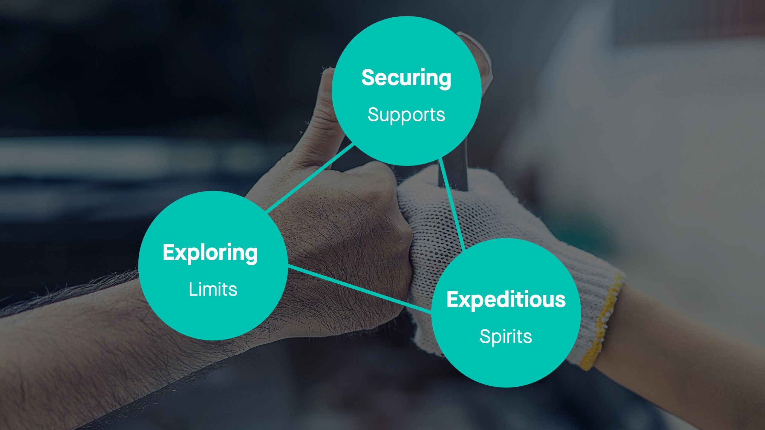
Strategically, Pro has transformed the daily negative and difficult professional work into positive emotions, using “Adventure Challenge” to arouse the brand's passion, and “Safety Guard” to express the brand's empathy and professionalism of the tool.
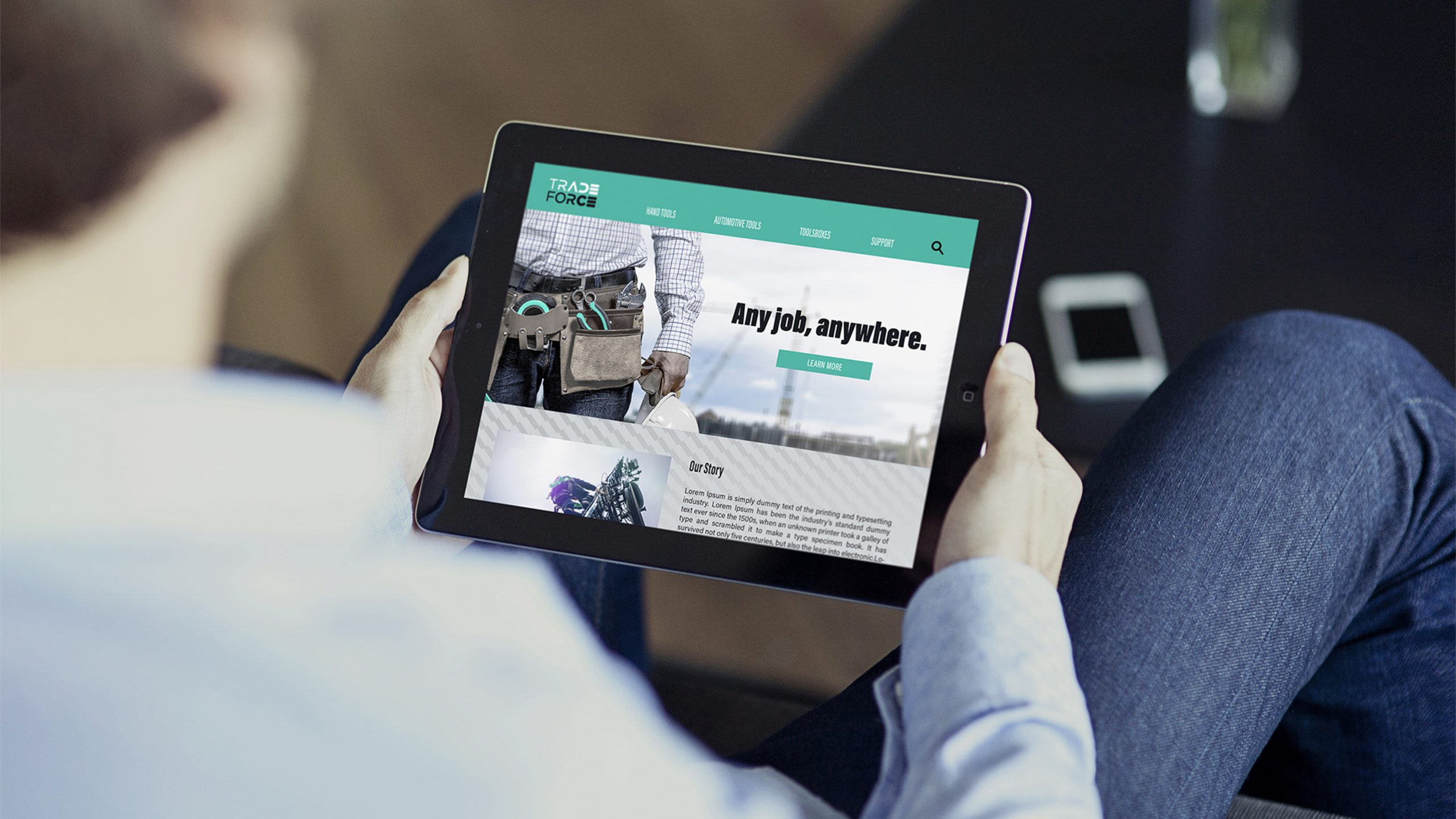
Brand image creates market differentiation
Visually, through interviews with target groups and analysis of industry brands. TRADEFORCE adopted a strategy to break away from the status quo by developing a unique brand image to create market differentiation through a visual system that is different from the traditional image of the industry.
In order to stand out in a competitive environment surrounded by strong brands, TRADEFORCE chose a fresh green color that is different from the industry's traditional color scheme. The color is different from the traditional color scheme of the industry, and through the use of fashionable and technological graphics, TRADEFORCE creates a brand image that is completely different from the stereotypes of the industry. It is a departure from the stereotypical image of hardware tools as unchanging, conservative and boring. During the design process, in order to emphasize the professionalism and functionality of the tools, the ergonomic feel of the tools was conveyed through dynamic auxiliary graphics, which further depicted the quality of the brand and the feeling of use.
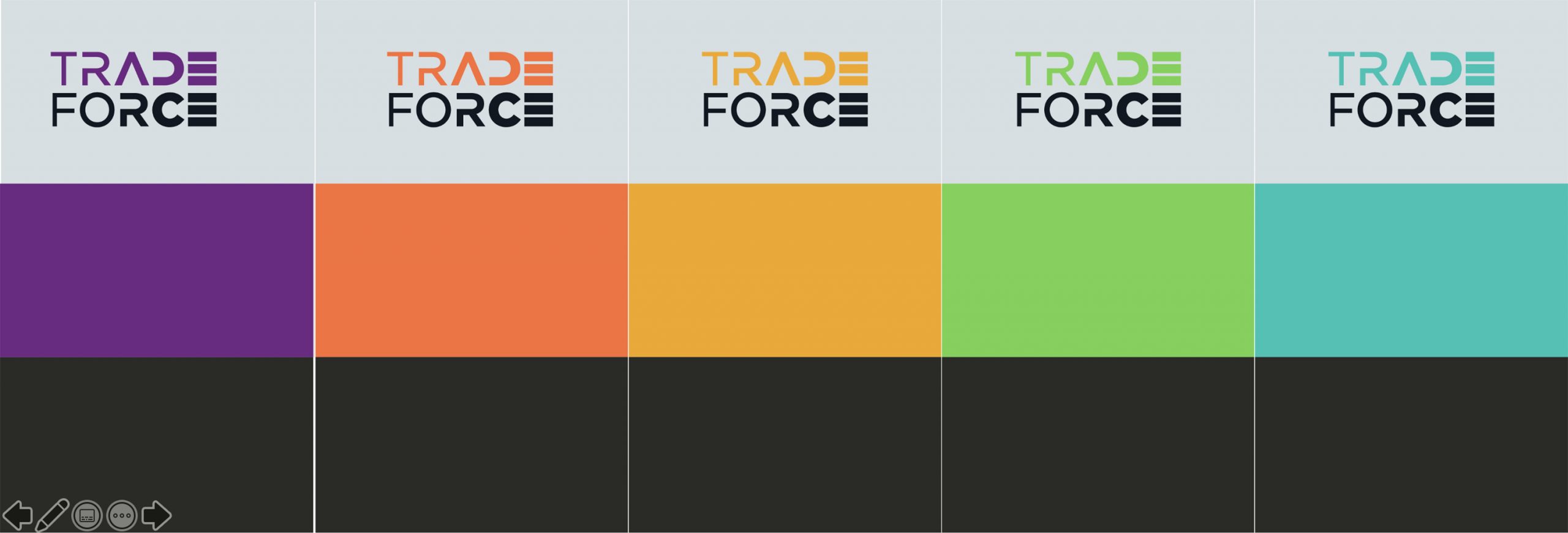
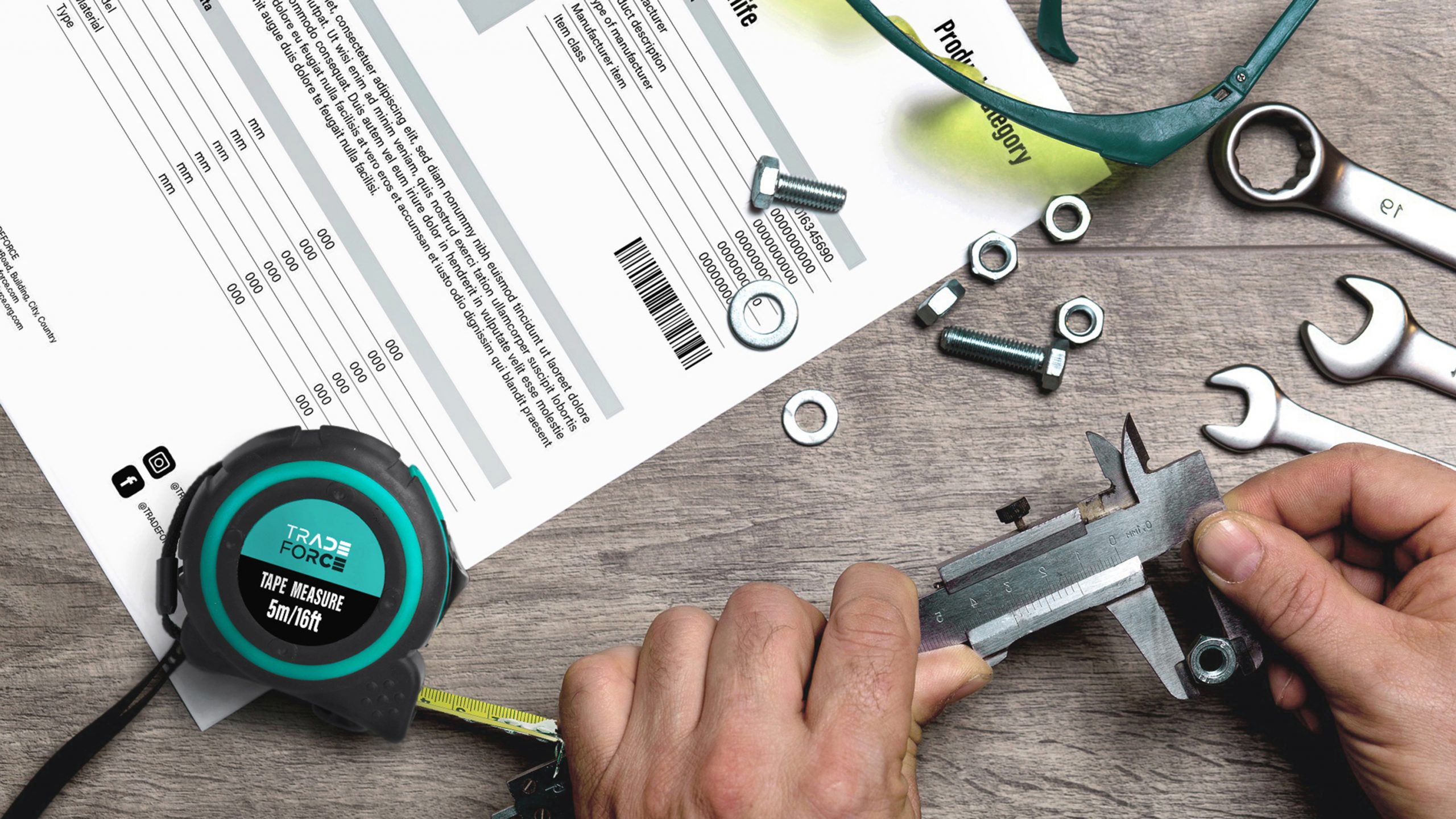
The most intuitive color classification system
In order to solve the problem of difficulty in communicating the classification of tool products to consumers, Pro has constructed a color system to provide the most intuitive classification system for products through intuitive color configuration. According to the clear color system, consumers can clearly distinguish the product categories. The geometric color block design allows the brand's products to be used flexibly in different product categories. At the same time, focusing on the diversified use of the brand and the differentiated needs of the brand's on-the-ground application, Pro Design team has established a set of on-the-ground application of the brand's color logic, so that the brand can be more diversified in the future application and also be able to convey the brand's image more accurately in different scenarios.
Creating a modern and fresh visual appearance
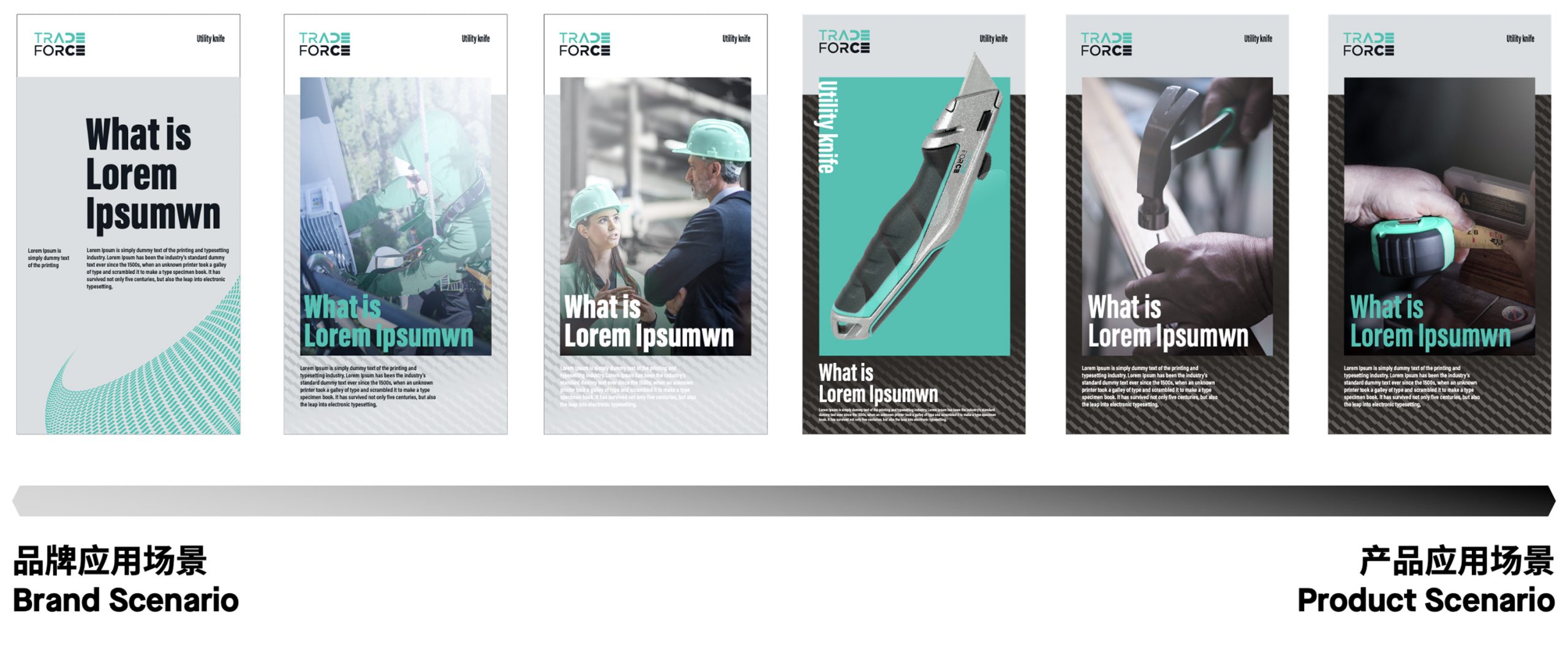
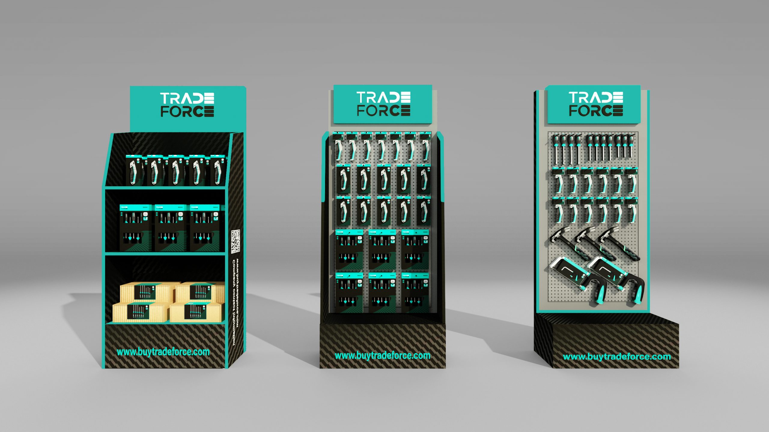
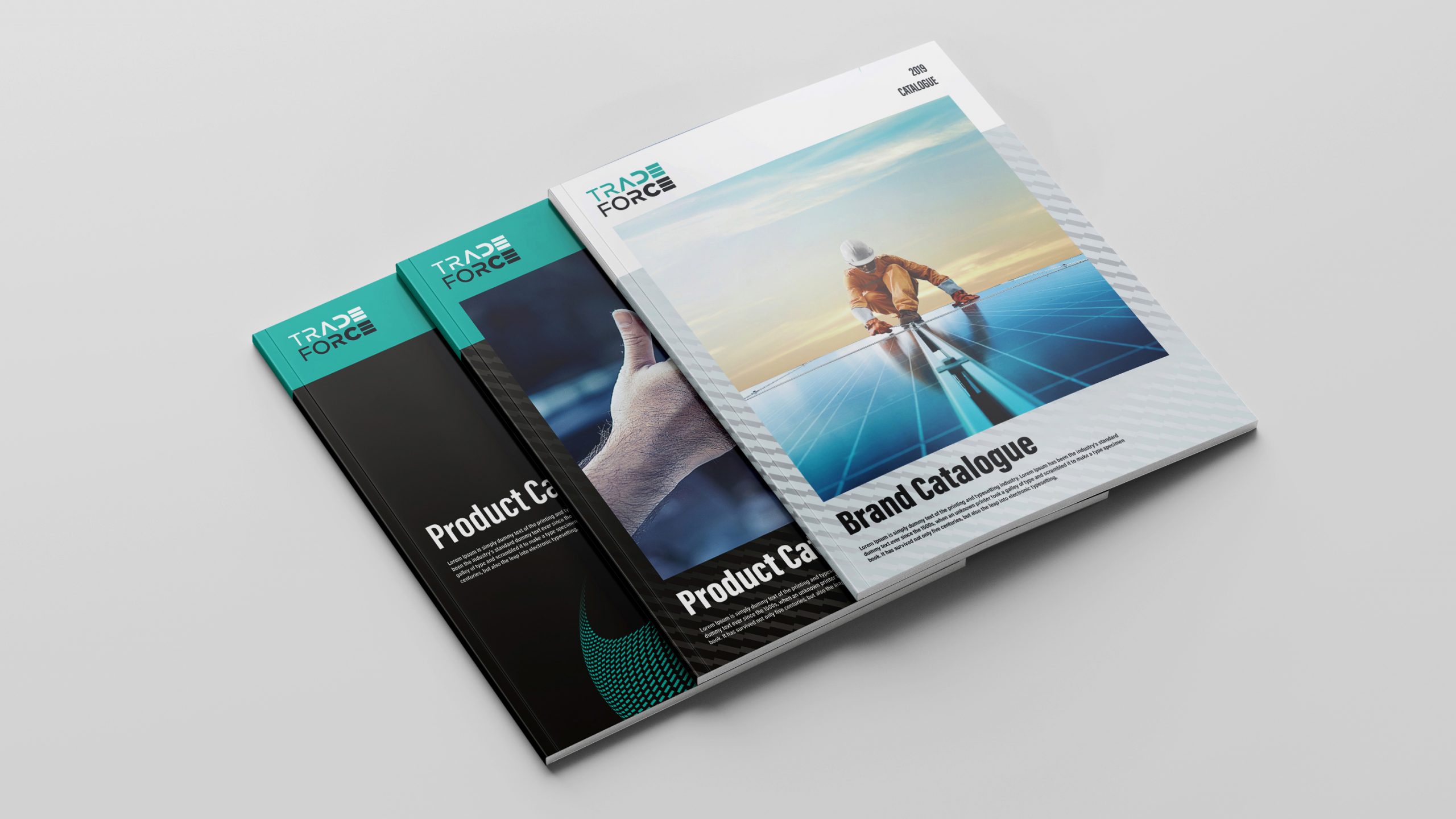
For the brand application design, product display racks and product packaging design, which are closely related to the product itself, the bright brand color and black color create a modern and novel visual appearance, and at the same time, appropriate grey color is integrated to achieve visual balance. The visual design of the dark-colored main body creates a stable and professional impression at the direct contact surface, giving people a reliable feeling and establishing a sense of trust between the brand and consumers.
In the case of business marketing applications such as brand brochures, the brand color is used as the basis with bright white and grey instead of the original black; through the light and bright color vision, it conveys a positive and active brand spirit for the brand.
Like the brand's core values, TRADEFORCE stands shoulder-to-shoulder with its expertise in challenging work environments.