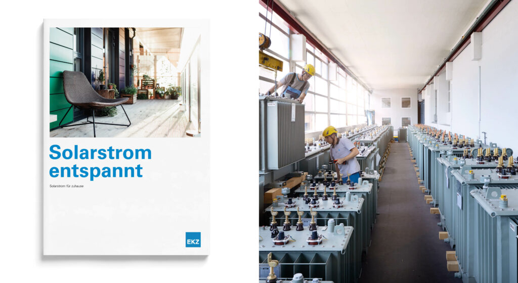
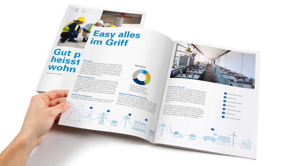
Year

2022

Sectors

B2C
manufacture

Service

brand strategy
brand positioning
Brand Design

EKZ

Simple and true

The power and energy sector is booming. If it is to keep up with the trends, it is important to make its positioning convincing in the market and to prove its closeness to its customers. With the brand renewal, EKZ is revamping its entire appearance and enhancing the layout, visual language and tone of voice.

Concise information

EKZ uses the typical blue color, short and large headings, and clear statements to get everyone's attention. The purpose of this is to explain things more simply and quickly to the benefit of the customer.

"Through rebranding, we can more directly and authentically communicate our values to our target audience and more convincingly demonstrate our services."

Norbert Egli Brand Management EKZ

direction

New icons and illustrations enhance the EKZ product range. More than 140 icons provide direction and help EKZ communicate even the most complex topics in a simple and user-friendly way.

Modern Design

Clarity needs space to be used to its full effect. The new look is therefore generous and light. Many whites and characteristic blues emphasize Zurich's character, while two other blues, a light pastel shade and three highlight colors bring variety and appeal.

Real Image

The new look of EKZ is revealed in the visual world and it is expressed in clear terms: moving and real images appear in multiple shots, demonstrating the energy solutions of EKZ customers.

Overall Design

All of the company's touchpoints and applications were adapted. All innovations are documented on Frontify, the online brand management platform created specifically for EKZ.

Process is a member of
Leading Swiss Agencies (LSA)

12F., No.8, Sec. 1, Heping E. Rd., Da’an Dist.,
Taipei City 106, Taiwan.
+886 (2)2368 3436

Facebook

Instagram

LinkedIn

Copyright © 2025 Process Ltd.
All rights reserved.