Year
2023
Sectors
B2B
manufacture
Service
brand strategy
Venue Design
Brand Recognition
ANKO Food Machinery
A taste of heritage, a manufacturing choice.
Founded in 1978, Ankou Food Machinery is the leading brand in Taiwan's food machinery industry, with a service territory that extends to five continents and sales in 112 countries, and a mission to provide total solutions for safe and delicious food. In order to welcome the 40th anniversary of the brand, Ankou has decided to carry out a brand re-branding program in the hope of expanding the enterprise's landscape and conveying the brand value through brand transformation.
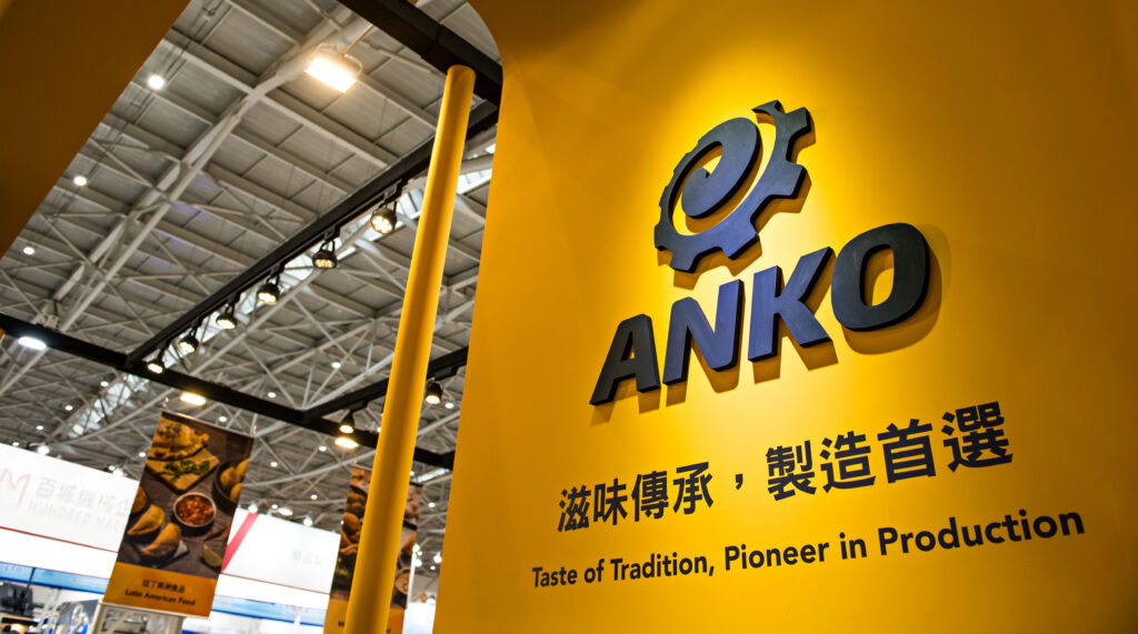
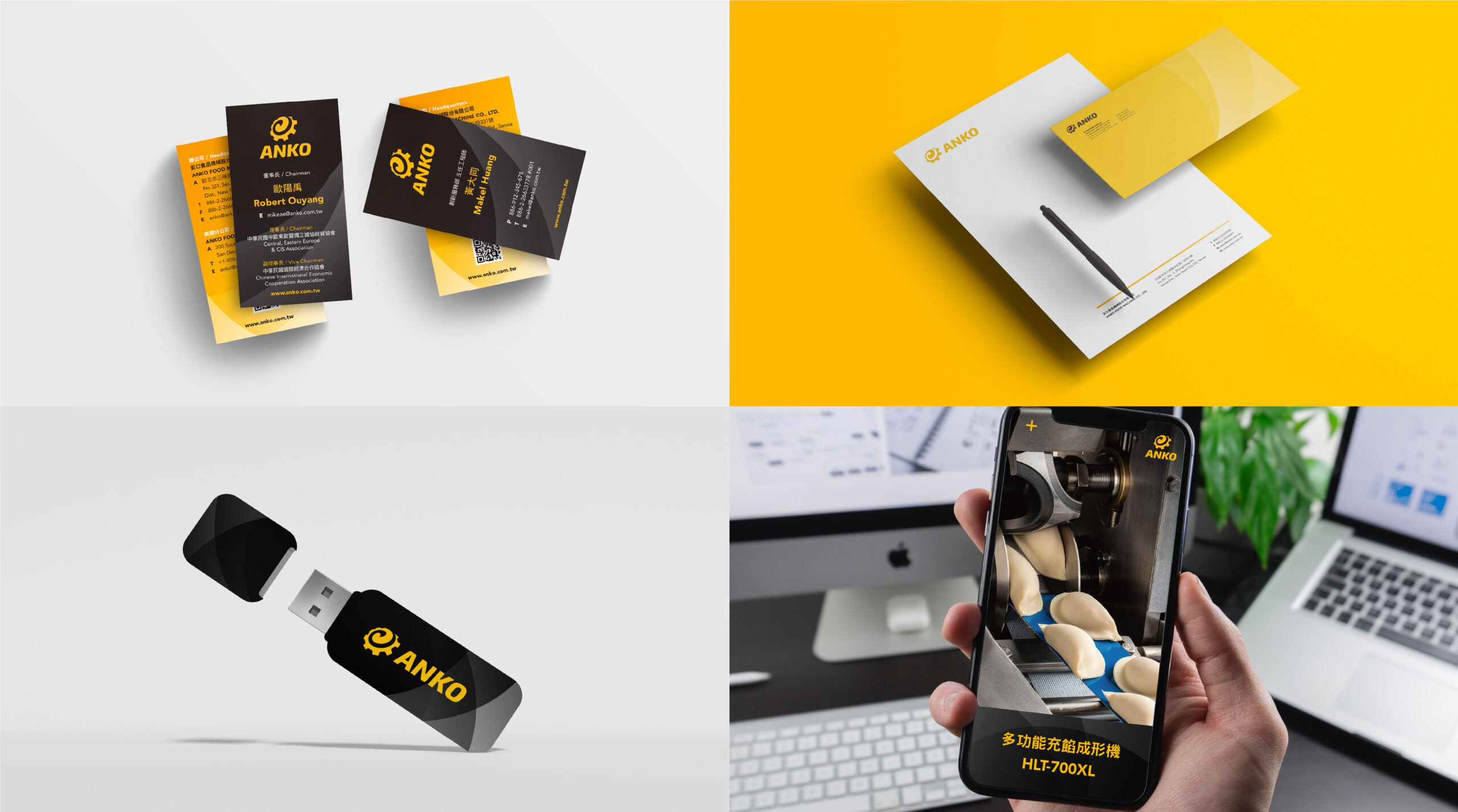
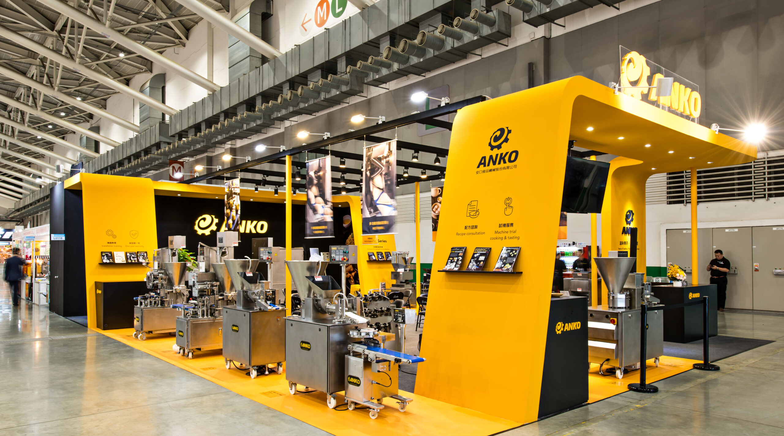
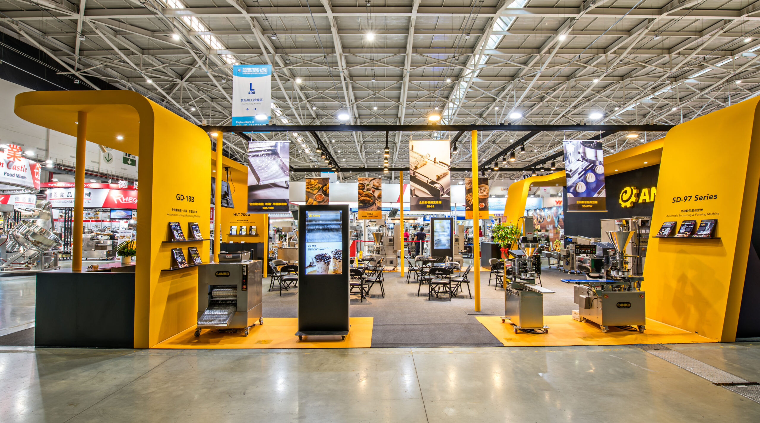
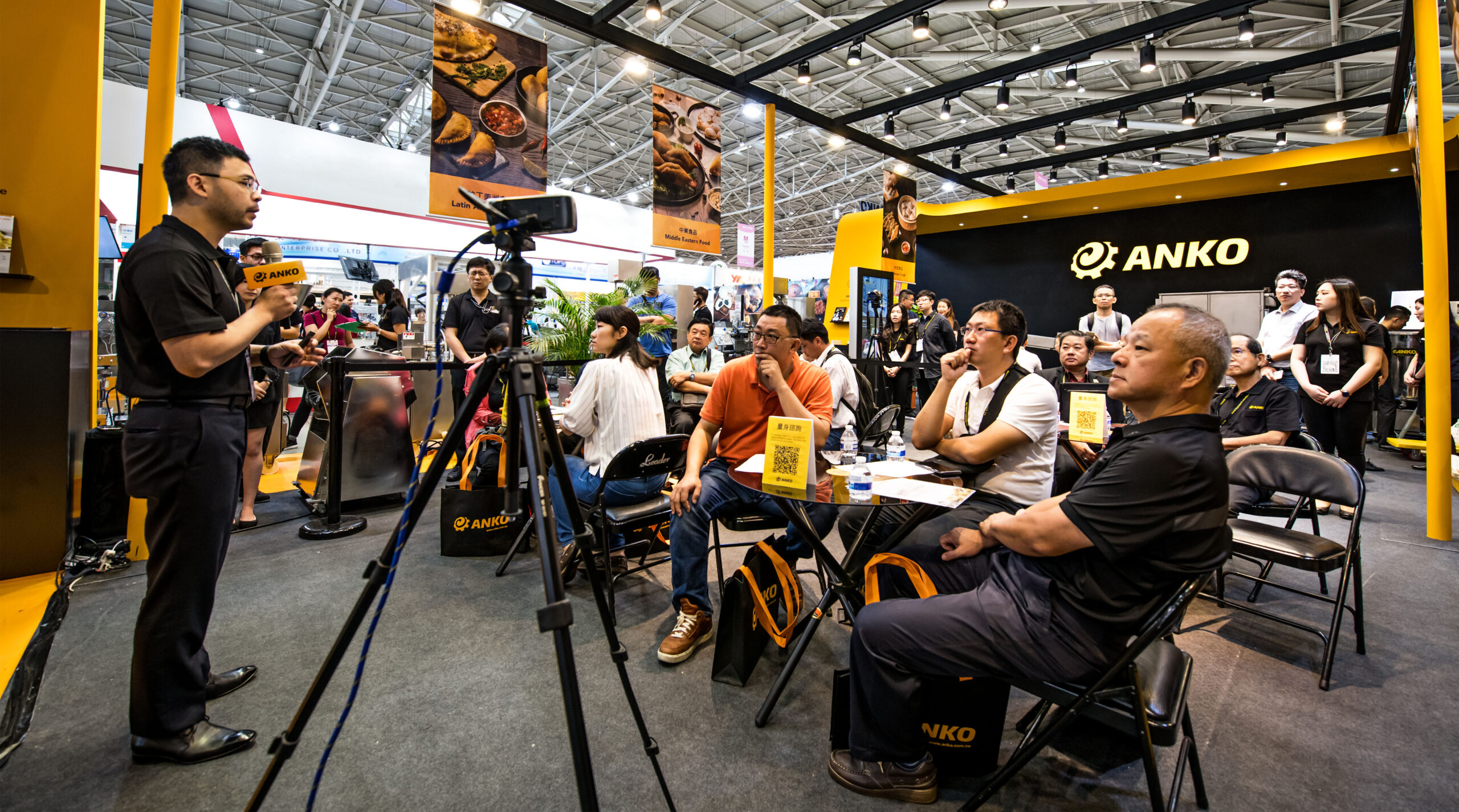
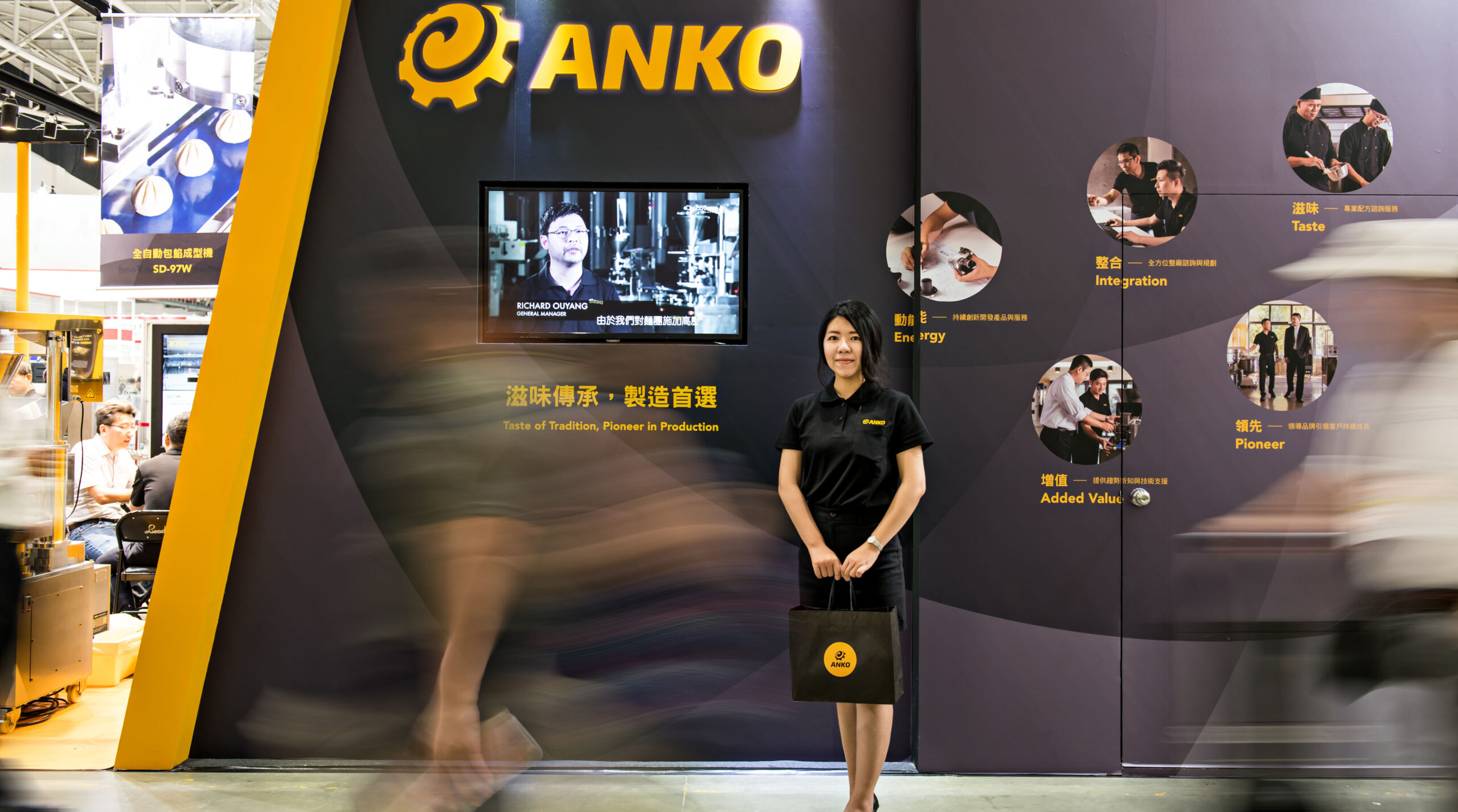
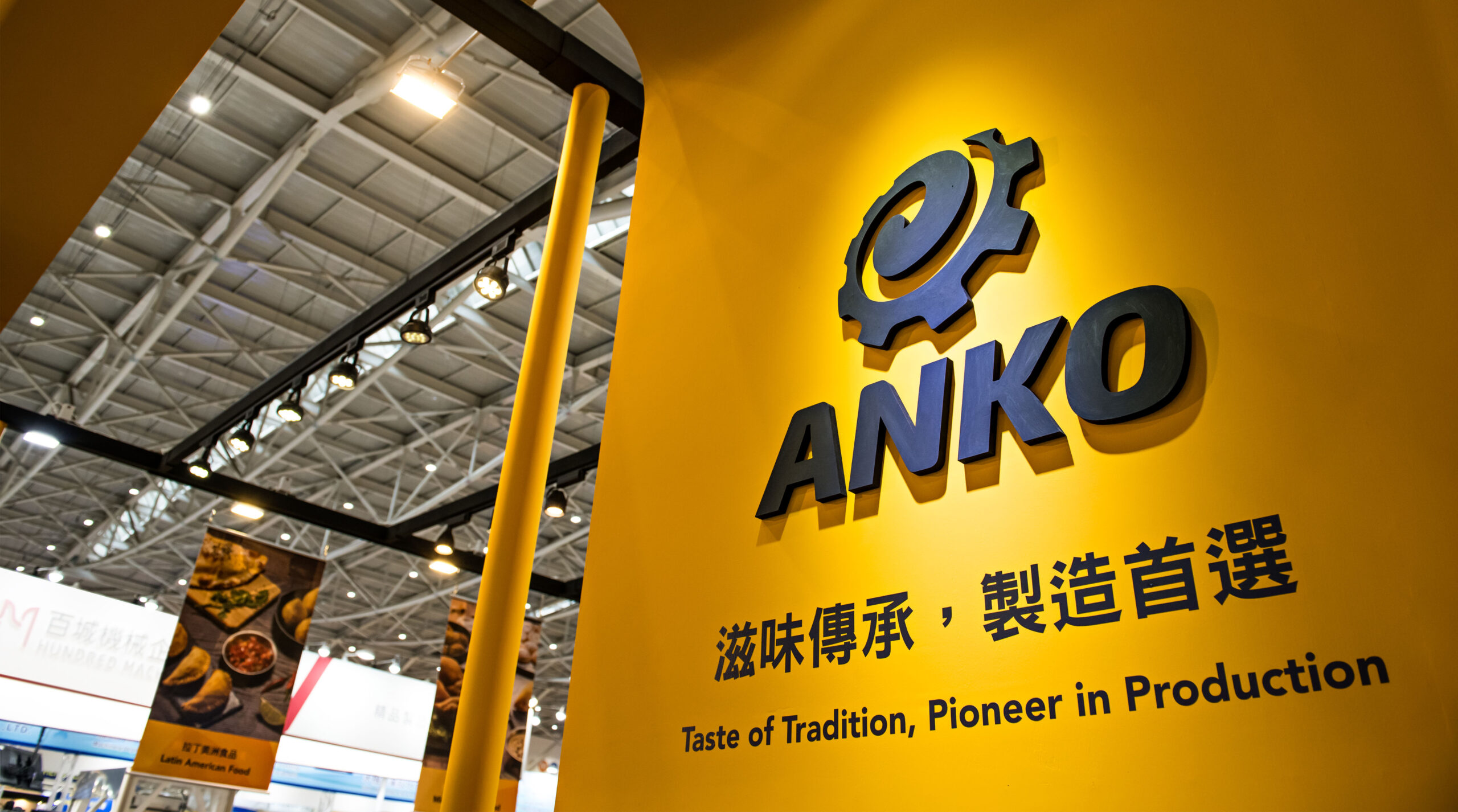
Incorporate sensual elements to deepen brand value
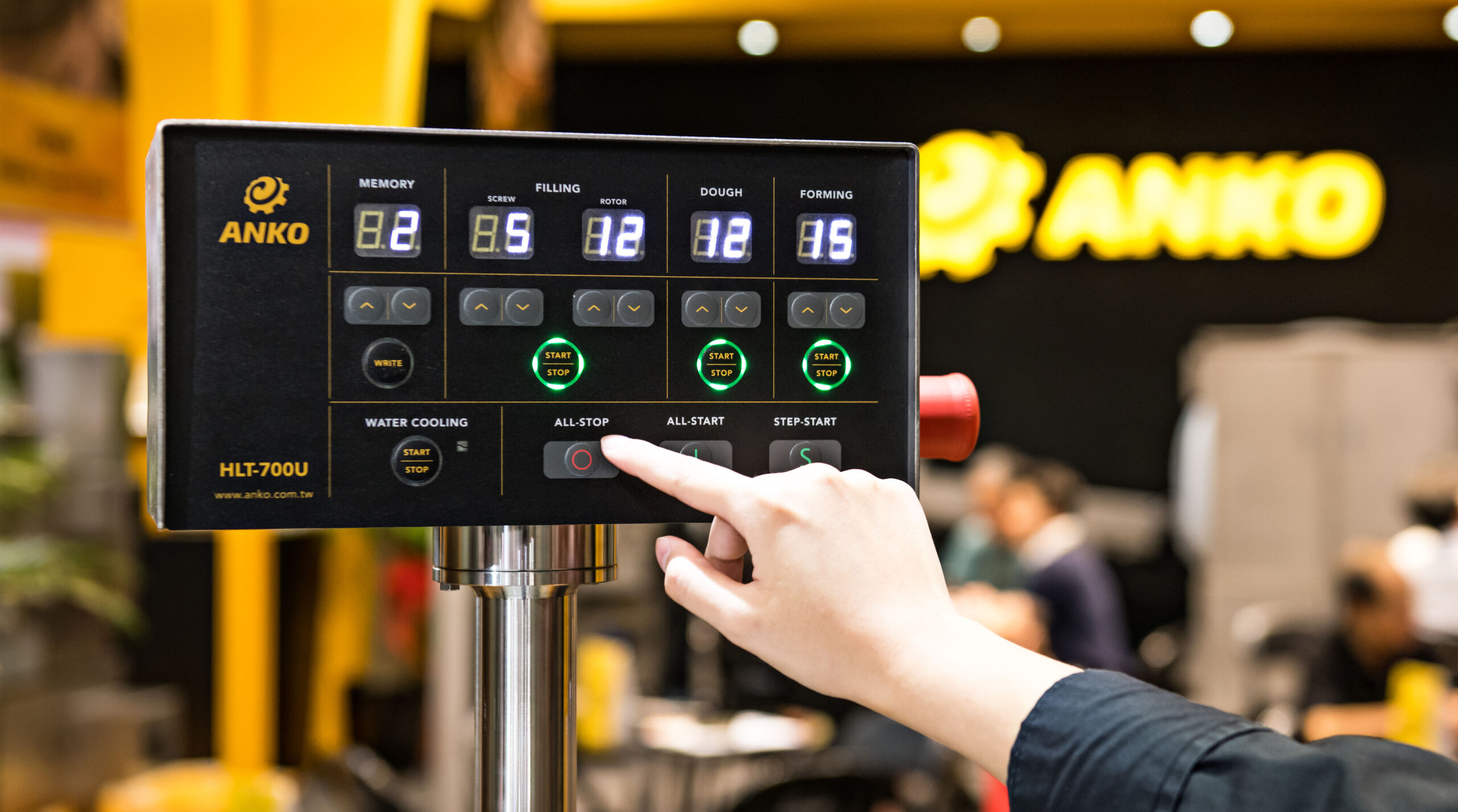
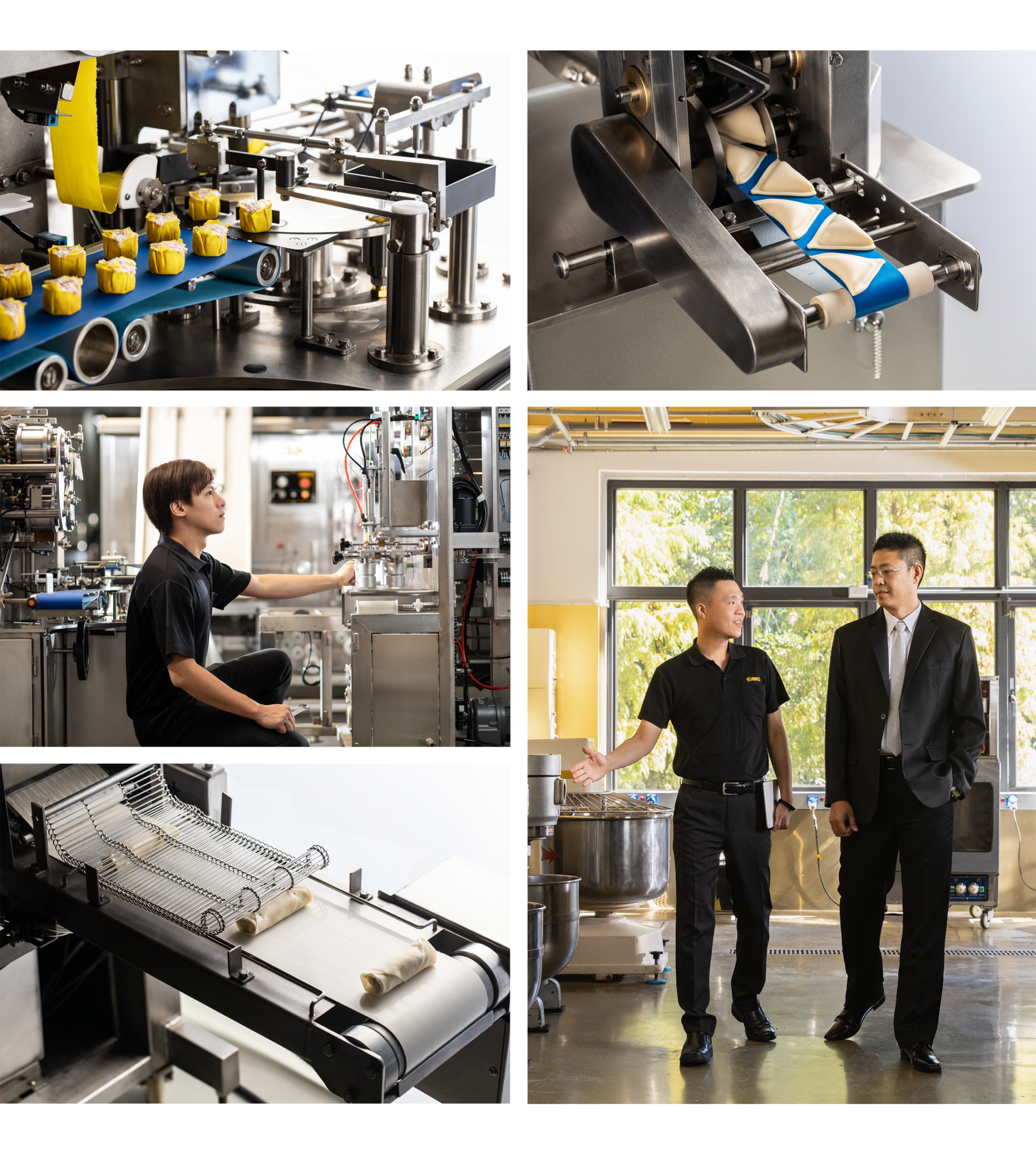
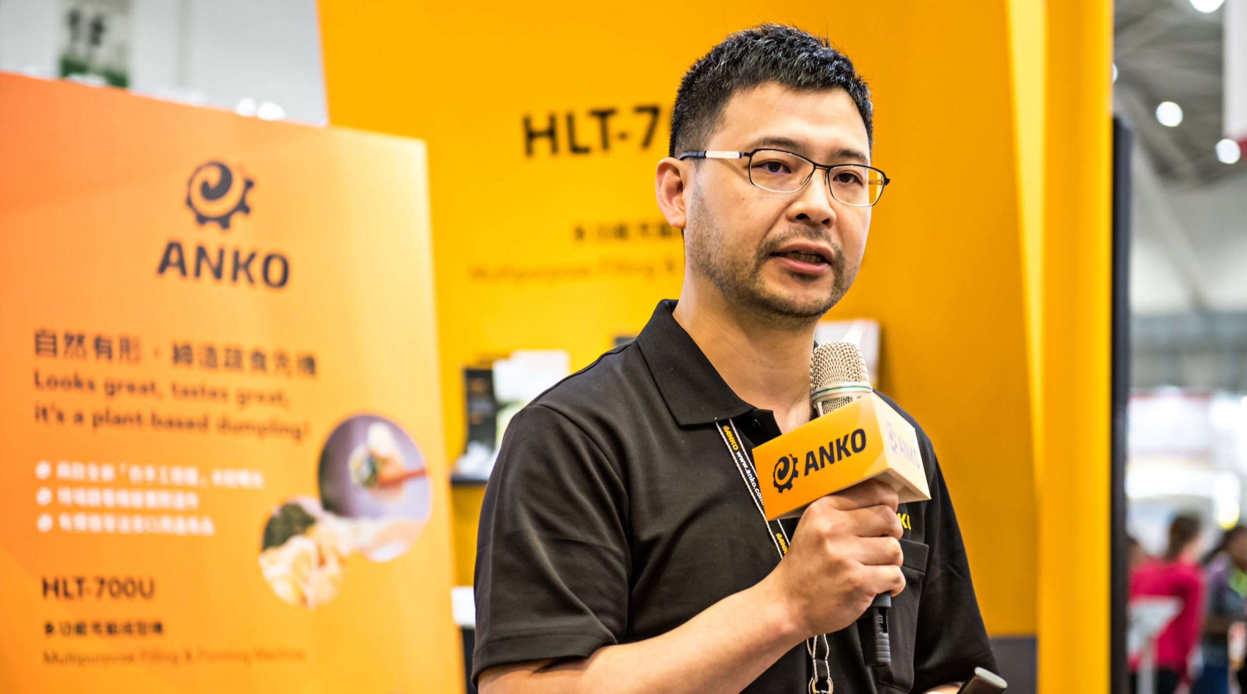
By giving Ankou a brand new image, we have incorporated more emotional elements into the brand, deepened the transmission of the brand value, and further connected with our customers so that they can deeply feel the brand value of Ankou. Through comprehensive and systematic planning, the brand identity design is extended to brand images, exhibition halls, product catalogs, business cards, machine operation panels and other contact points, creating a brand new look with Ankou.
Layers of craftsmanship, inheriting the good taste of the local area
Built on refined craftsmanship and extensive knowledge of food formulations, Ankou offers a full range of solutions through its highly integrated capabilities. Its supporting graphics utilize the richness of blossoming flowers to accentuate the brand's cultural and warmth of service, while its dynamic features highlight the brand's continued heritage of authentic good taste, creating a continuous flow of profitability for customers.


Brand value deepening, globalization of the fiber warming fill material specialists
In terms of brand identity design, the new identity is based on the need to incorporate the initials of the two parent companies, Hop Lung Woolen Mills and Molina (Italy), into the design. The circular structure of "chemical fiber filler" is cleverly designed into the logo symbols, and through the dynamic thinking of cycling forward and the design of a slight forward tilt and curved lines, the product's comfort and warmth are presented to convey the message that M&H is a forward-looking and stable chemical fiber warmth-filling material. M&H is a forward-looking and stable chemical fiber thermal padding expert, maintaining the most comfortable temperature for customers.
40 Years of Shaping Brands
Ankou participates in more than 10 international exhibitions every year, and the exhibition hall is a very important contact point for the brand. In the past, most of Ankou's exhibition halls had a modest identity, which was not easy to stand out from other exhibitors in the European market. ProTech has extended Ankou's new identity to the design of the exhibition hall, emphasizing on the all-round solution provider, using simple black and yellow color blocks to delineate the space levels, highlighting the characteristics of the machines, and showing Ankou's professional value of providing comprehensive solutions.
Brand Image and New Machine Launch
In response to the need to hold a new machine launch event for the general public and VIPs at the same time, the exhibition venue was designed with a stage space that could be flexibly utilized. Through the new brand image and activities, not only did the brand close the gap with the public and successfully attract new customers, but also enhanced the brand loyalty of existing customers, which was well received by the public!


Awards
2020 Asia Design Prize Asia Design Award - Winner