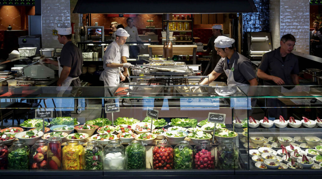
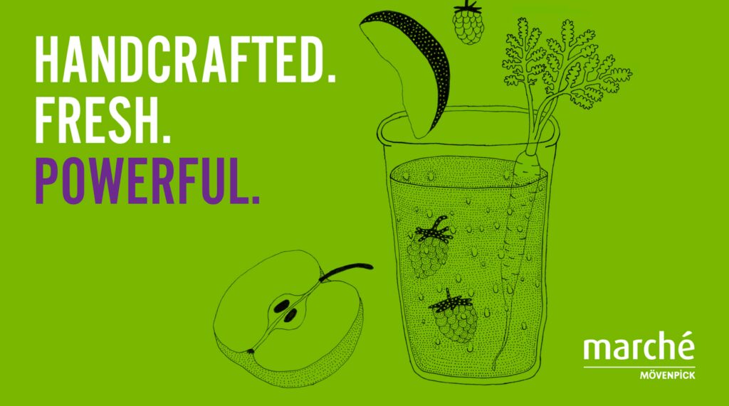
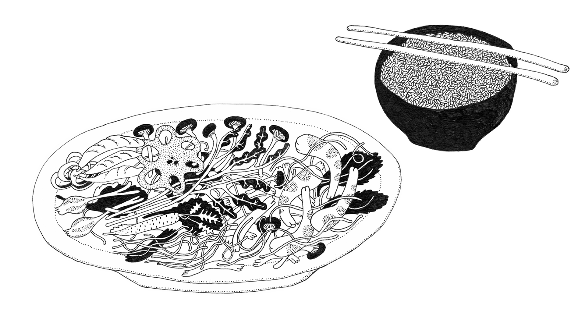
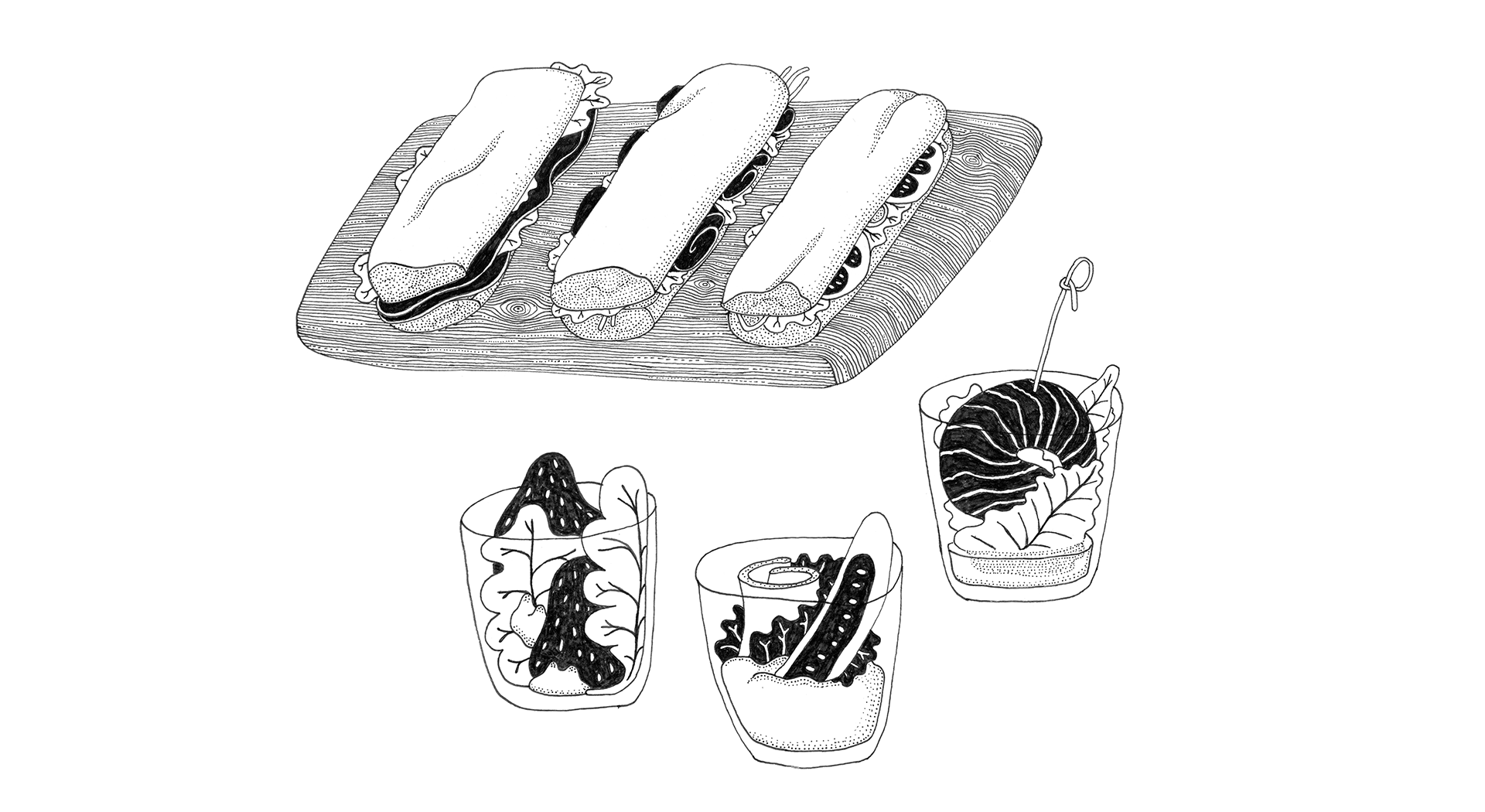
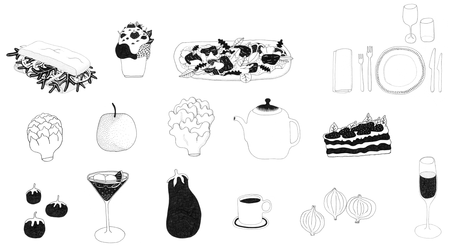
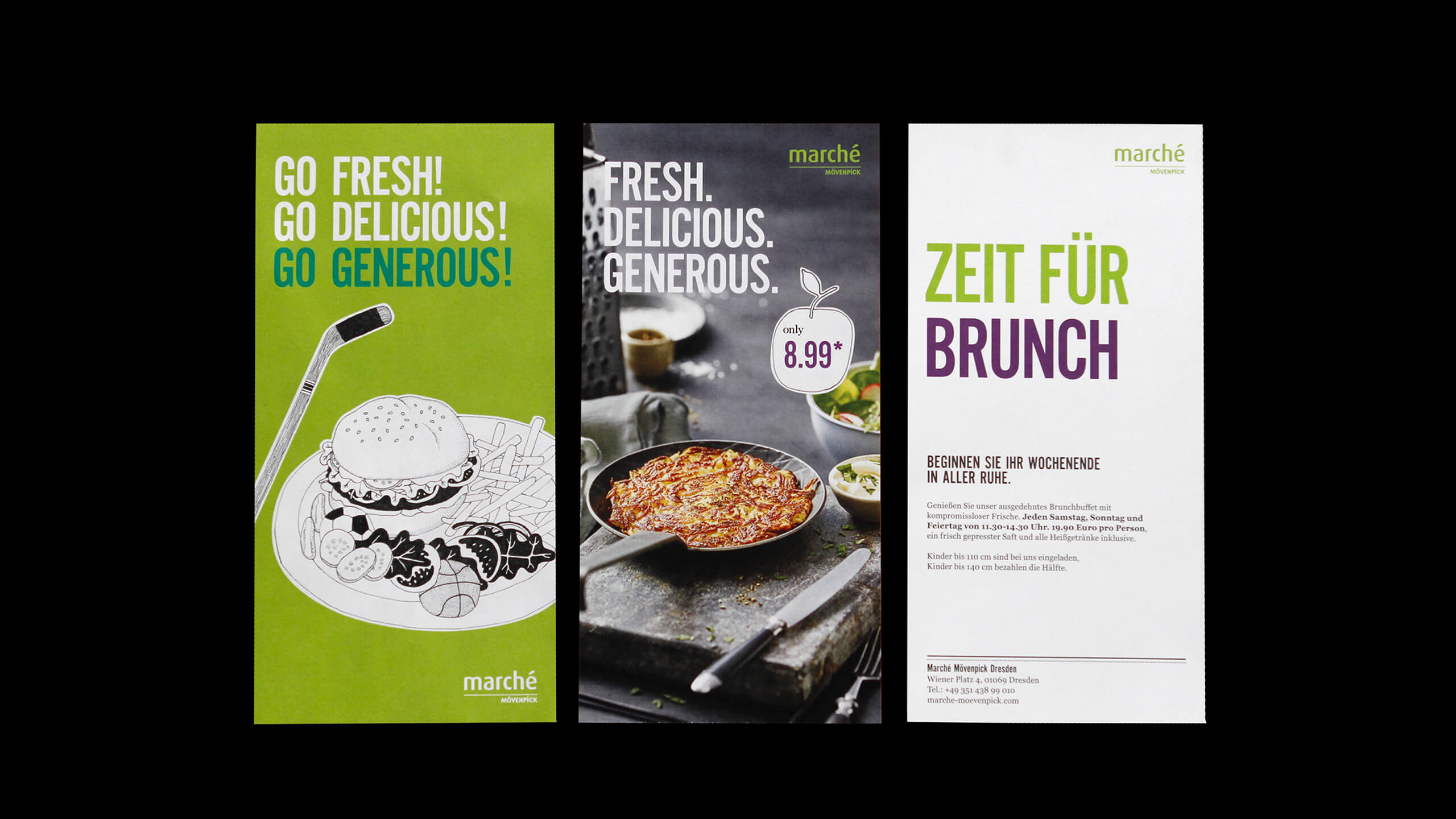
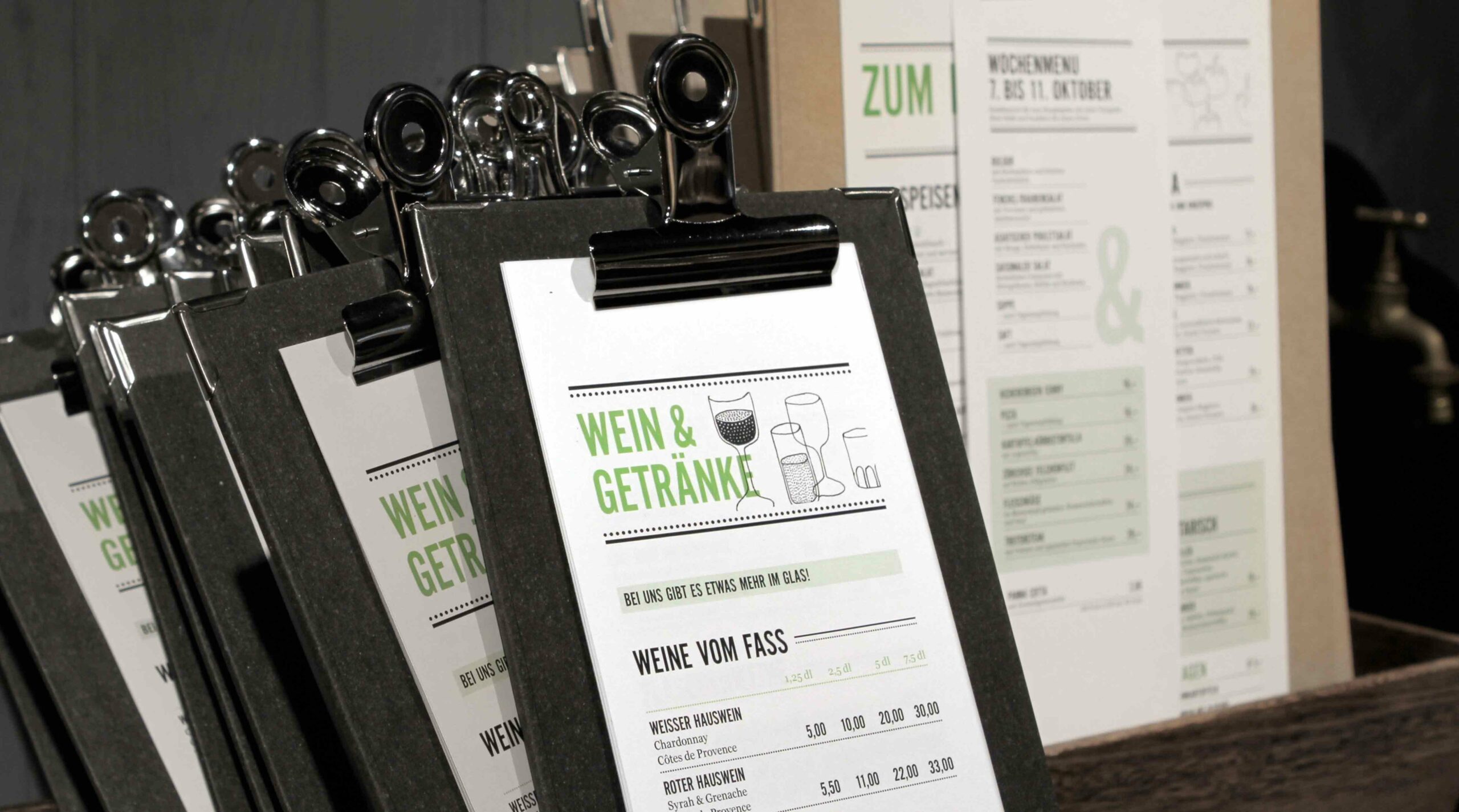
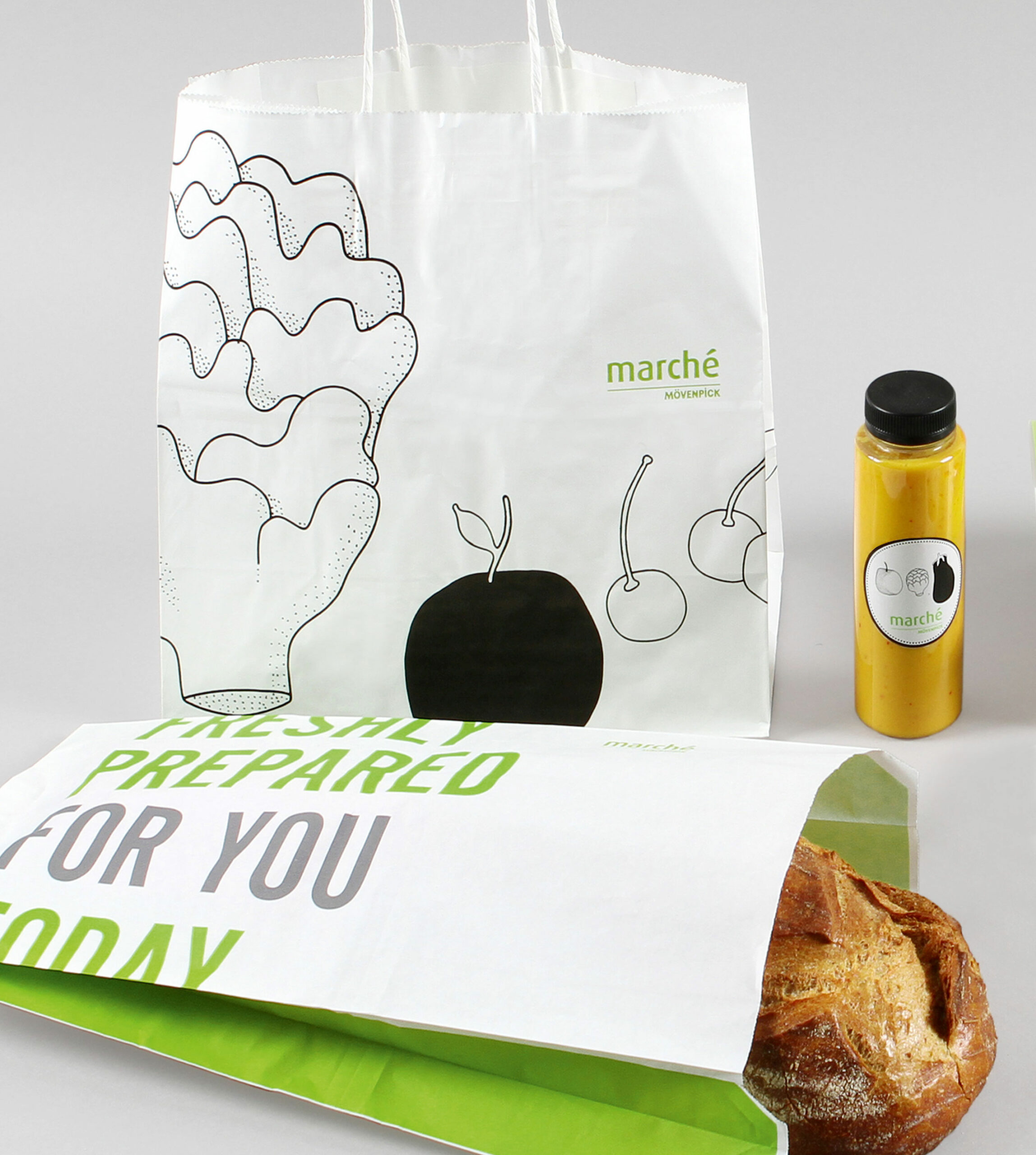
Year
2021
Sectors
B2C
Consumption
Service
Re-branding
Marché Mövenpick
Return to Town
The Swiss restaurant chain has partnered with Pro to develop the positioning of the Marché Mövenpick food service concept. Marché's existing values are reinforced by the Movenpick concept, a new brand focused on pleasure and refined sensations.
Illustrations
The new Marché Mövenpick logo, hand-drawn illustrations by Swedish artist Klas Herbert, weave together the brand's new look. From the menu board, to the table menu, to the packaging, to the coffee cups - a simple black line drawing runs through it all.
color scheme
Created in collaboration with photographer Klaus Einwanger, the colorful food images convey the grandeur, sophistication and market freshness of Marché Mövenpick's cuisine. At the same time, playful elements such as Klas Herbert's illustrations emphasize the “artisanal“ feel.
Fonts and Typography
The striking sans-serif Alternate Gothic No2 is a house font with the system font Georgia used for key messaging. The handwriting feel of the decorative font, Handsome Pro, which is used to illustrate the brand's story, completes the brand's font and design. Decorative lines are combined with Japanese dotted lines to bring a more refined and structured feel to the image.
“The new brand positioning of Marché Mövenpick is presented very effectively with corporate design.”
Carolin Versteeg, Chief Marketing Officer, Marché International
Packaging
The take-away products are also perfect for showcasing their brand image. We have developed an easy-to-use and flexible packaging design that has served as the basis for many different types of packaging.


Icons and Labels
We have developed a complete set of icons. A clear and easy to understand system with simple arrows was created as a guideline. The overall design is based on the main font Alternate Gothic No. 2, with the dotted lines of the brand design as a reused element.


