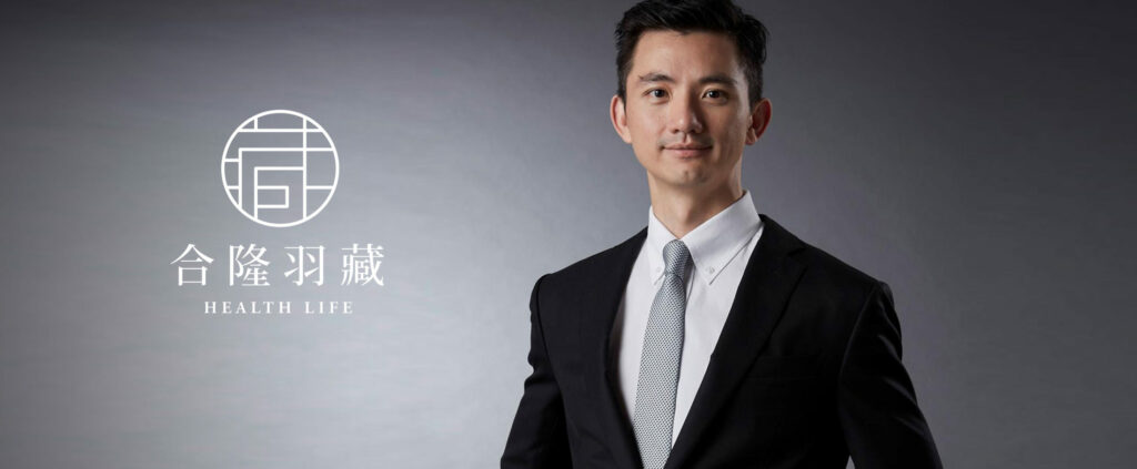
Interview
Taiwan Centennial Brand Re-establishment: Hop Lung Woolen Mills and Hop Lung Feather Collection

"Established in 1908, the Ho-Long Woolen Mills is the oldest and most widely spread professional down manufacturer in Asia, which belongs to the B2B business sector, while the Group's Ho-Long Feather & Hide (Health Life) is a brand for the consumer end-market, which is dedicated to personal bedding. After the fifth-generation successor, Chen Yen-Cheng, took over as chairman of the board of directors in 2015, he wanted to refurbish the company, and because the logo had been in use for a long time, he wanted to make a new visual package. Therefore, he invited Process to not only rebuild the centuries-old brand, "Hualong Woolen Factory", but also create a corporate identity for the consumer brand, "Hualong Huzo", through a series of corporate identity programs. Corporate Identity", through a series of supporting design applications, to highlight the original corporate strengths and assets, looking for more opportunities.
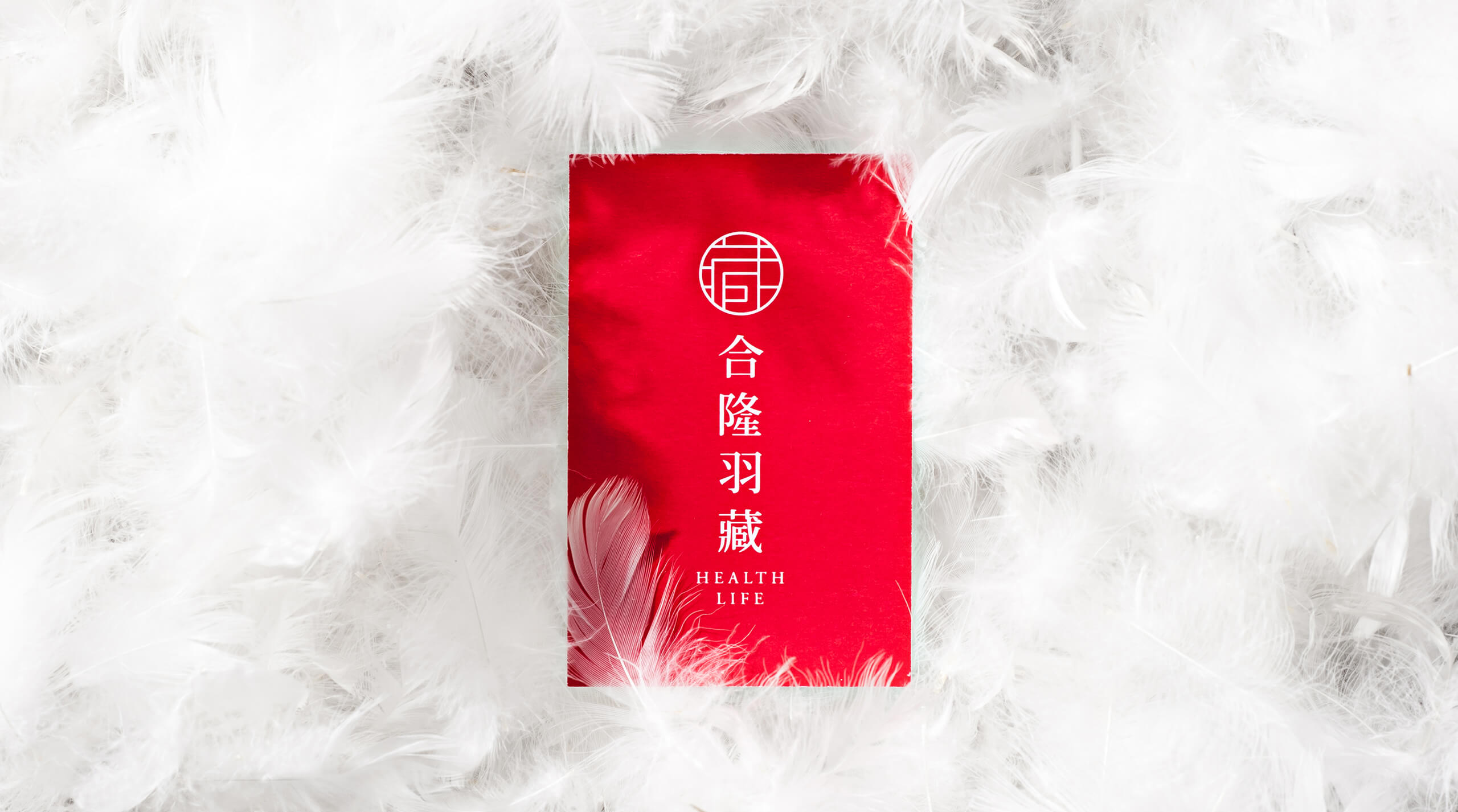
The new visual identity retains the company's long-established color "red," shape "diamond," and "feather," which visualize the company's core raw materials and technologies.
The desire to rebrand comes from the inside out
The desire to re-create the corporate image is actually the most profound response of enterprises to the transformation, which is derived from the extension of the enterprise body, hoping for the promotion and expansion of the business, the external image of the enterprise can be the unity of the surface and the inside, the demand for complementing each other. For example, Mr. Li Xinyu, the marketing director of Hualong Woolen Factory, said:
The Chairman hopes that in the future, Hop Lung will not only be a supplier, but also a solution provider. Customers can express their needs of what kind of condition (environment), what kind of warmth, and what kind of function, and Hop Lung will be able to find the corresponding things to meet the needs, not just like the traditional suppliers, what price I want to pay for the down, and what proportion of raw materials I want to use," he said. He hopes that the enterprise itself, from the traditional industry that only provides raw materials, will evolve to actively provide solutions, in which case, the enterprise identification will be improved, and the customer's perception and positioning of Holon will be in line with.
With the new impetus of reform from the inside out, the brand new corporate identity of Hop Lung Woolen Mills is developed based on the employees' image, expectations, and the feelings they want to give to the people now, and in line with the company's unique competitiveness. Employees felt that the past logo gave people a sense of history and simplicity, and hoped that the future logo would have the same colors as the past logo, retain the sense of history, and at the same time have a modern sense of simplicity and ease of recognition.
Contact points where customers actually interact with Hoplon are also designed, such as office supplies, factory uniforms and corporate images, to convey a complete new image.
A new corporate identity with a feather as the logo.
Therefore, based on these needs, and after comparing with competitors, Pro Brand evolved a new visual identity that retains the company's long-used color - red, shape - diamond, and "feather" the company's core raw materials and technology of the graphic, developed a new corporate logo, and developed two basic colors, as well as a series of standards, so that print and digital can be complete. Two basic colors were developed, along with a series of standards, to allow for a complete representation in both print and digital form. In addition, touchpoints where customers would actually interact with Holon were also designed, such as office supplies, factory uniforms, and corporate images, to convey a complete new image.
However, Lee pointed out that long-time customers will not think that Hoplon has given up its long-standing philosophy and service spirit just because it has changed its logo, and newly developed customers will not compare the old and new logos because they do not know the Hoplon of the past; rather, it is the core business of Hoplon itself that has been adjusted, for example, it has begun to act as an agent for European and American technologies and fabrics, and it has also set up a chemical fiber company last year to collaborate with its supply chain partners, no longer just providing raw materials and possibly blending. We are no longer just providing raw materials, but also blending. In the Korean market, we will also carry out branding projects and launch products such as "Gore-Tex (fabric technology)", at which point a new visual identity will come into play.
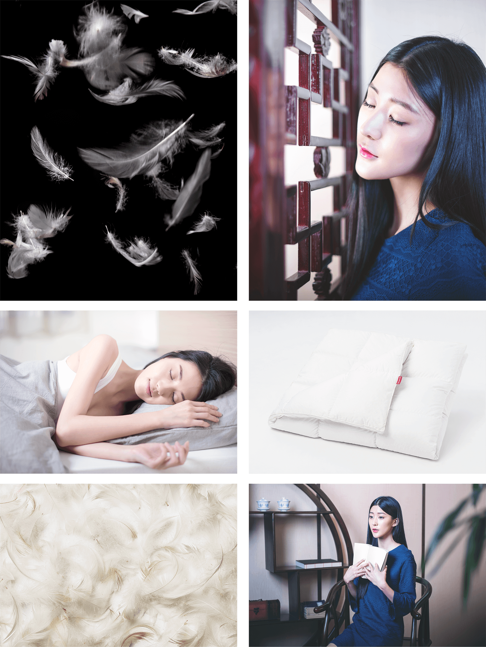
Hanzo's design concepts are inspired by oriental boutiques, dobbles, and femininity.
The Birth of Consumer Brand Hopalong Hanzo
At the consumer end of the spectrum, the brand "Horyu Hazo" (Health Life) is also the result of the new chairman's efforts to re-execute the plans that were already in place internally. From recruiting in-house marketing professionals and hiring an outside brand consulting and design firm, the idea of a consumer brand was finally realized, and at the end of October and the beginning of November 2016, a brand new website was launched in the e-commerce market. The design concept of Hazo comes from the Oriental boutique, Doppelgänger, as well as the feminine character, so the logo follows the classic "red" color of Hop Lung, blending the long history of traditional raw material suppliers with the brand new image layout, taking care of the existing customers and new consumers, realizing and multiplying the corporate culture.
In addition to the development of corporate identity and standardized characters, in the face of the development of digital communication and marketing, vision plays an important role in e-commerce communication. ProLogic has also produced a series of "visual templates" for "HELLO HUZZO", so that the relevant brand management and marketing staffs can have something to rely on, develop brand consistency, and ensure that the consumer receives a complete brand image.

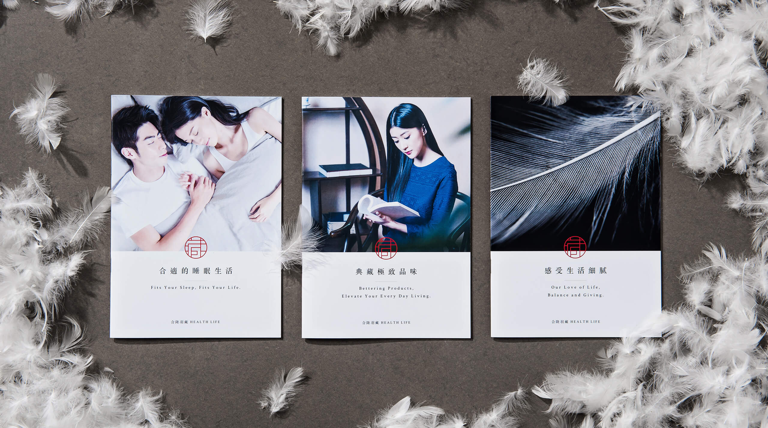
Process Pro Brands created a series of "visual templates" for Haplong Hanzo to give brand managers and marketers something to work off of, to develop brand consistency, and to ensure that consumers receive a complete brand image.
Lee also said that good design communication, such as the texture of the logo and graphics, will have an impact on the status of the brand after the consumer is exposed to it. After a systematic approach to analyzing the overall Process Pro brand and developing the underlying strategy, then developing the corporate identity and design concepts, and finally completing all the design applications and management, she says, "The response I get from people who come into contact with 'Haplong Hazo' is a feeling of sophistication, refinement, and texture.
Since the launch of its website at the end of October 2016, "HELLO HASUZO" has seen significant growth in terms of performance, especially in November and December when compared to the same period of the previous year, with growth on the website of 8 times and 4 times, and overall growth of 4 times and more than 2 times. This proves that a good product, paired with good brand design and marketing communication, is the golden combination for brand growth.
1. Consistency in tables:
Design is not just about surface image, it is actually about what you can see on the inside. Therefore, a good brand reengineering, in addition to outstanding brand identity design, the enterprise itself must also be transformed internally, so that the internal and external changes can be effective, so that the brand's own positioning and customer perception of the consistency of the corresponding.
2. brand design systematization:
Systematization of brand design: Good design communication, when consumers come into contact with logos, graphics, packaging, and other brand touch points, the impression left behind will have an impact on brand positioning, so we should take a systematic approach to building or rebranding, from analysis, strategy development, conceptualization, to the application of the design, as well as long-term maintenance and management, a step-by-step approach to solid progress.
Want to start rebranding your business? Feel free to contact us!
Related Post: