Insight
What does the soul of a brand wear? From Movie Characters and Stories

In the branding process, the strategic foundation provides the direction for the brand, while the Visual Identity System (VI) translates these strategies into concrete language that customers can perceive. Just like a successful movie, the design of a character not only relies on the values and logic of behavior set out in the script, but also on the design of the exterior to express the character's qualities.
Hair, clothing, accessories and even props all contribute to the audience's understanding and memory of the character. A brand's visual identity system, just like a movie character's appearance design, can make the brand's personality more vivid and make the brand's soul really "come alive".
Characterization: When Strategy and Vision Intertwine
Imagine Captain Jack Sparrow from "Deus Ex". When you think of this character, do you immediately see his deep black eyes, messy hair, and tattered, slightly dirty mid-century costume? These visual elements visualize Jack's cynical, adventurous personality and tie in with the plot, making the character even more vivid and deeper.
Similarly, the strategic foundation of a brand defines the core values of the brand, while the visual identity system translates these values into concrete images that customers can see, perceive and even directly associate with the brand.
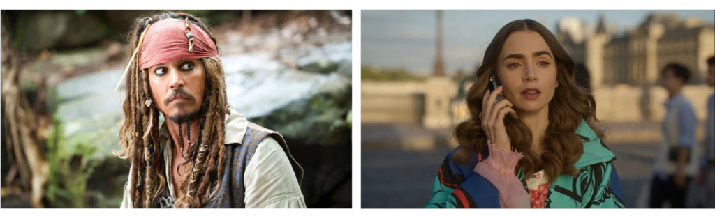
Like Amélie in the movie, her big wavy hair, chic outfits and subtle lack of French fluency convey her image as an outsider. These visual signifiers blend so well with the character's inner qualities that they immediately allow the viewer to anticipate the adventures and missteps she will take on the streets of Paris.
Such image building not only makes Emily, a confused but naturally charming character, deeply popular, but also shows the power of brand visual identity - integrating the core spirit of the brand into every detail, so that the brand story not only lives in the minds of customers, but also vividly presented in every contact.
Brand Case: Using visual design to convey personality and create resonance for a brand.
"Brand Story" is an important link between strategy and vision, not only defining the direction of the brand, but also giving the brand emotion and memory points; while design is an important means to deepen the brand.
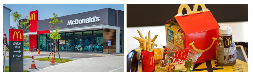
A concrete example is McDonald's, which originated from the founder's desire to provide fast, tasty and reasonably priced food and beverage services for every customer, so that every customer can enjoy the fun of eating easily. Therefore, this concept is continued in the visual identity by using red and yellow as the main colors of the brand, symbolizing its brand character: passionate, lively and happy.
McDonald's communicates the core of the brand as the "Maker of Happiness". No matter where you are, when the red and yellow colors come into view, customers will always be reminded of McDonald's iconic crispy fries, soft burgers, and the childhood joys of a kid's meal.
Another case in point is Wangpin Steak, a major player in Taiwan's food and beverage industry, which focuses on the unique Chinese flavor of its steaks, special seasonings and carefully selected meat highlights to treat every customer.
Pro uses the auxiliary graphic rose to represent the "noble hospitality" and champagne to represent the "beginning of the banquet", conveying Wangpin's brand concept of "treating only those who are most important to your heart", and reinforcing Wangpin's elegant and noble brand character, so that when people see the identification, they will be able to associate it with the feeling of being cherished, making it a warm and high-class dining experience in the hearts of customers.
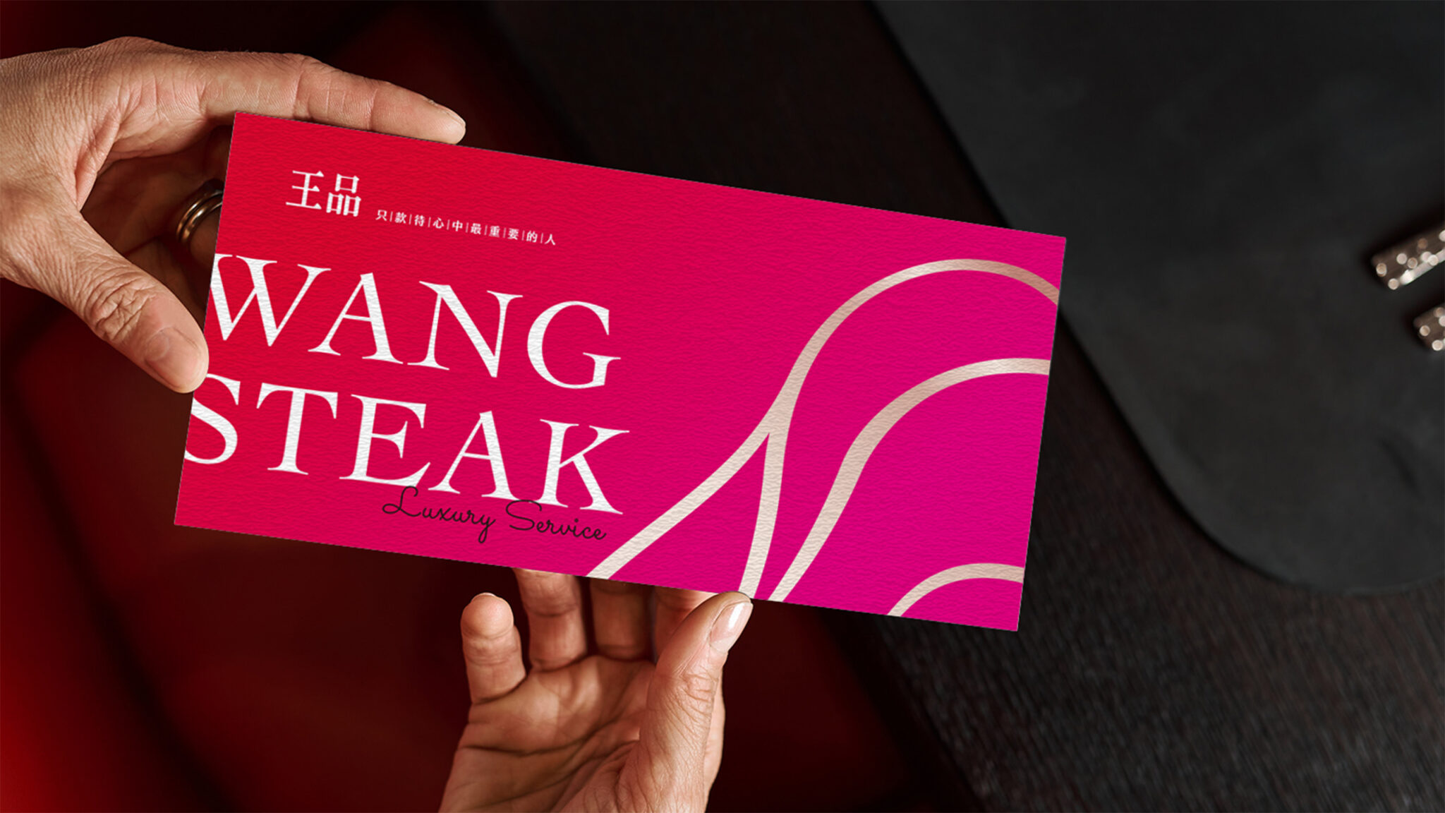
Case reading:Wang Steak。
From Vision to Systems: The Secret to Making Your Brand Everywhere
Brand identity is not just about designing a good-looking logo, it is about building a visual system that demonstrates consistency and flexibility in multiple scenarios through the use of complementary elements such as color, typography, graphics and image styles:
1. Color and Emotional Connection
Colors can help brands convey emotions, such as blue conveying stability and professionalism, and green symbolizing nature and health. These elements inject more layers of sensory experience into the brand, not just the graphic design of the logo.
2. Typography and brand tonality
The choice of fonts and typography can reinforce the brand's identity. For example, handwritten fonts convey intimacy, while geometric fonts are more modern. These elements complement a logo's ability to express the brand's identity.
3. Graphics and Image Styles
Graphic design and imagery styles can further illustrate a brand's story and atmosphere. For example, a tech brand might use simple, linear graphics, while a children's clothing brand would prefer an illustrative design to give a quick sense of the brand's different positioning.
4. Unified brand image
A logo may not be able to take on all the visual representation needs alone across different touch points (e.g. packaging, social media, website). Complementing other elements ensures that the brand image remains consistent across scenes, enhancing recognition and professionalism.
These elements not only complement the logo in conveying the brand's emotion and story, but also ensure consistency across different touch points (e.g., packaging, social media, website), enhancing customers' brand memory and emotional connection, as well as strengthening the sense of recognition and professionalism.
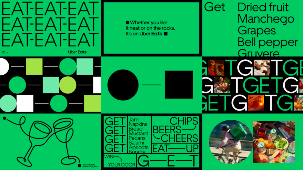
Taking Uber as an example, its identity system has evolved from the initial black and white minimalist style to the design concept of "journey": no matter whether it is hailing a cab, delivering a ride, or any other service, Uber's brand image always conveys the core brand spirit of "Uber's service is a journey from the starting point to the end point, where people can go anywhere and get anything". This systematic identity design not only allows the brand to quickly adapt to new business needs, but also strengthens consumers' awareness of the brand's core values.
Another example is Mia C'bon Supermarket (formerly known as JASONS), whose concept takes "inspiring life inspiration" as the starting point of the brand, and combines simple yet concrete design language to incorporate the core spirit of the brand into every consumer experience. From fresh and healthy organic fruits and vegetables, to imported and local products, and even stories that inspire people's hearts, the identity design uses a clever combination of fonts and squares to convey the meaning of "loaded" - loaded with the protection of the world, friendliness to the environment, and insistence on freshness.
In the identity system, Mia C'bon extends the use of diversity, using black as a stable base to symbolize the brand's diversity and inclusiveness, complemented by color combinations such as lime green, which symbolizes "health", aqua blue, which presents fresh seafood, and burgundy, which symbolizes "international wines". The flexible use of these colors not only unifies and enriches the brand identity, but also allows consumers to feel an immersive experience and the brand's commitment to a better life the moment they step into Mia C'bon.
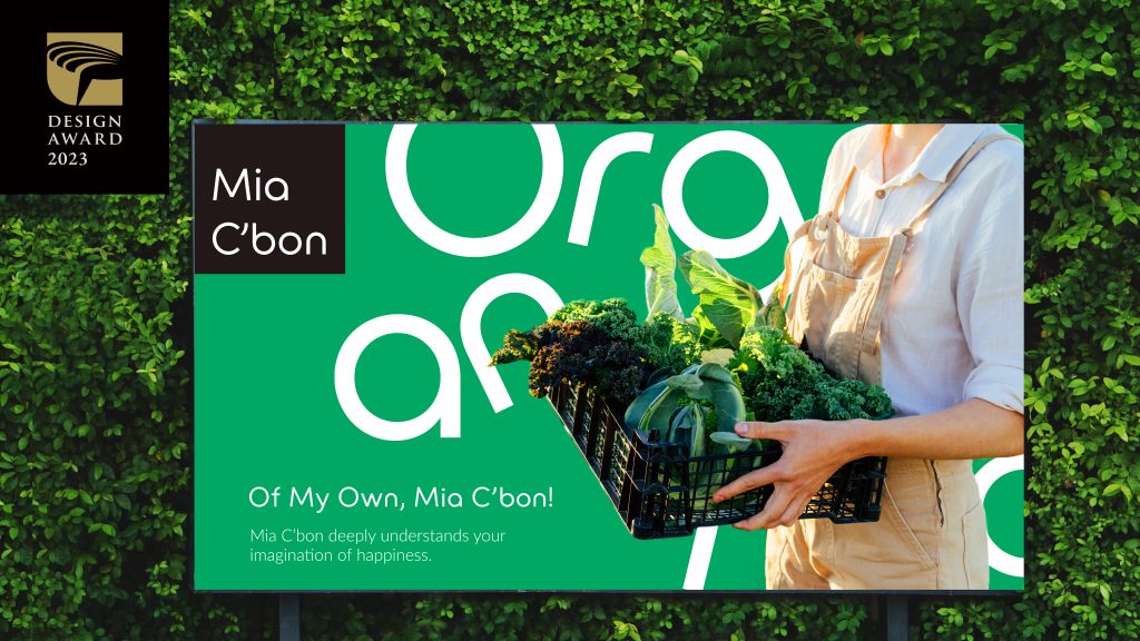
Case reading:Mia C'bon Supermarket
Visual design puts brands on the map in the marketplace
The success of a brand is just like the birth of a classic character, which requires the cornerstone of strategy as well as visual highlights. Through a unified and distinctive visual identity system, the core values of a brand are visualized as symbols that touch people's hearts, just like the audience's unforgettable sight of Captain Jack's eye make-up or Emily's red dress.
This visual language allows the brand to naturally become that memorable protagonist in the mind of the customer without having to say anything.